Loading

Digital Whiteboard

A brand new product designed to replace traditional analogue whiteboards which allows real time Admission, Discharge & Transfer of patients on mobile.

My Role

  • UI & UX Design

Time Frame

  • 12+ Months
  • 2018 - 2019

Tools

  • Pen & Paper
  • Photoshop
  • Adobe XD
  • Illustrator
  • Invision
  • HTML
  • CSS
  • Angular Framework

Team

  • Dan Laffan - Team Lead & Backend
  • Jack Gallagher - Mobile Engineer
  • James Judge - Mobile Engineer
  • Seán O' Neill - Mobile Engineer
  • Jamie Condon - Backend Developer
  • Ashling McNabb - Business Analyst
  • Dean Mawson - Clinical Safety Officer
  • Simon Neve - Product Manager

Brief

Brief

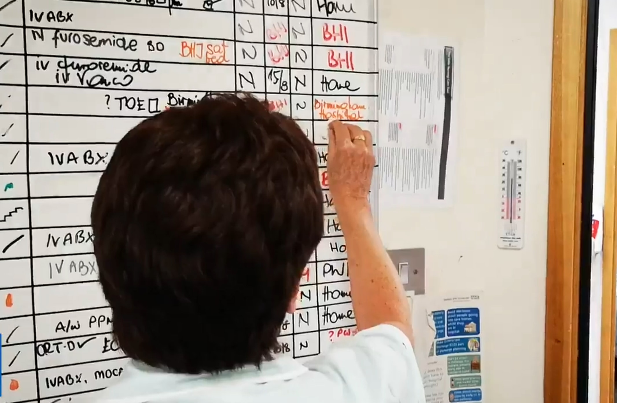
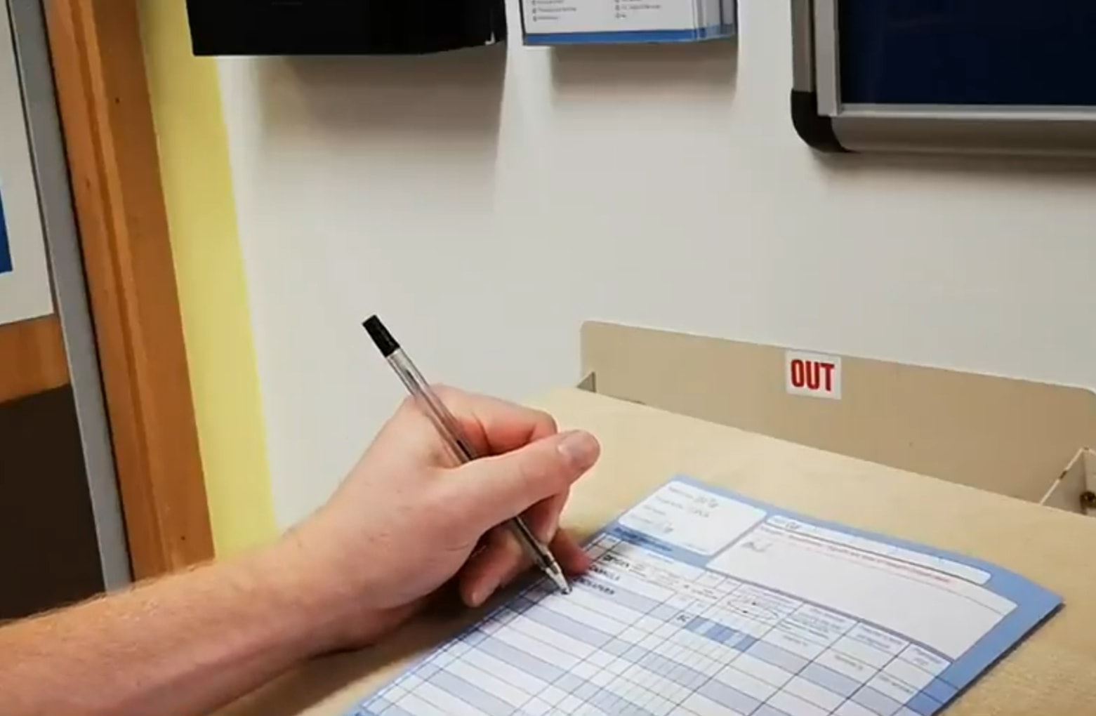
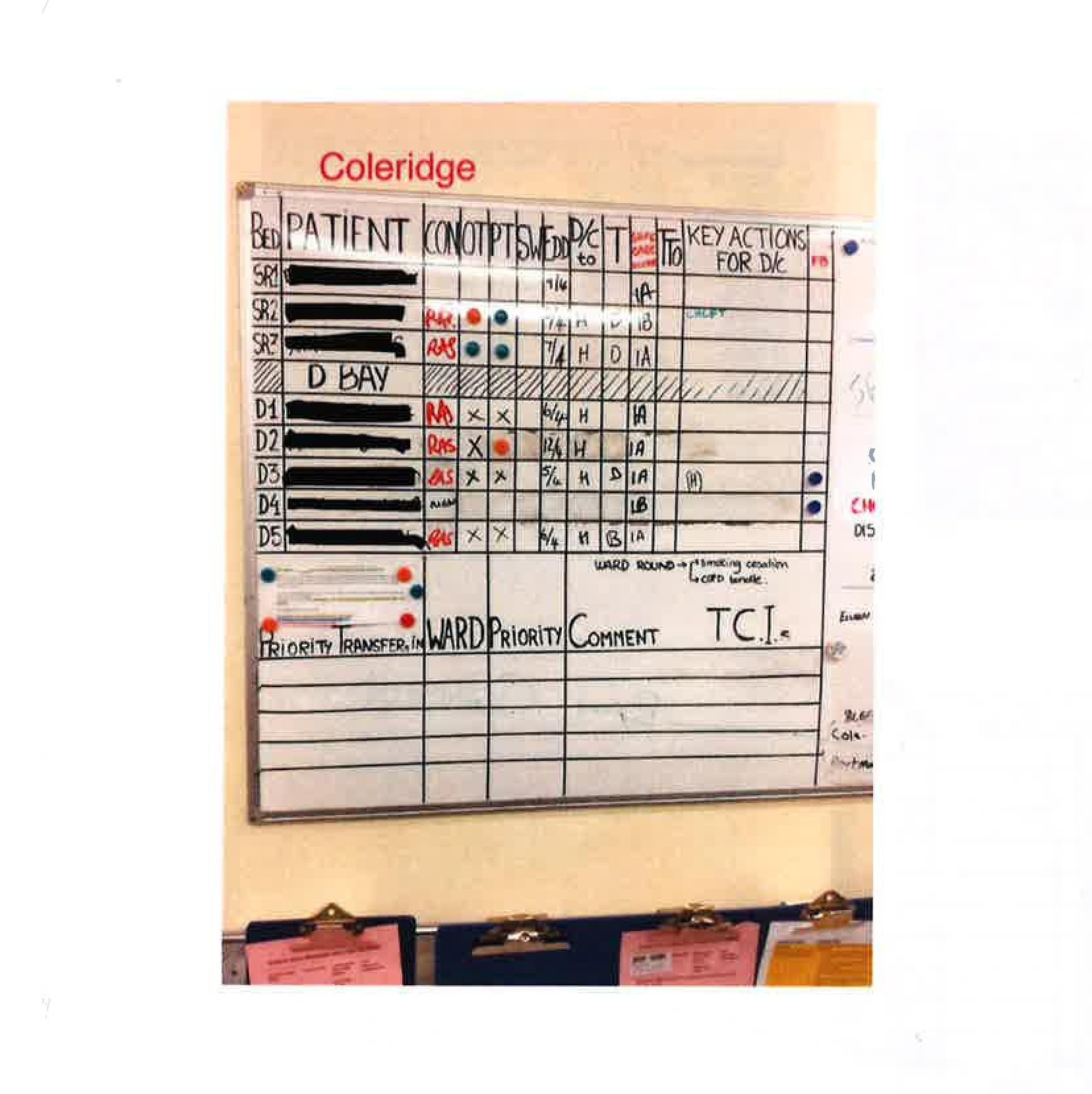
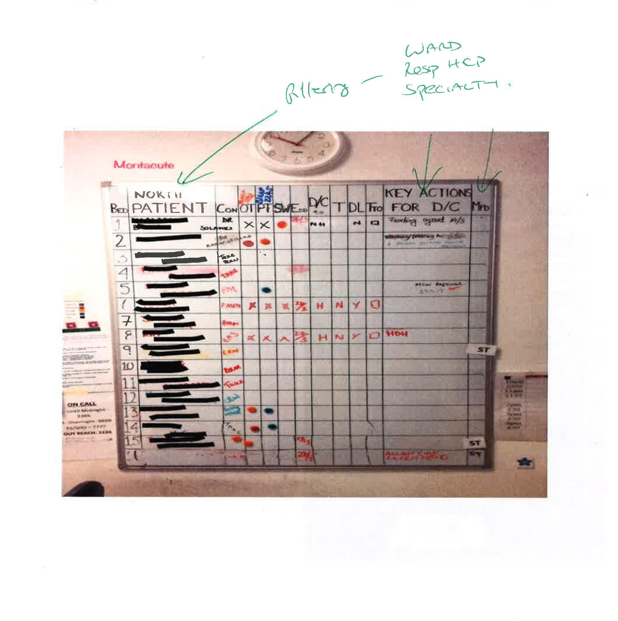
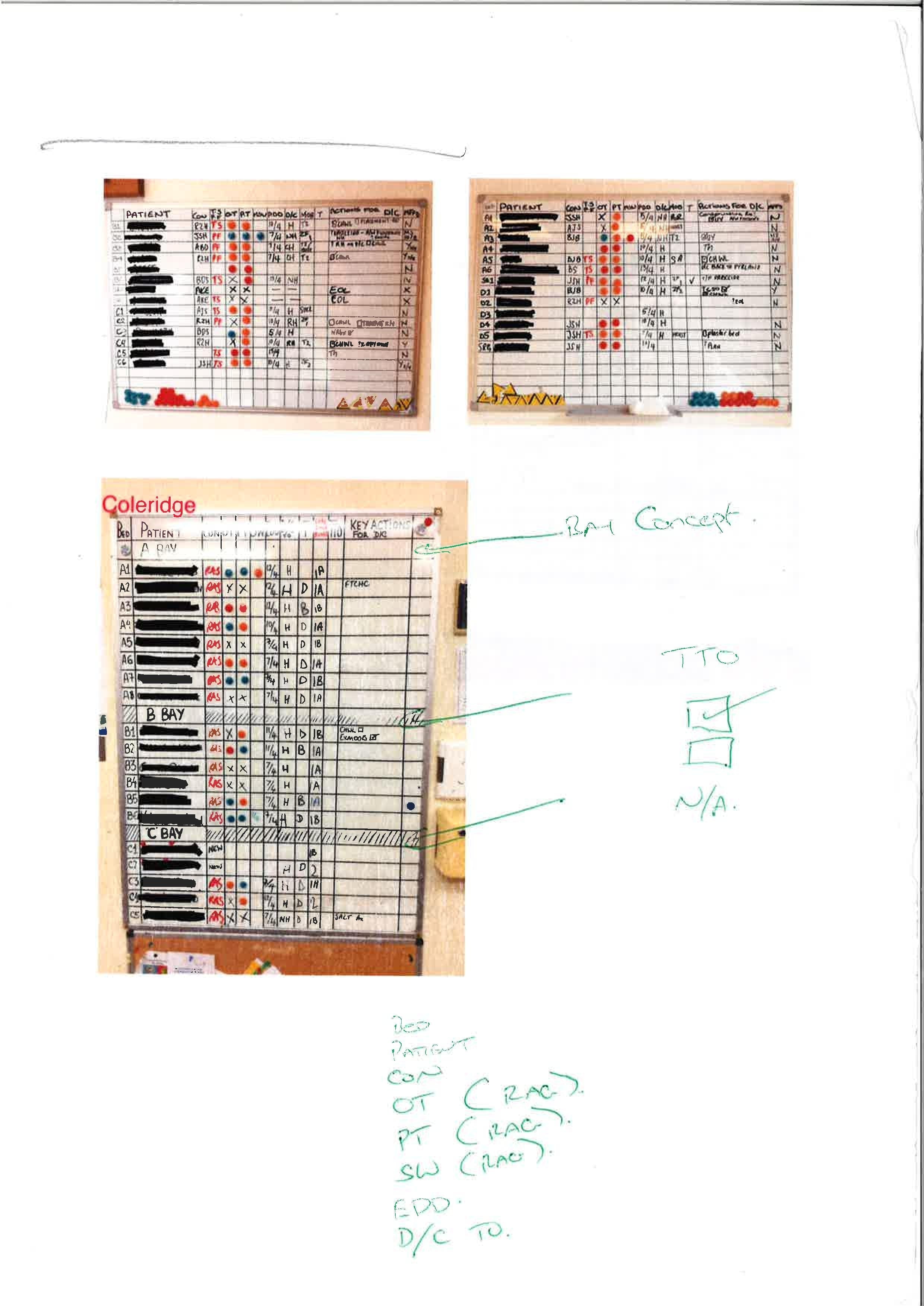
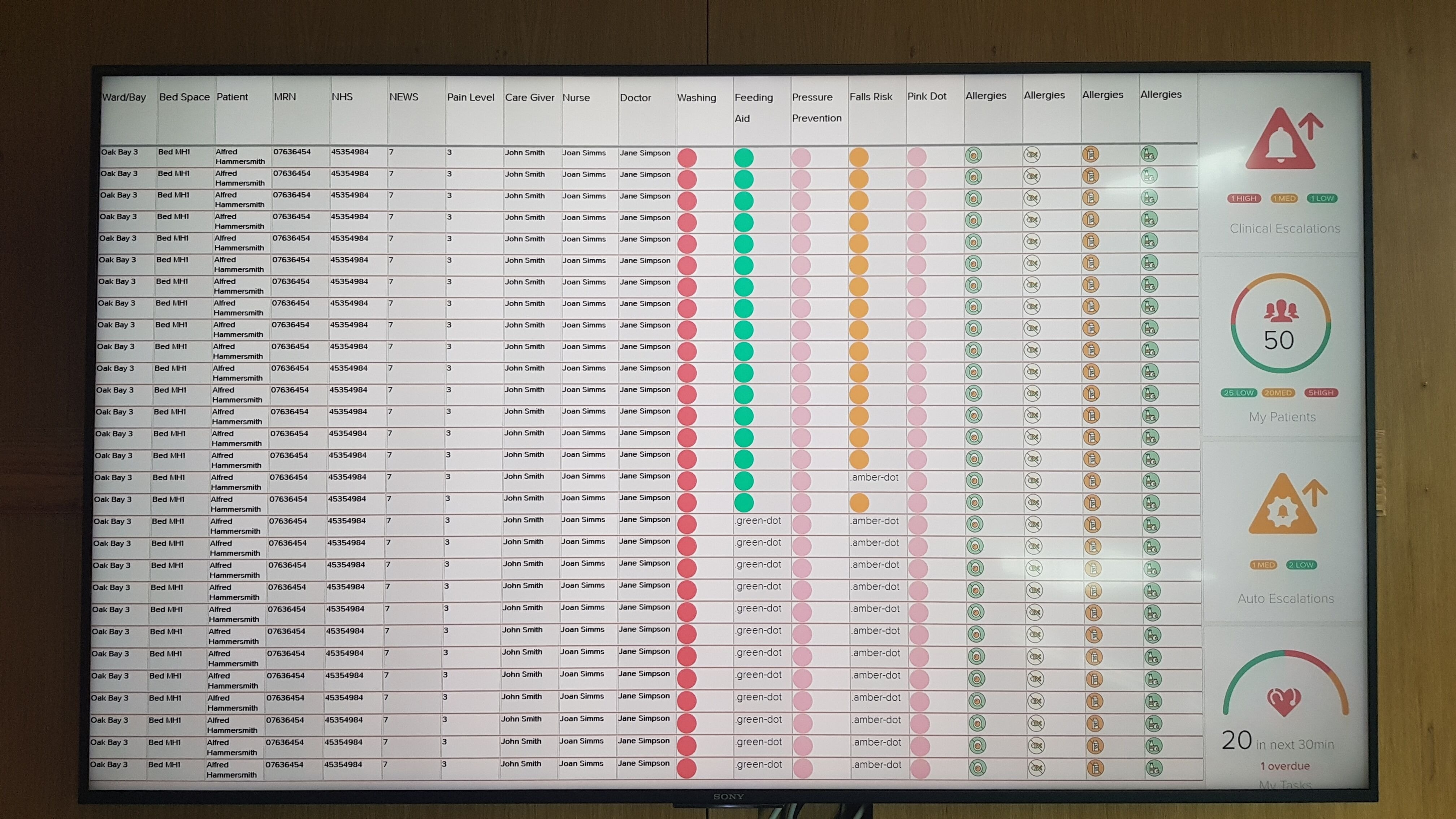
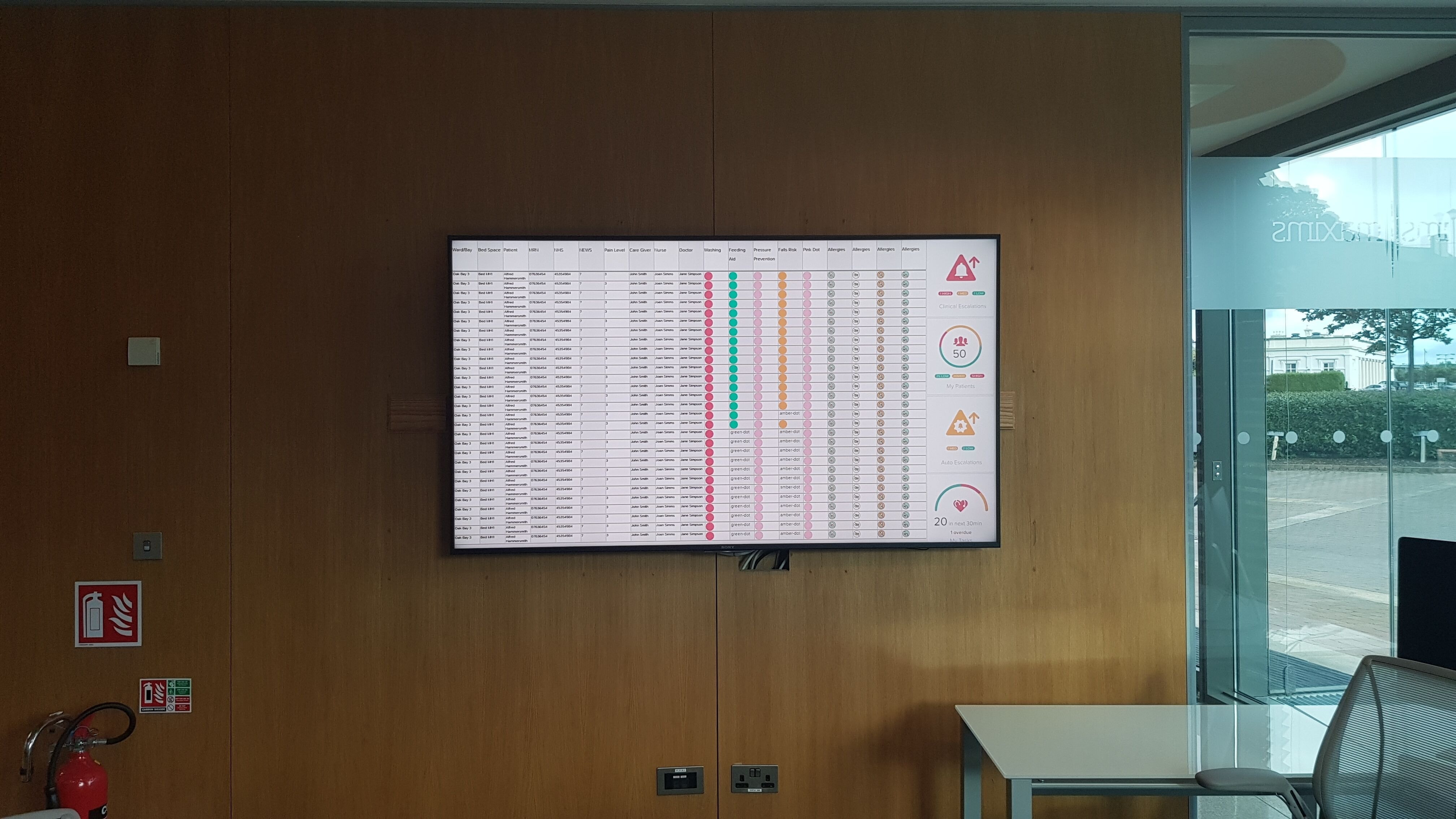
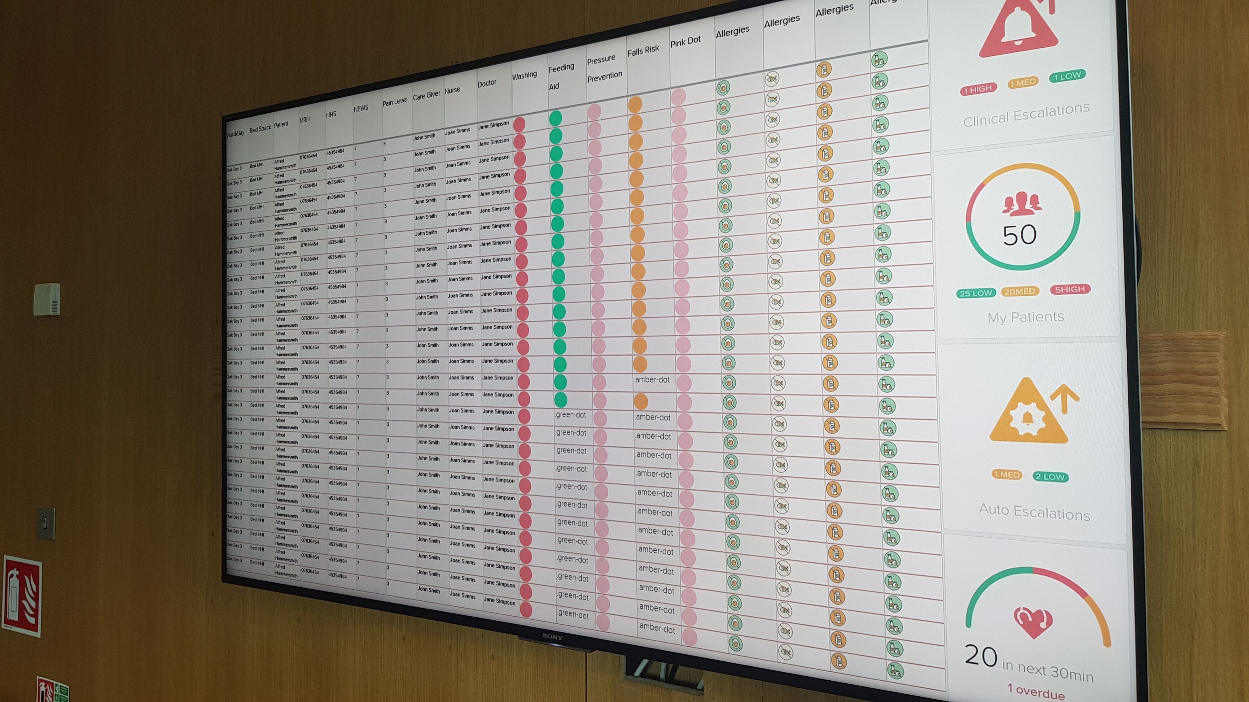
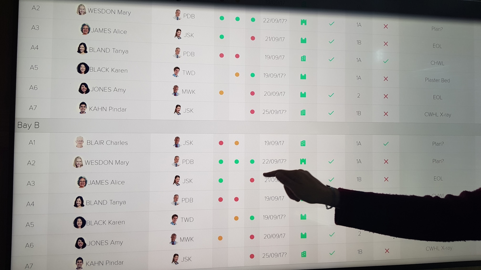
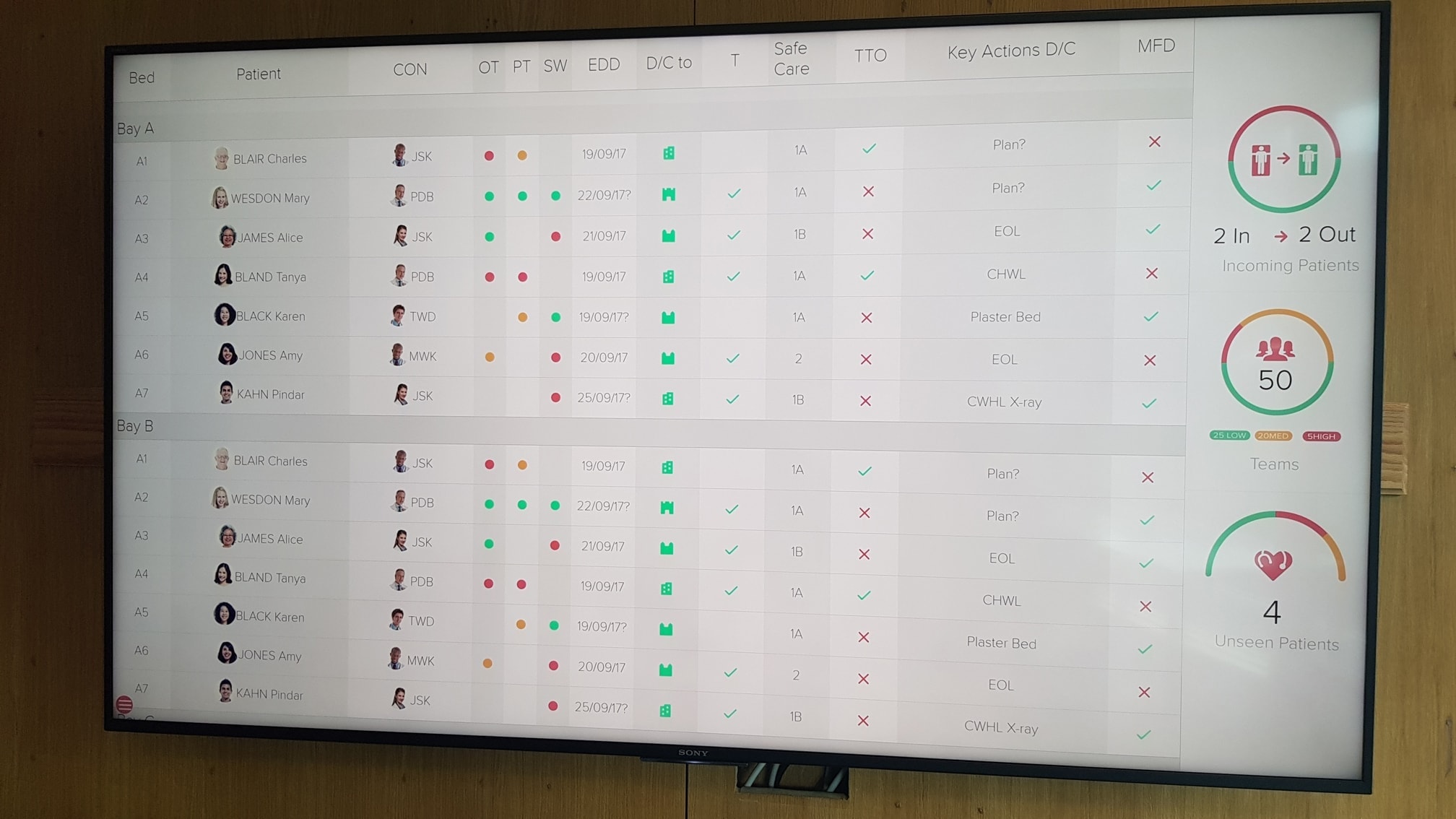
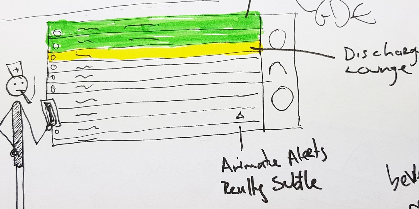
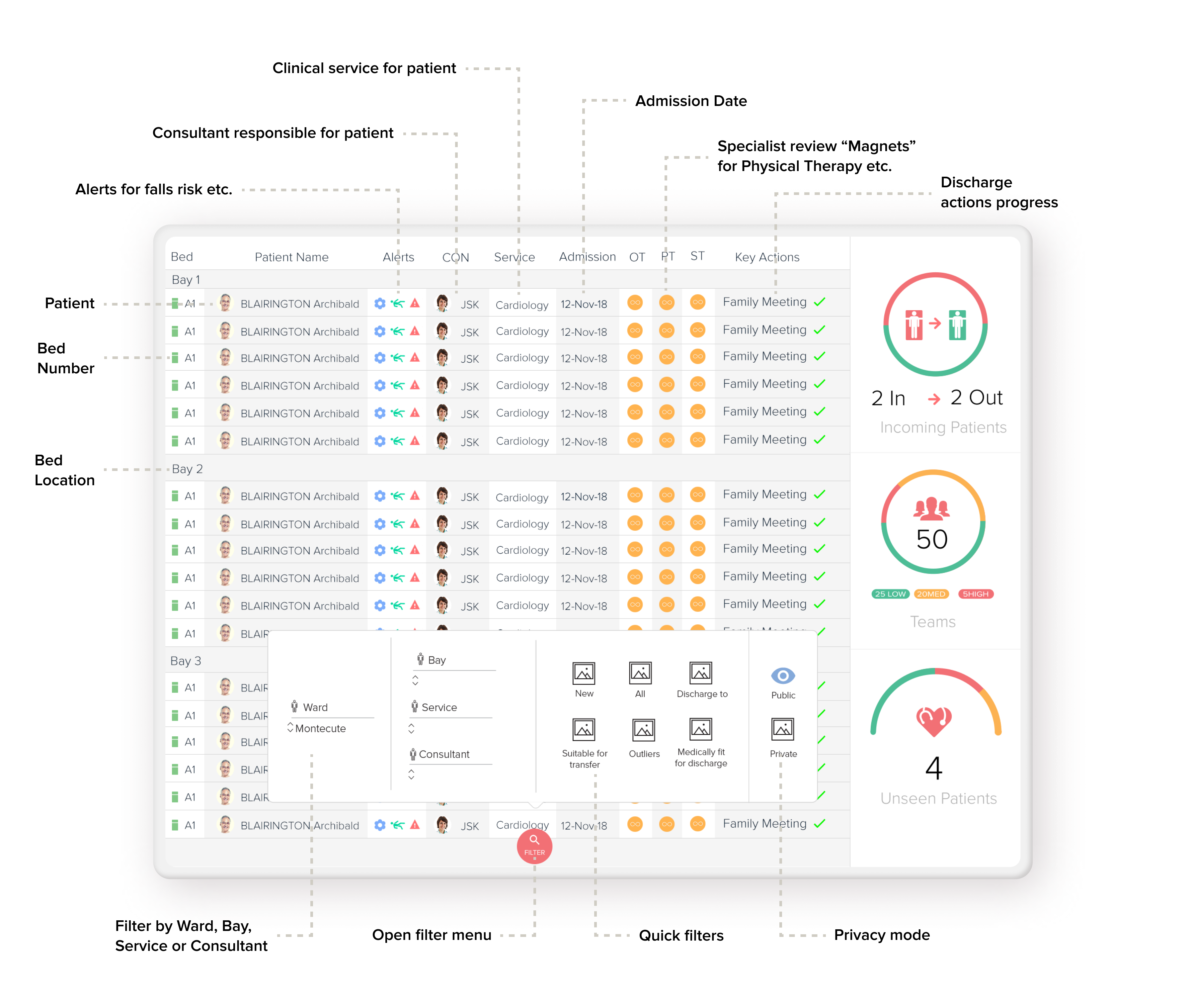
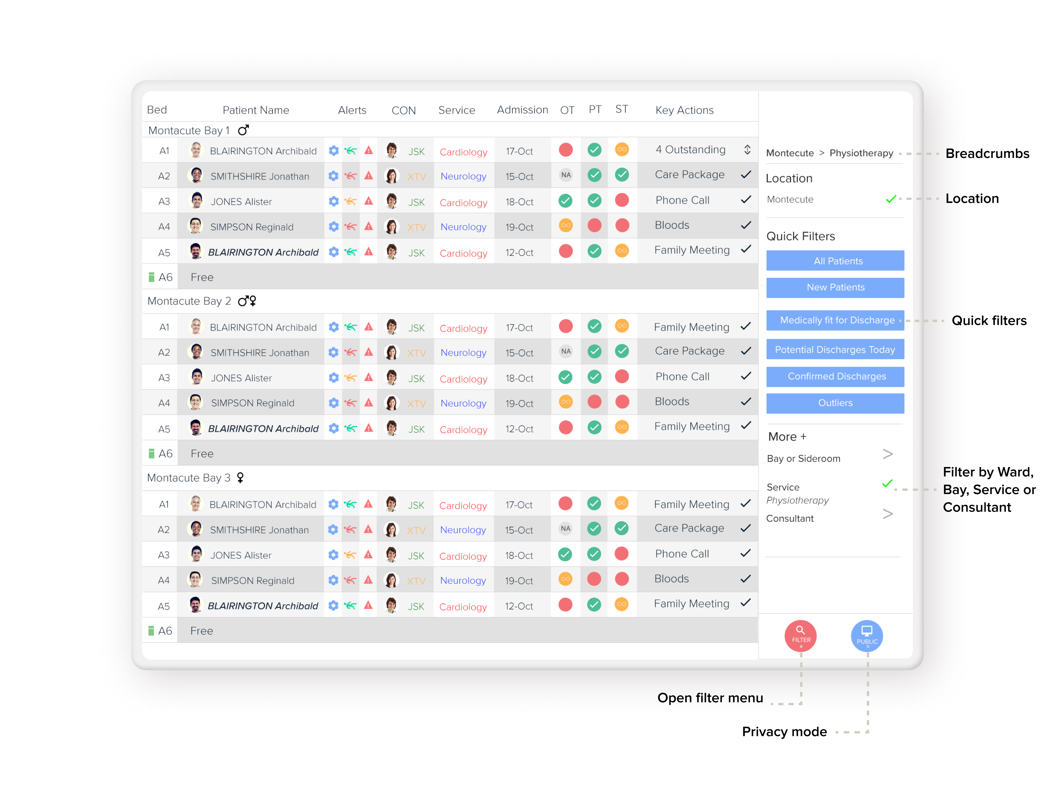
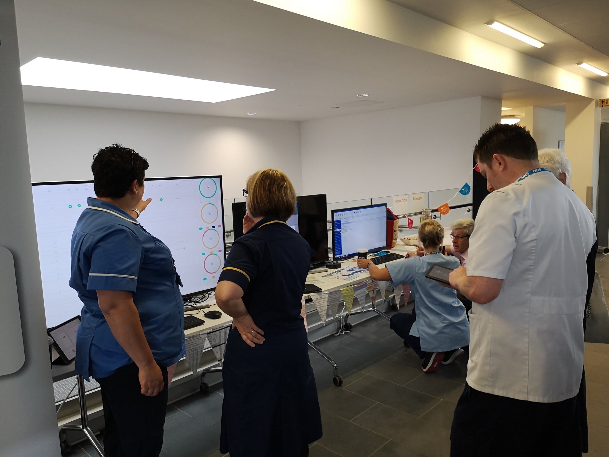
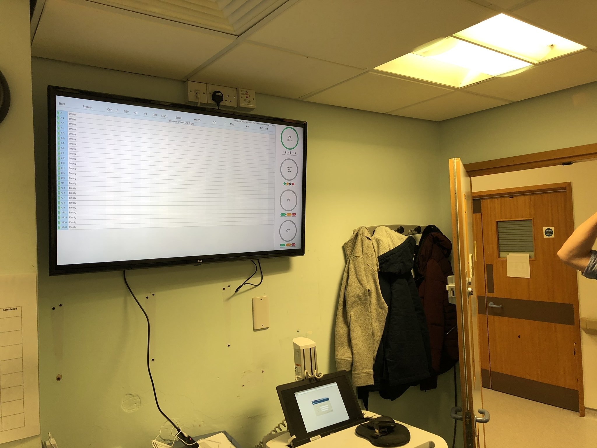
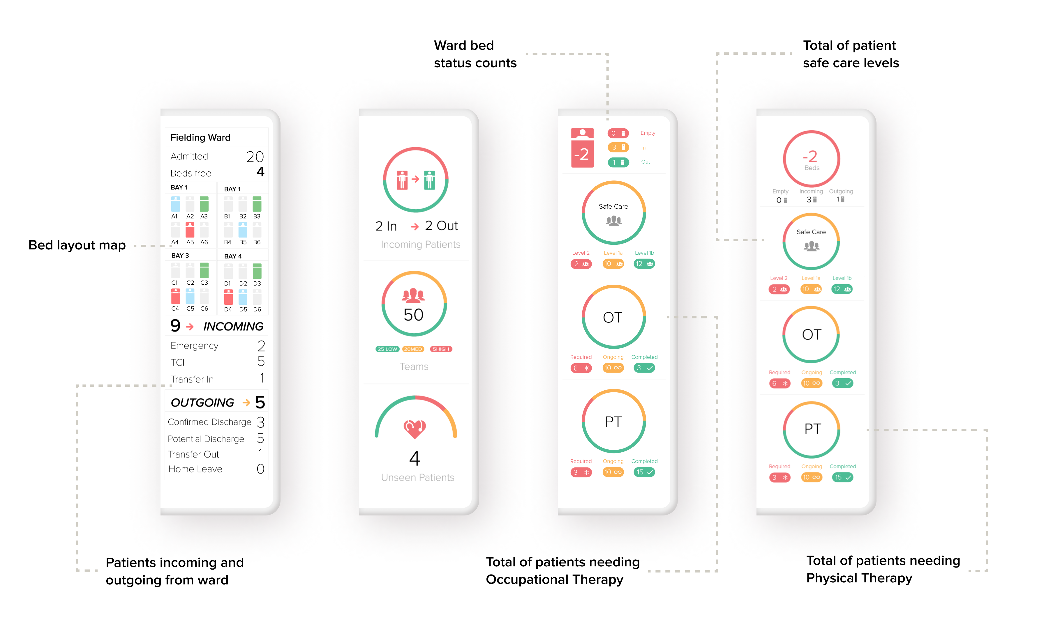
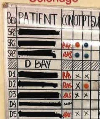
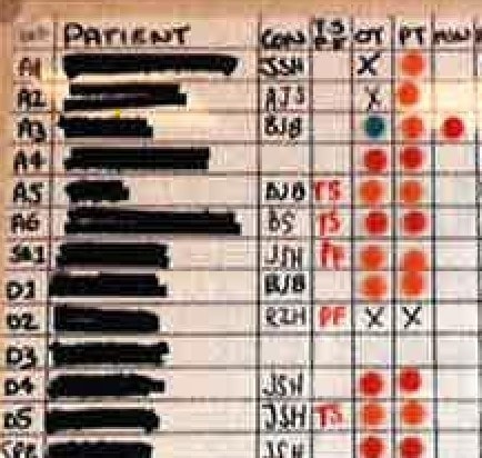
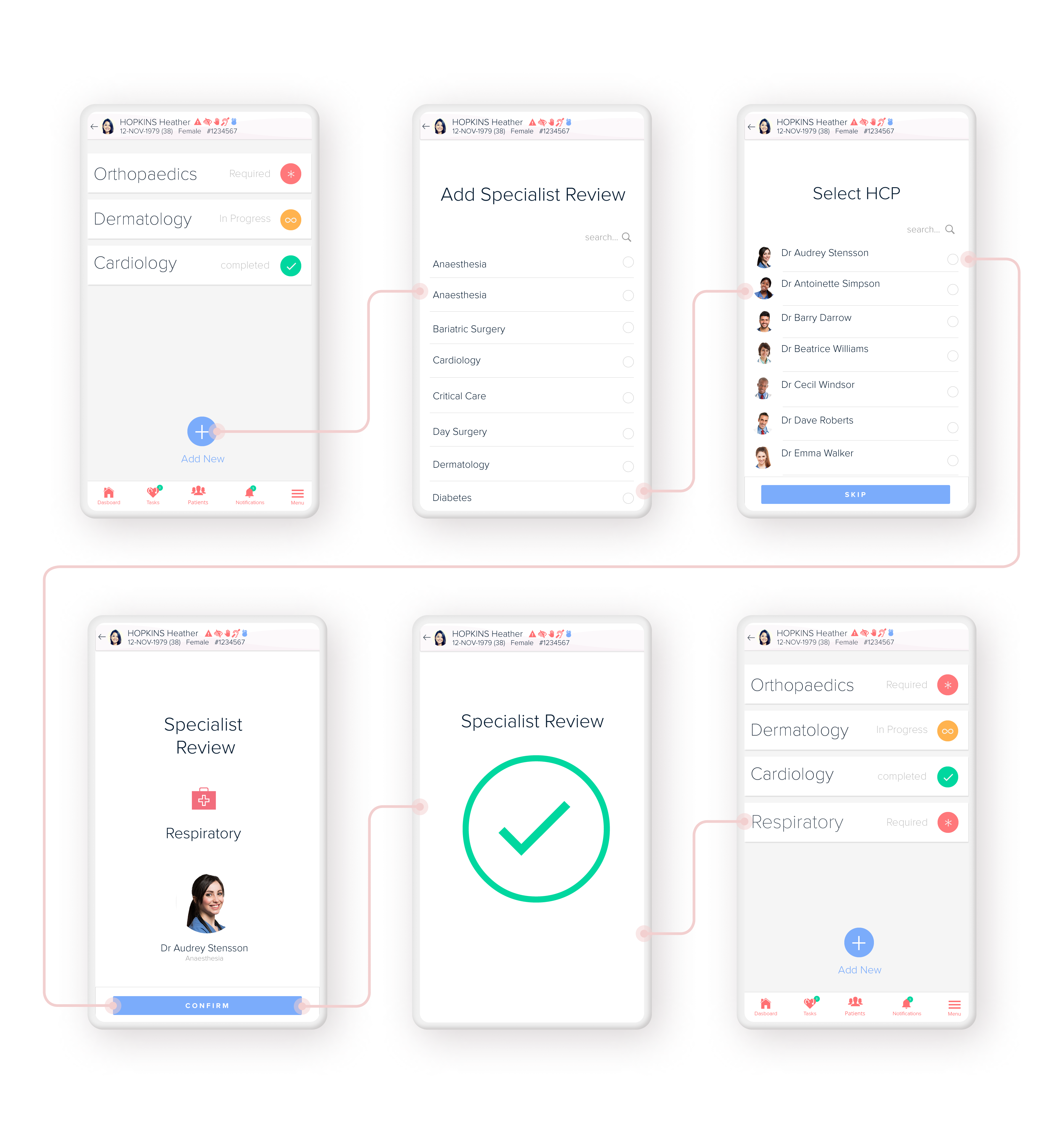
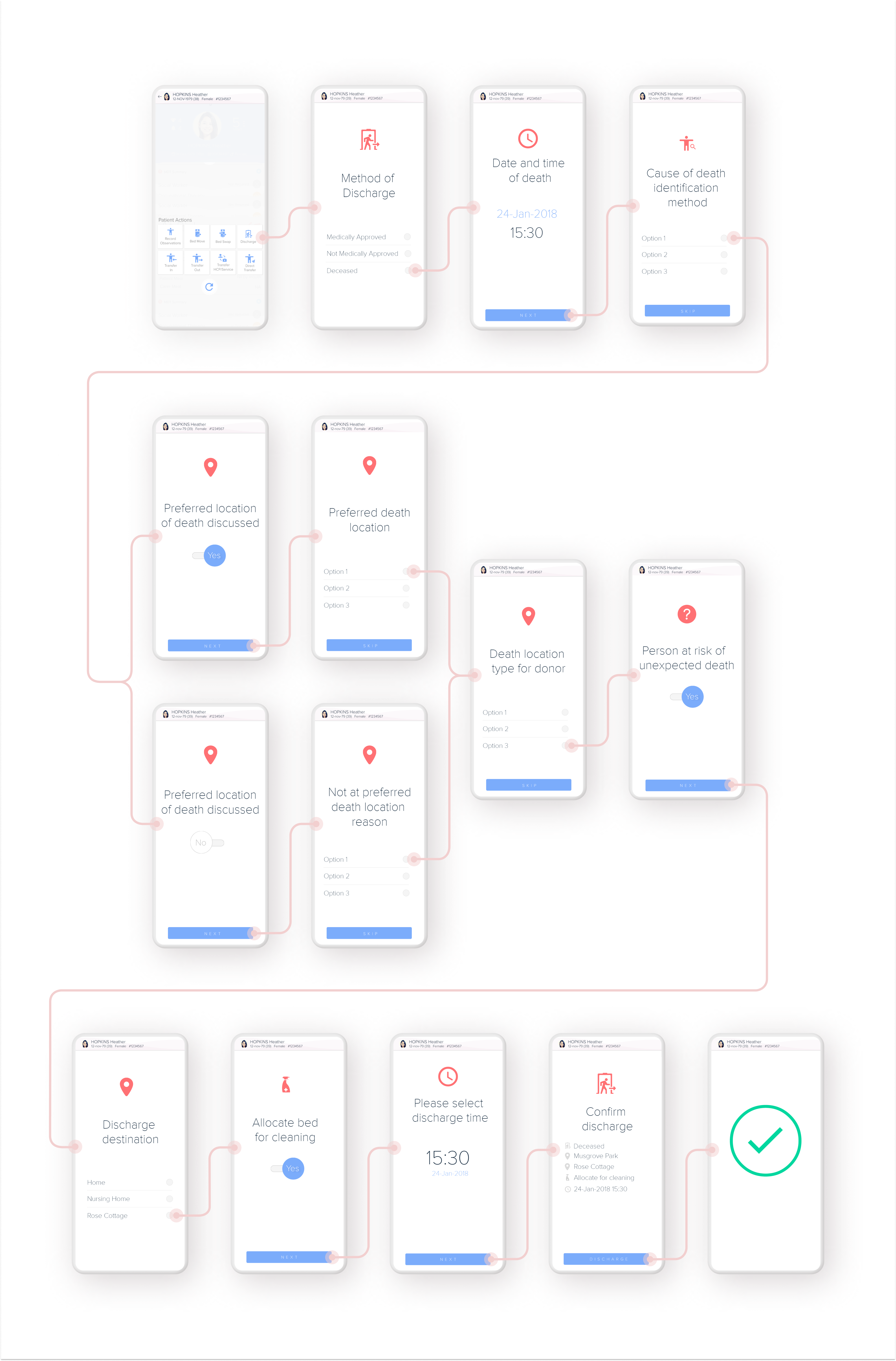
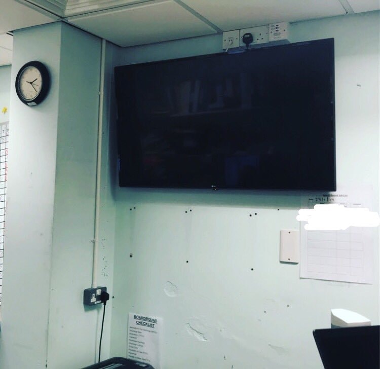
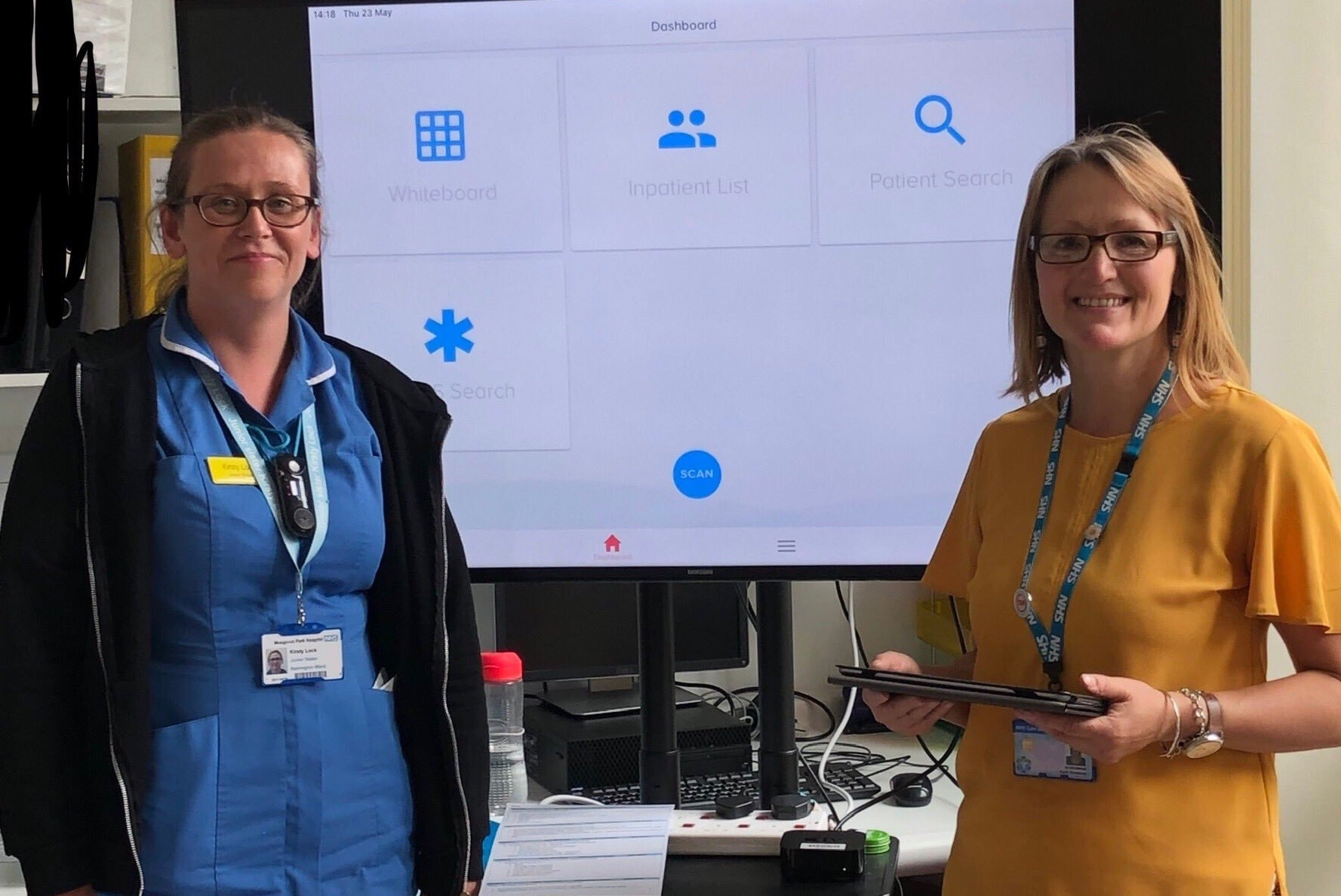
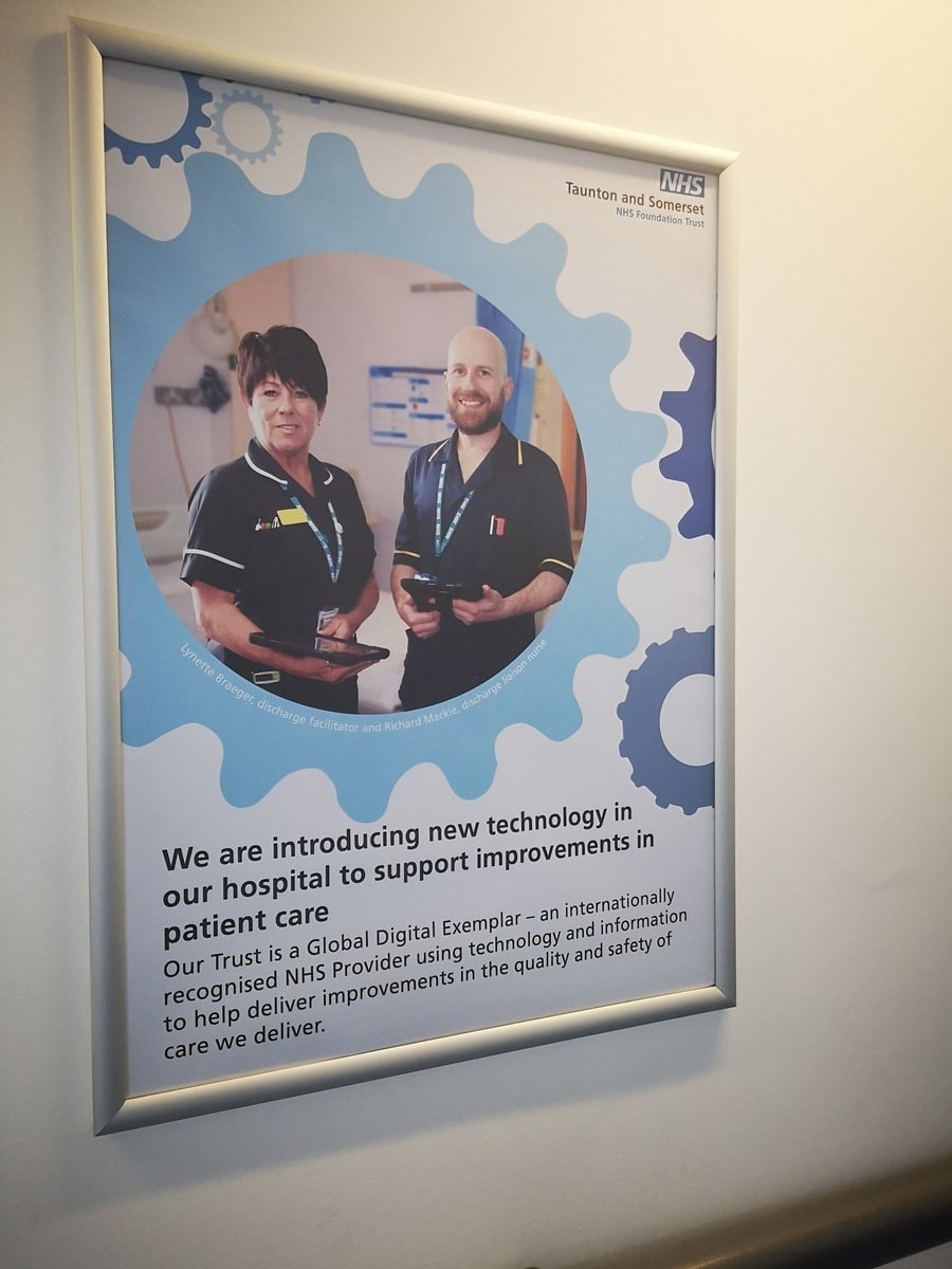
The eWhiteboard is a brand new product, we designed a digital version of the traditional whiteboards that are used to coordinate the discharge of patients from the hospital, or transfer to another ward once they have completed their specified actions for discharge. This project is part of the Digital Transformation undertaken by the NHS to reduce the reliance on paper-based workflows.

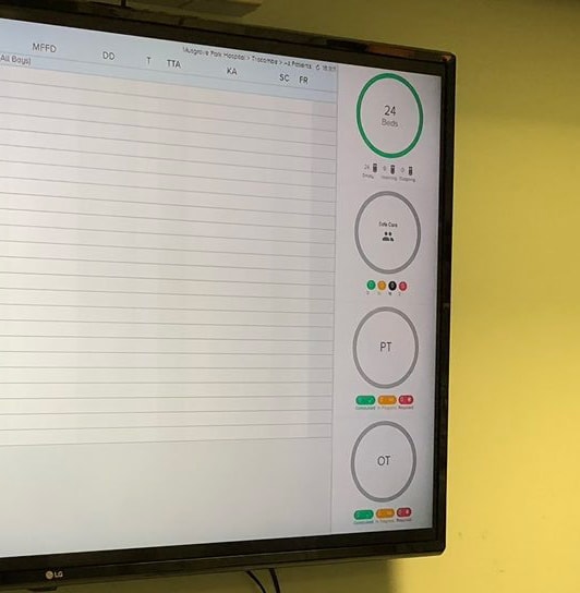
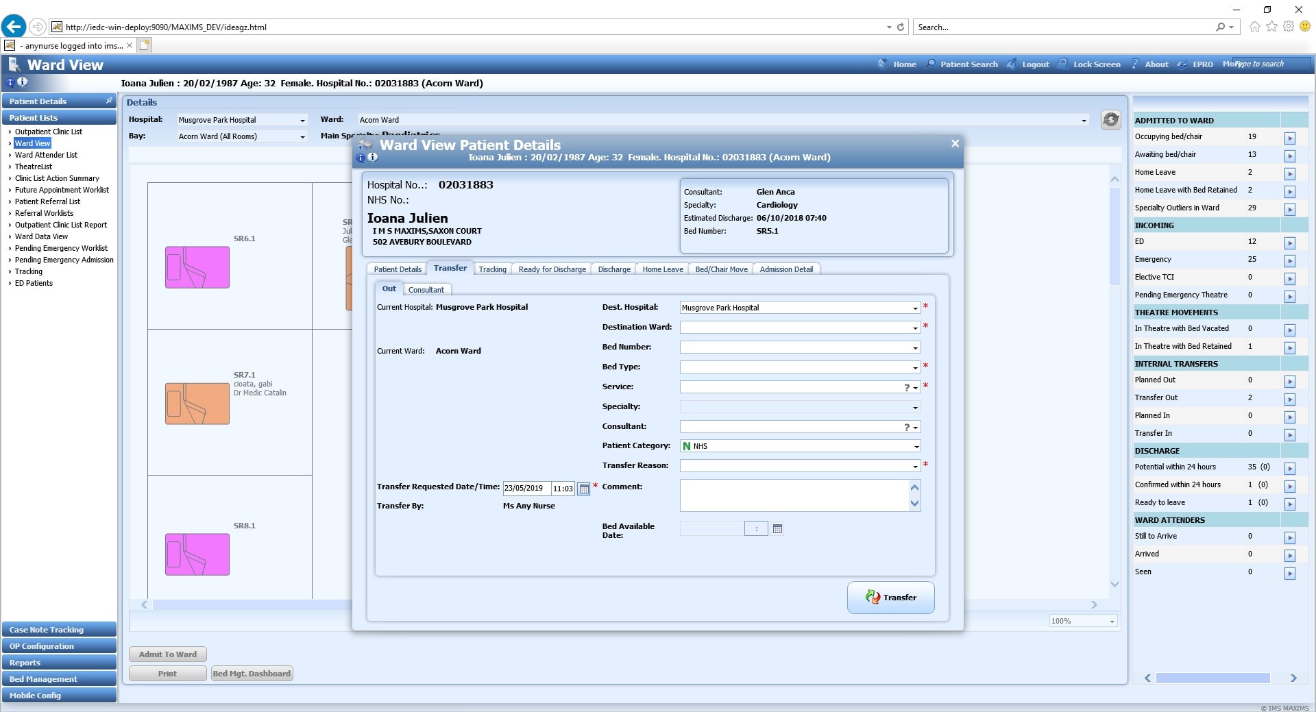
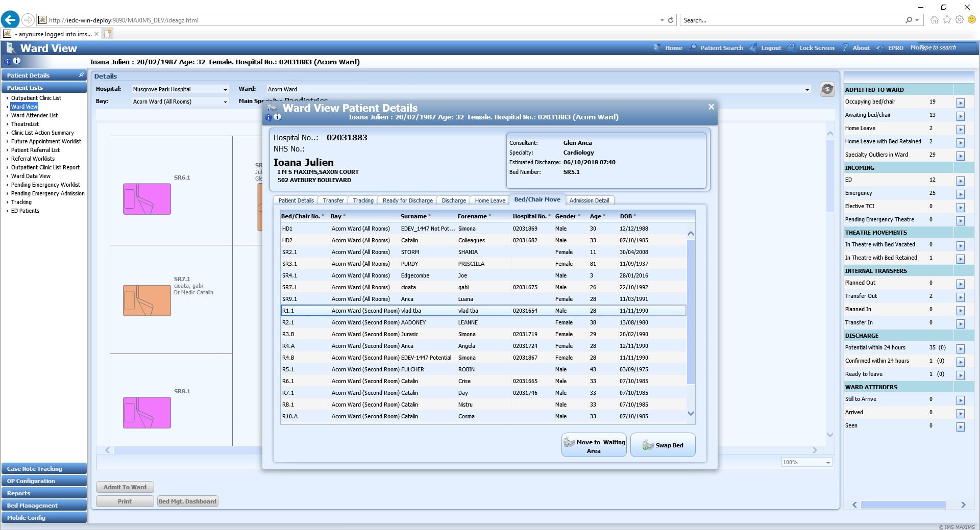
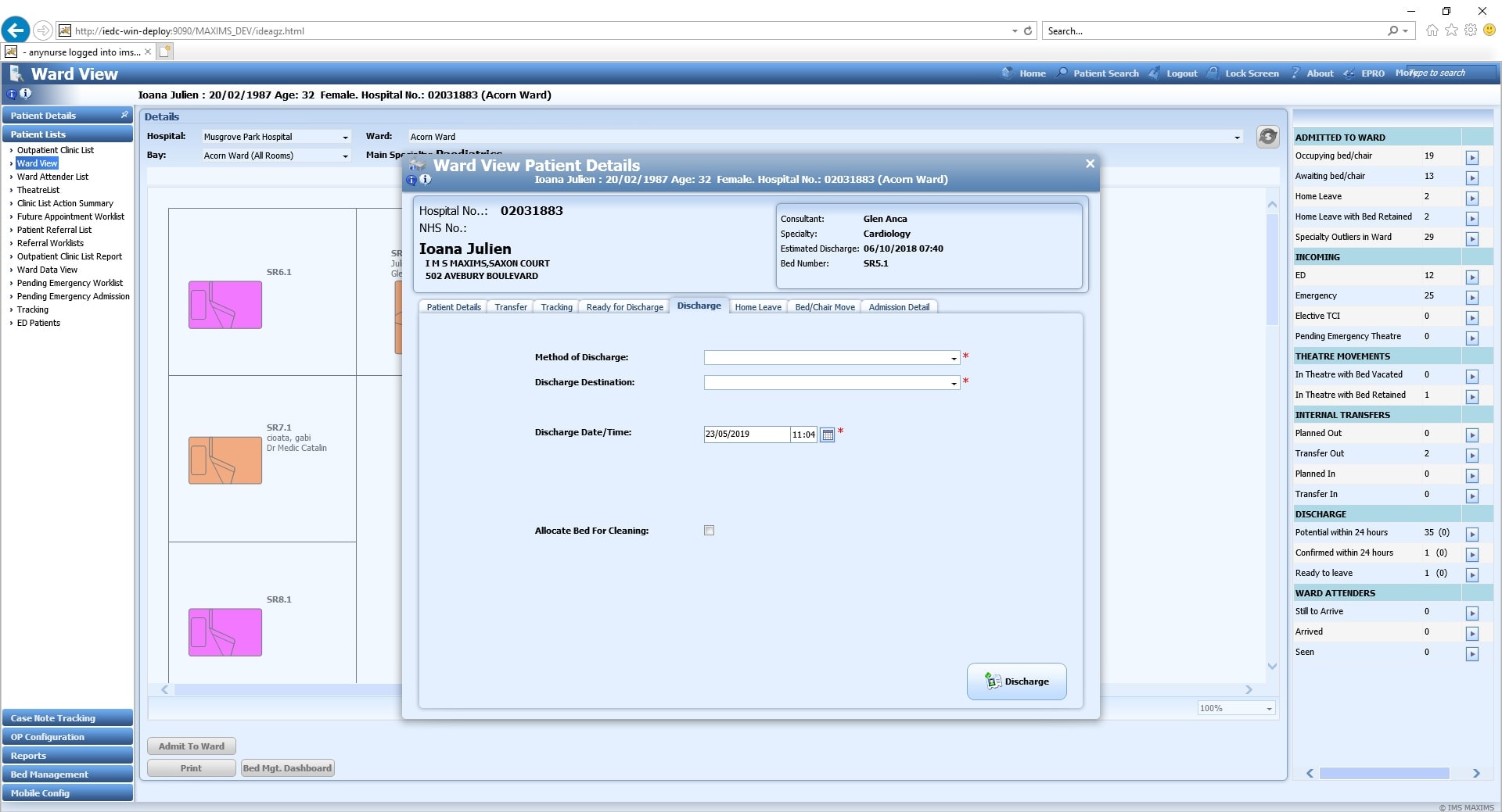
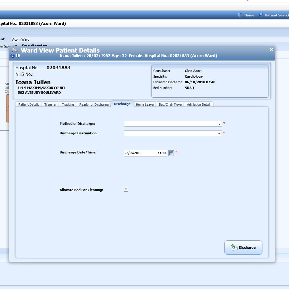
The Whiteboard is a module built on top of the eOBS App and integrates with MAXIMS Enterprise desktop solution.

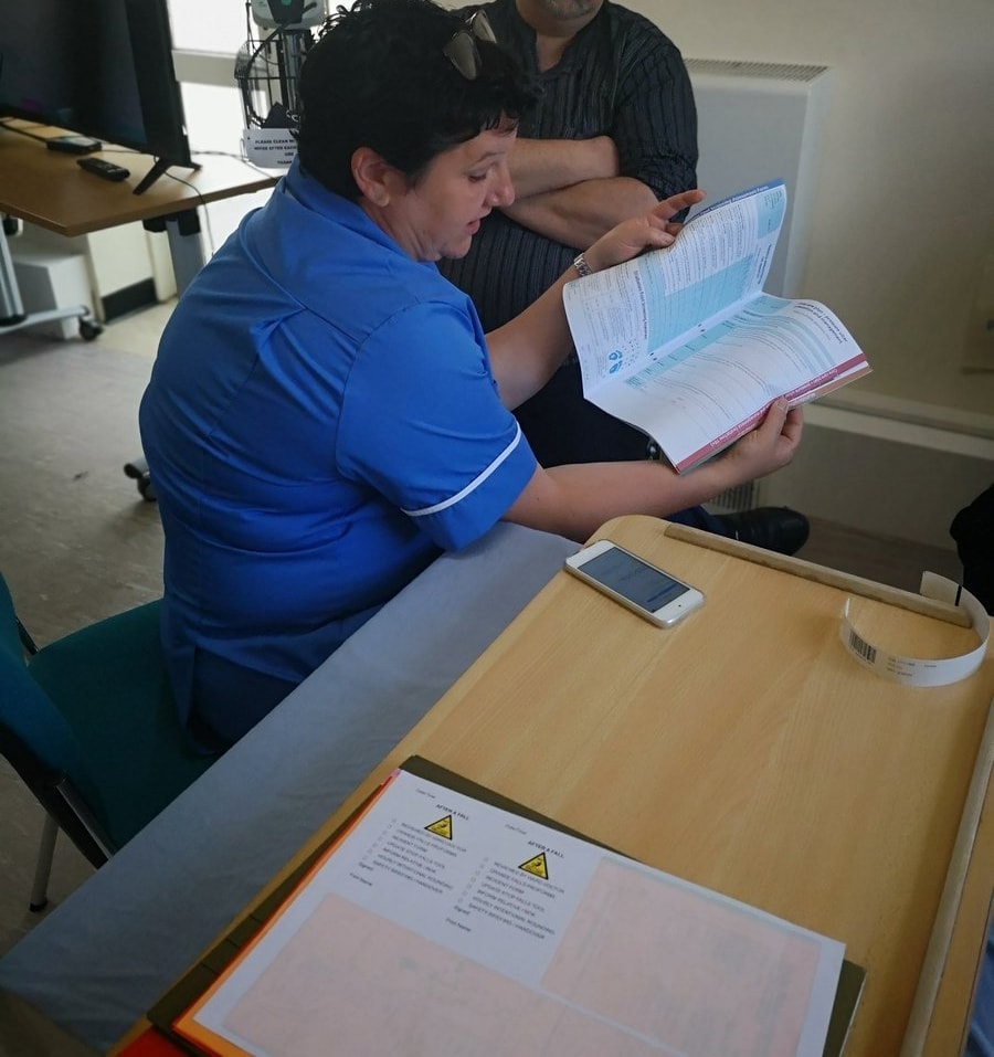
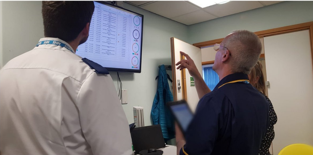
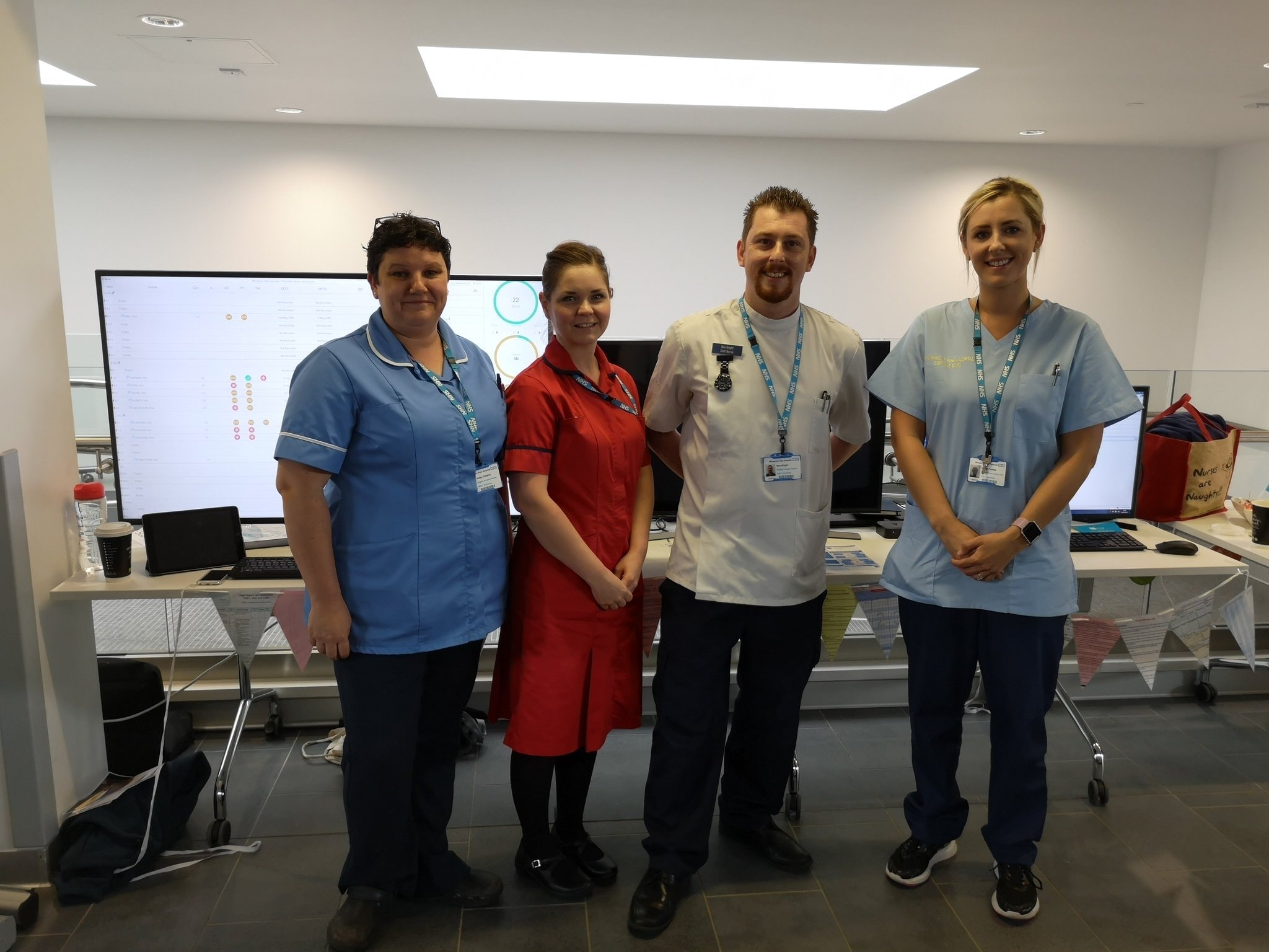
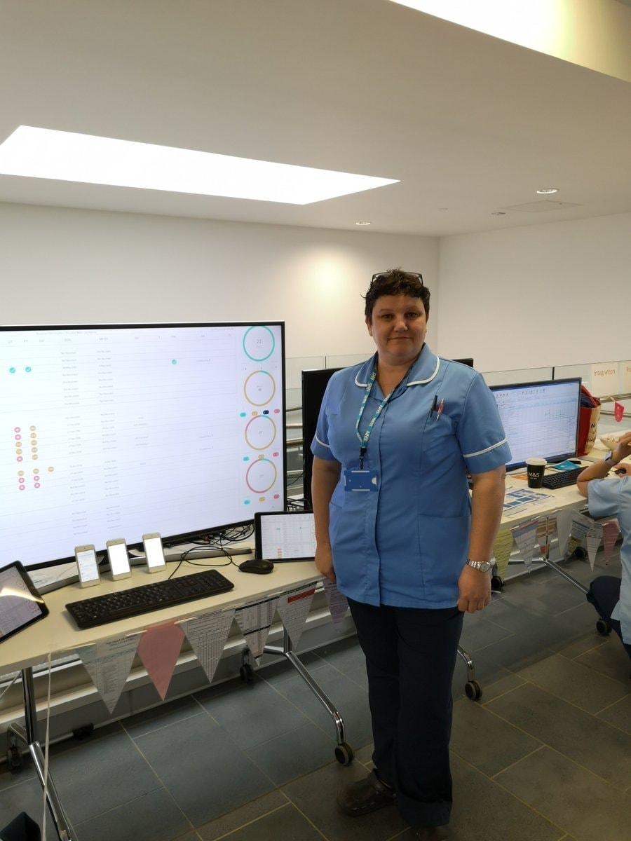
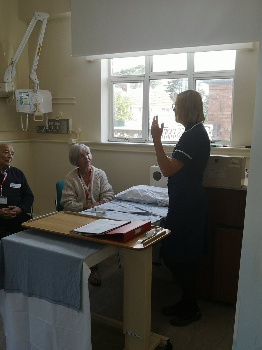
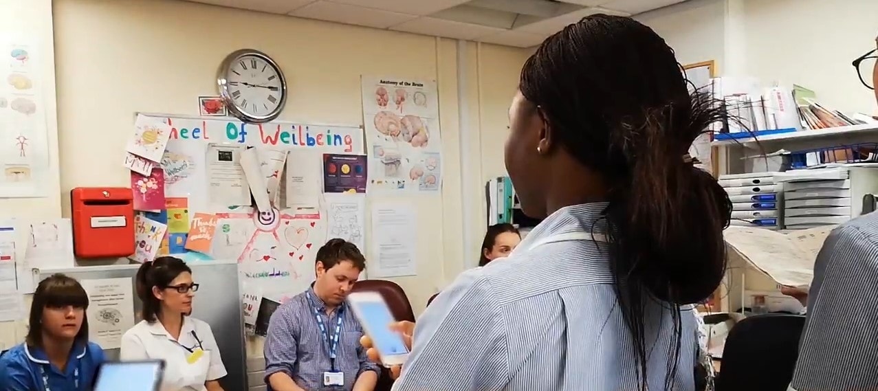
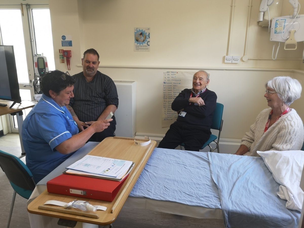
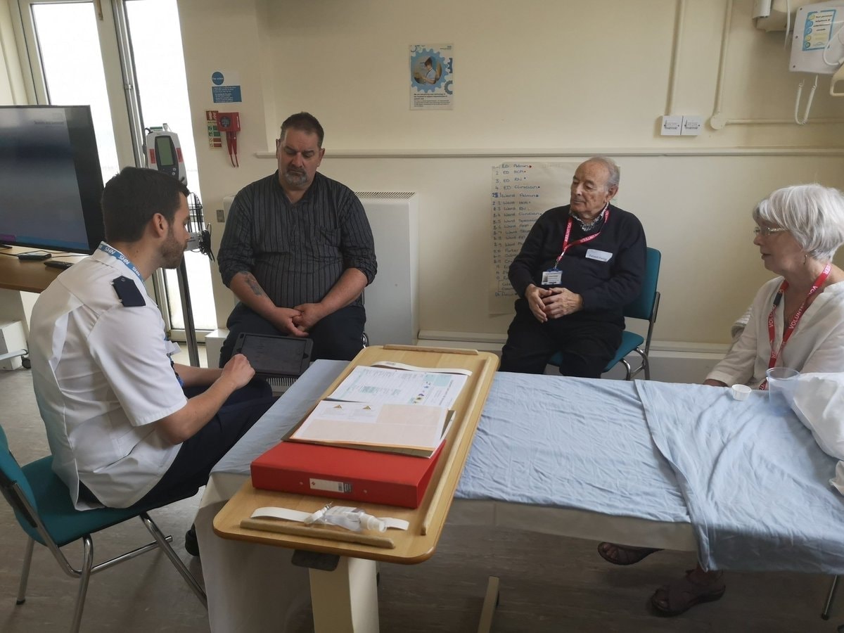
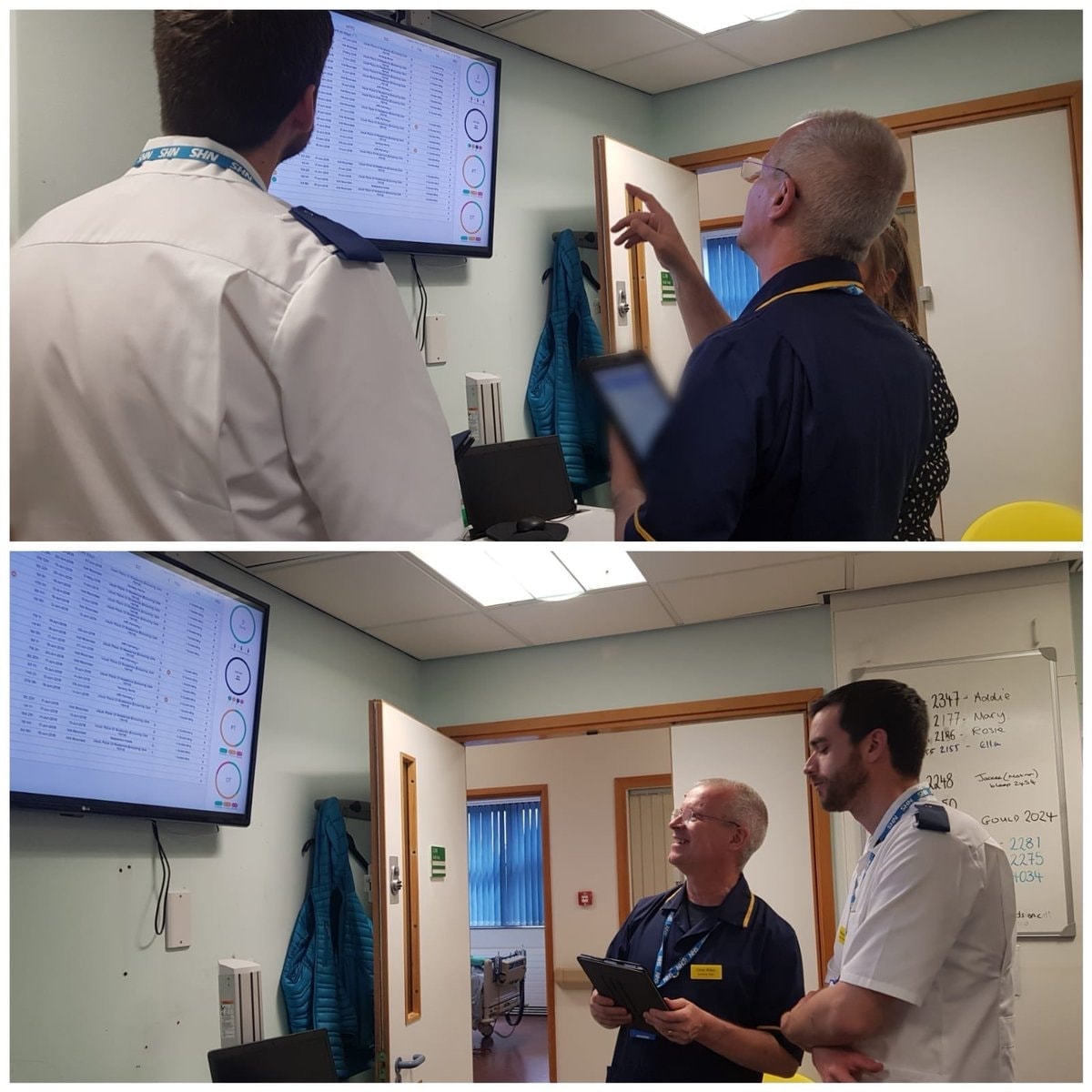
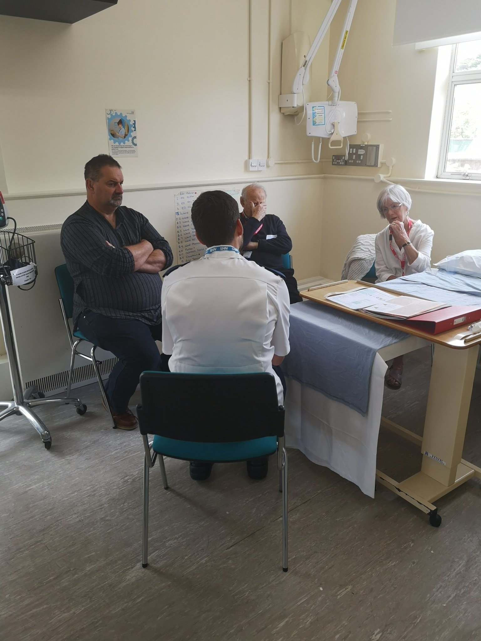
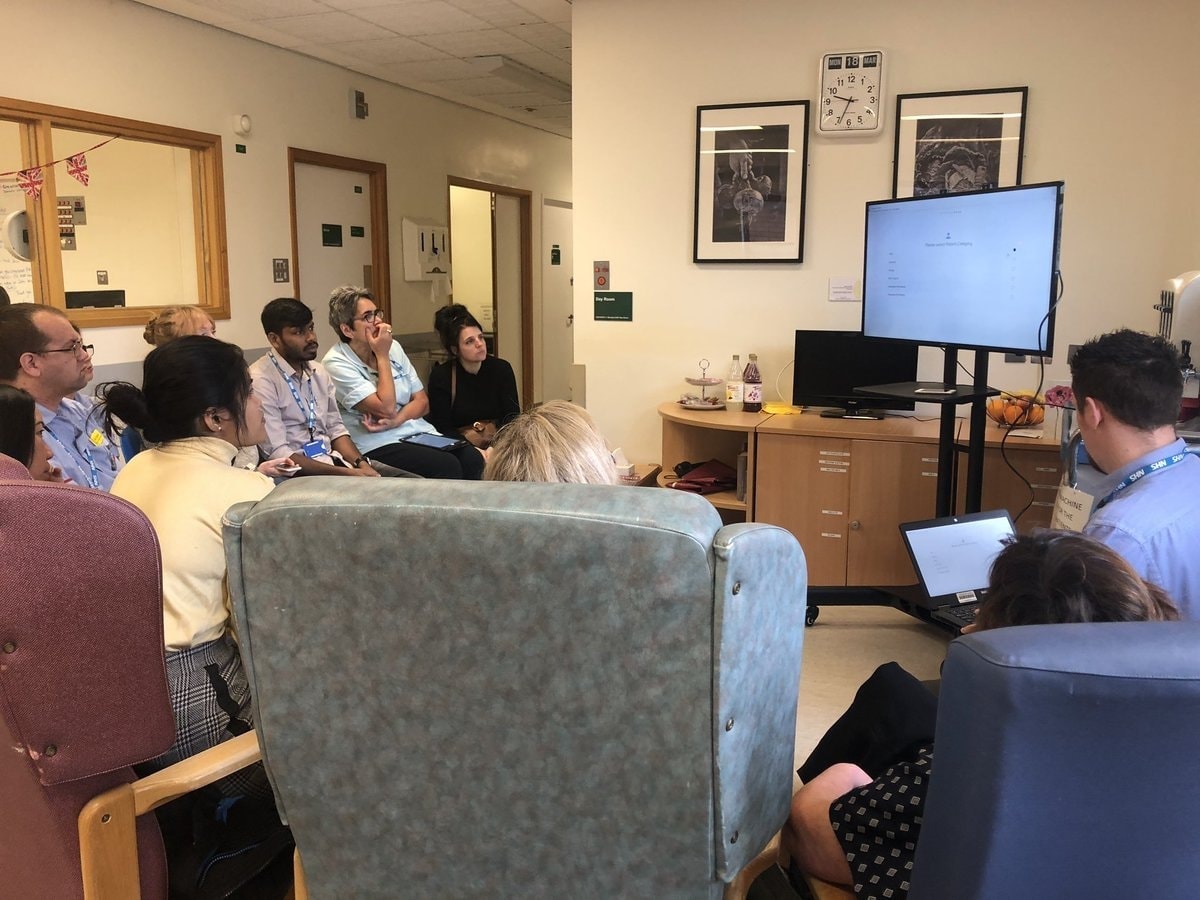
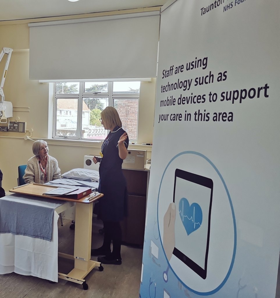
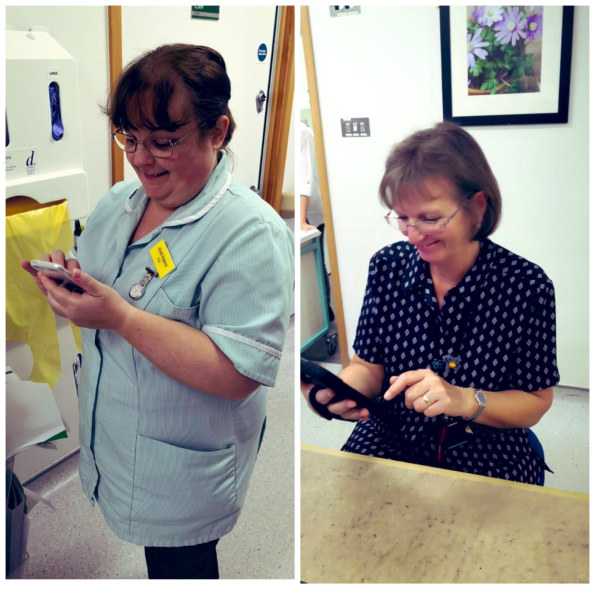
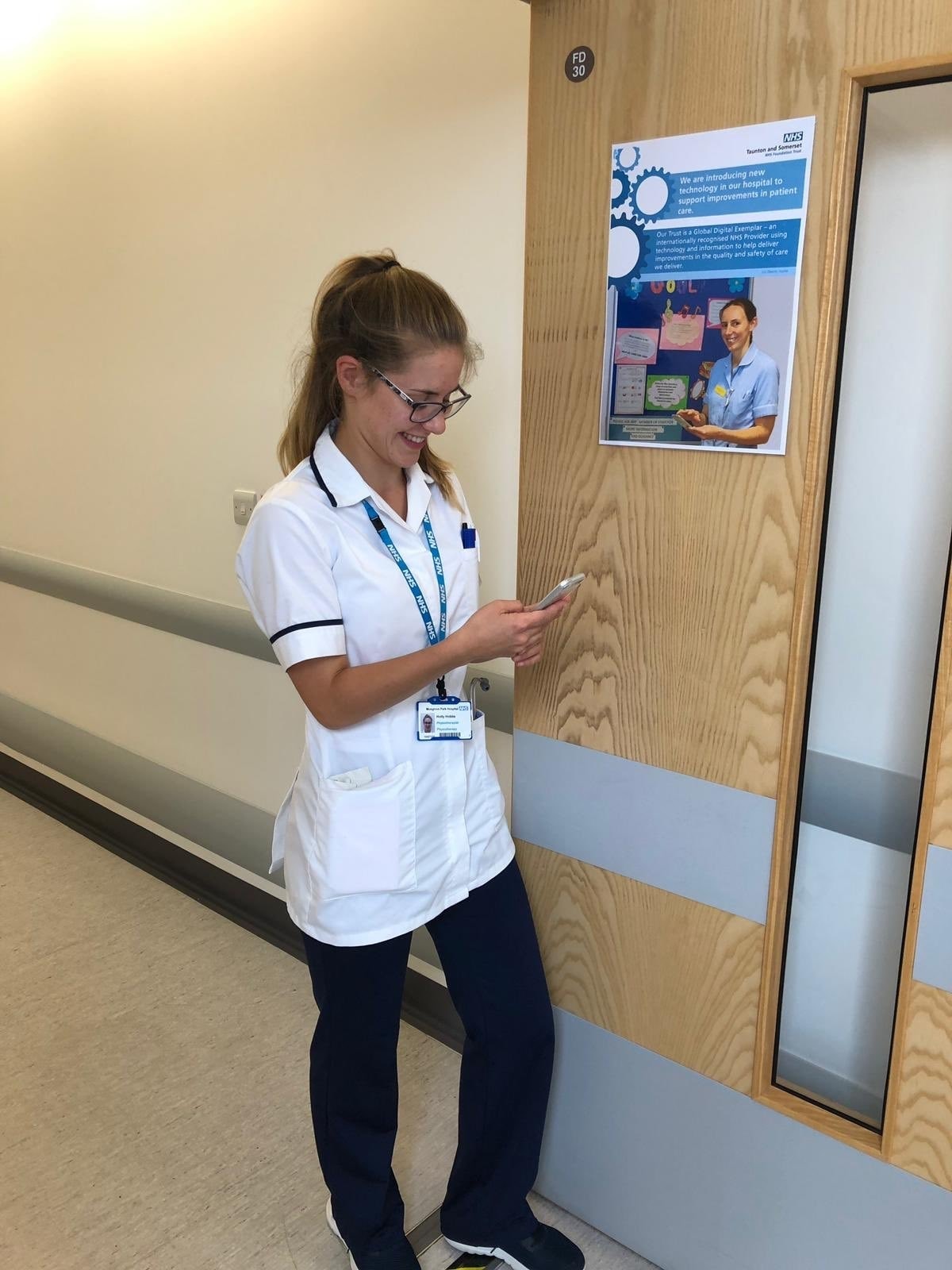
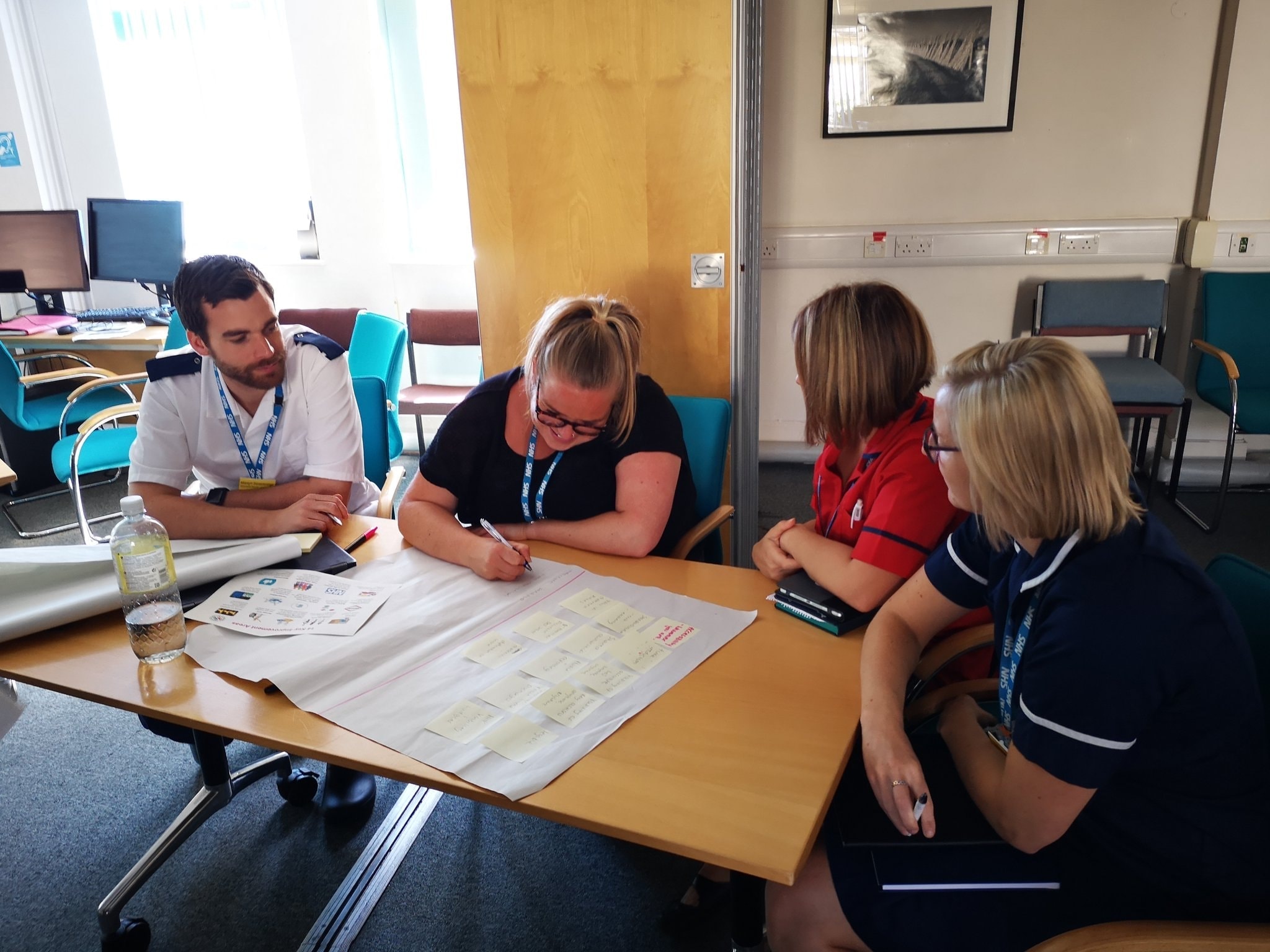
We work hand in hand with the UK’s National Health Service (NHS) Digital Team in Musgrove Park Hospital Hospital in Taunton, which is one of only a handful of hospitals in the UK to be accredited as a Global Digital Exemplar (GDE).The hospital is one of the largest in the UK and has over 700 beds, 15 surgical theatres and over 4000 staff members. The majority of the Product Team work in the UK office and visit the Digital Team in Musgrove Park several days a week.

My role was to lead the UX/UI Design. I was responsible for all designing, prototyping, ideation, testing and minor development.

Business Goals

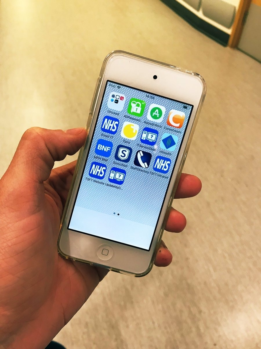
Increase revenue by launching a new mobile product and export existing features from MAXIMS Enterprise desktop PAS (Patient Administration Software) into suitable mobile solutions.

User Goals

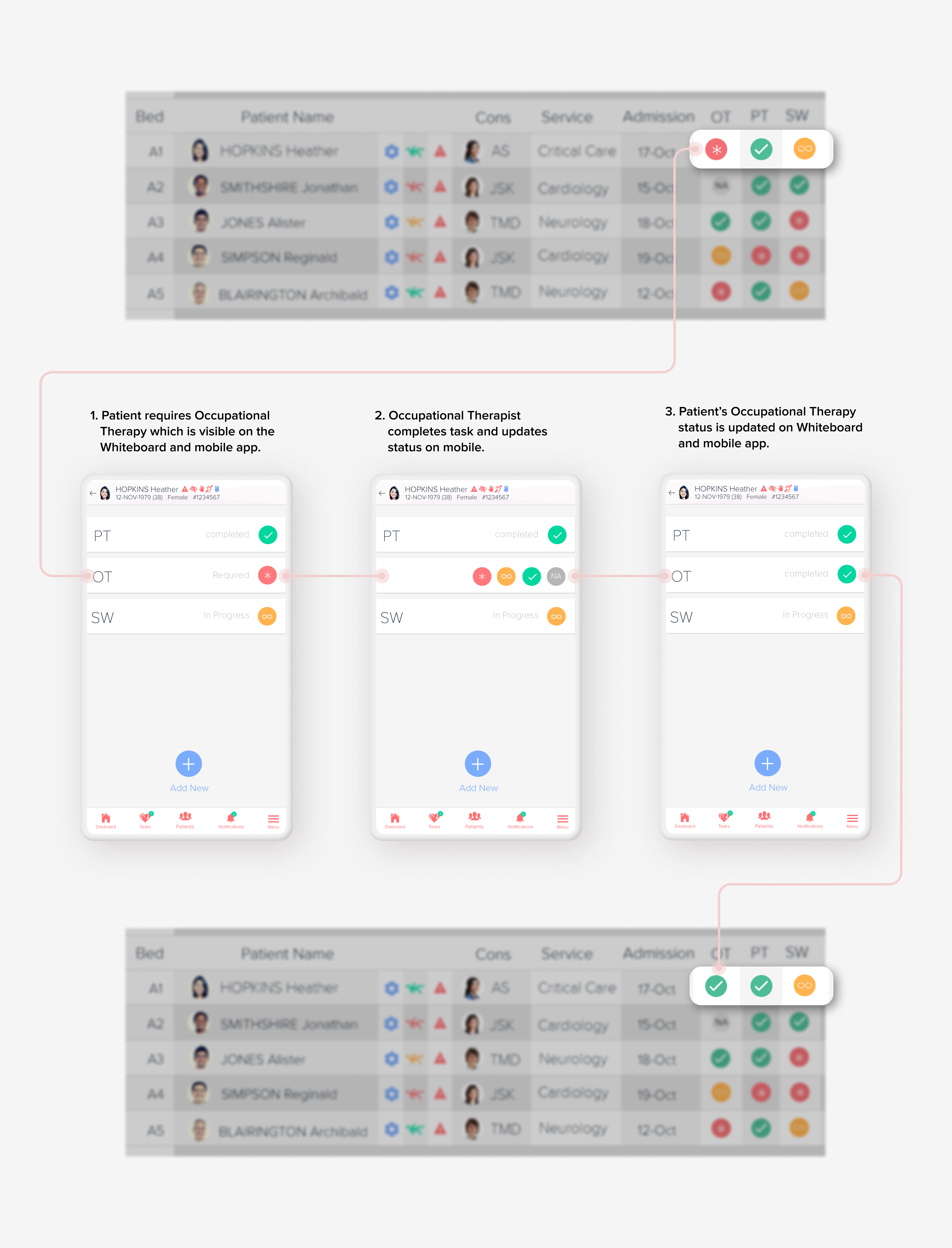
Easily find patient information on a digital whiteboard and admit, transfer and discharge patients on a mobile device.

Project Goals

Create a digital whiteboard and find solutions for supporting medical workflows via a mobile device.

Scope and restraints:

  • Limited access to the end users.
  • ISB 1500-1508: Common User Interface (CUI) guidelines which set information standards for use in health ITsystems
  • Had to rely on a lot of second-hand information.
  • No resources for proper testing.
  • Majority of the Product team work in another country.
  • Users in another country.
  • The clinical safety/testing process.
  • Restricted by some previous UX decisions on MAXIMS Desktop software.
  • Prohibited from conducting a UI review or UI sign-off of designs implemented by the developers.

User Demographics

The user demographics for the app is extremely broad as the users can vary from 20 to 65 years of age, they also have varying technical skill levels.

🥱TL;DR

Too Long; Didn't Read

This second design journey is even longer than the first one but converting highly complex hospital work flows to mobile device is not a simple task and the Digital Whiteboard application has a ton of functionality built into it.

For this product I was there from the initial stages and because I had proven the value of a design led approach, it went smoother than the Electronic Observations app. As before, we worked with one of the very few NHS digital exemplar hospitals in the UK and after nearly 2 years the app went live in two NHS Trusts. For the first time ever clinicians could have a complete overview of ward occupancy, admit, transfer, discharge and request patient specific reviews in real-time in the hospital ward, without having to fill out paper forms in the back office.

Before:

A photo of a physical Whiteboard in Coleridge ward in Musgrove Park Hospital, Taunton, UK.
Typical Whiteboard
A photo several physical Whiteboards from wards inMusgrove Park Hospital, Taunton, UK Taunton, UK.
A photo of several physical Whiteboards from wards in Musgrove Park Hospital, Taunton, UK Taunton, UK
The medical team developed their own analogue user interface for task management.

After:

Doctors and nurses on our wards are now using digital technology to make processes easier and more efficient. using iPads and iPods, staff can update patient information on the go, as well as transfer and discharge patients.
Patient Workshop
This is the book I'd fill out before the iPad, now it's all in my pocket.
❝ eWhiteboards make patient bed moves, discharge and transfer across the system a lot easier for nursing staff because they can do it by the patient bedside or whilst attending the MDT meeting. ❞
— Sam Cattermole
EPR Clinical Workstream Lead at Wye Valley
❝ I love the eWhiteboard, It's smart looking, bright, clean and easy to read. It's so much better than the old marker boards, which I could not go back to now. ❞
— Phyllis Okeefe
Ward Clerk (Acute) at Wye Valley
a picture of digital whiteboard in a hospital

Whiteboard

Problem

The hospital needed to transition from traditional analogue Whiteboards used throughout the wards.

Solution

Create a digital version that would help with patient discharge planning and update in real-time.

The traditional hospital whiteboard is used in wards as a type of patient journey management tool. Its goal is to display task information and task progress for individual patients. After a patient’s treatments are fully resolved, they can be safely discharged from the hospital or transferred to another ward.

At the start of each day, ward staff gather for a board round meeting to establish each individual patient plan. The white board displays the list of patients on the current ward, who their named consultant is, if they need need to be visited by the MDT (Multi-Disciplinary-Team), to establish their current treatments, if any, before discharge or transfer. It can also display other information such as consultant services, allergies, patient alerts, safe care level, key actions for discharge and estimated discharge date.

I was given photos of the whiteboard for a reference and I sketched out some ideas. They already had an analogue system in place so I wanted to digitally replicate all the functionality and retain the essence of the original whiteboard, this way it would still be familiar to the users. As the whiteboard would be dynamic and have the ability to update itself in real-time, I thought we could add some useful data insights such as charts in the right-hand sidebar. To combat the problem of some staff not being able to physically reach the top the areas of the touch screen, I theorised a height adjuster slider that would slide inaccessible rows down to the users level.

A photo of a physical Whiteboard in Coleridge ward in Musgrove Park Hospital, Taunton, UK.
A photo of a physical Whiteboard in Coleridge ward in Musgrove Park Hospital, Taunton, UK
All patient information has been censored.
A photo of a physical Whiteboard in Montecute ward in Musgrove Park Hospital, Taunton, UK
I thought it was extremely clever how they use colour-coded round magnets to show the task status.
A photo several physical Whiteboards from wards inMusgrove Park Hospital, Taunton, UK Taunton, UK.
A photo of several physical Whiteboards from wards in Musgrove Park Hospital, Taunton, UK Taunton, UK
The medical team developed their own analogue user interface for task management.
Wireframe sketch of Sketch of whiteboard
It had widgets, allergy warnings, and patient alerts on display in rows for individual patients.
Wireframe sketch of whiteboard
I added an adjustable height slider to the touch screen. This would allow users of all heights to interact with the rows that are out of arm's reach.
Detailed sketch of height adjuster menu
Detailed view for adjustable height slider and menu options that expand out once the menu is opened. I took some inspiration from the User Interface design of Westworld and Star Trek Discovery.
Sketch of whitboard animation steps for menu
Sketch of whiteboard animation steps for menu
Once the menu is opened, the user can slide down the content to their level.

The brief was for a giant touch screen whiteboard that could work on a huge display and scale down to a tablet. I decided the best way to approach the design was to build a coded prototype. The Whiteboard was unknown territory because the requirements were very specific about how many patients needed to be visible at one time and we did not know how the design would scale. I felt that using a static Photoshop or Illustrator design would not be the best way to experiment and test our options.

At the first round of testing, the prototype scaled up perfectly on the 80 inch TV in the office and gave us a great idea of what would be possible.

Following on from this I built a second more polished version, using the angular framework. This way we could have a database of fake information for demo purposes and the developers could add and test code for the touch menu. I made it more visual by adding medic and patient photos and experimented using icons, where suitable.

During development the whiteboard was extensively tested and trialled in the hospital, each ward is different and the back-end allows the columns to be configurable to suit the needs of the ward. This way each ward can have their own customised version.

Photo of the first Whiteboard prototype being tested on an 80 inch display
This was made with HTML & CSS.
Second photo of the first Whiteboard prototype being tested on an 80 inch display
Photo of the first Whiteboard prototype being tested on an 80 inch display
The initial rows displayed patient information, allergies, patient alerts and Medics associated with the patient.
Third photo of the first Whiteboard prototype being tested on an 80 inch display
Photo of the first Whiteboard prototype being tested on an 80 inch display
I used an SVG on the right hand sidebar to display some dashboard tiles.
Second photo of the second Whiteboard prototype being tested on an 80 inch display
Photo of the second Whiteboard prototype being tested on an 80 inch display
I added images and icons
Video of opening the menu a touch screen using the wizard of oz technique
Photo of a departure screen in the airport
While waiting in the airport I was struck how an airport departure screen had the same function as the whiteboard, the only difference is, we discharge patients and they discharge planes.
Wireframe sketch depicting new features based the airport departures screen
Wireframe sketch depicting new features based on the airport departures screen
I thought that once a patient had reached all their conditions for discharge, they would move to the top of the list and the row would animate green to indicate they were ready to leave. Unfortunately the product team did not want the idea expanded upon.

After we nailed down the rows columns, more requirements were requested. The users wanted a way to to sort and change the view of the patients listed on the whiteboard. They needed the ability to refine the list by Hospital, Ward, Service and Consultant, and a way to see what patients are ready for transfer or discharge. The whiteboard also contains sensitive data such as patient name, patient alerts etc., so we needed a way to make the information private if the whiteboard was in a public place that could be viewed by the general public.

I sketched out some ideas that had a menu expand out, after being activated from a floating action button on the bottom of the whiteboard. In that menu I had the filtering options and made some quick filter buttons so the medics could instantly sort by predefined parameters, such as ready for transfer or discharge. For the privacy option, I added a button that would hide all the sensitive information on the patient.

I made an InVision prototype and demonstrated the ideas to the product team. They liked the concept of quick filters and the privacy options but did not like position of the floating action button, as it would obscure some information on the whiteboard. I offered to lower the opacity of the button to make it more transparent and to allow the list patients scroll above the button, so they would not be obscured.

I then decided to move the filter menu to the sidebar area that already contained the widgets. I made another prototype that contained the filter menu button and privacy button, below the widgets on the sidebar. This allowed the filter menu to slide over the widgets instead and no patient information would be obscured. Product approved and we went with this option.

Wireframe sketch of filters
Screenshot of Invision prototype demonstrating the floating menu
High-fidelity design of the floating menu and filters
It had a floating button that would animate the filter menu into view when activated but it obscured the patients.
Screenshot of Invision prototype demonstrating the floating menu
High-fidelity design of the sidebar menu and filters
The sidebar filter slides out to cover the space that was occupied by the widgets and leaves the patients visible.

back

 to back

*

Screen recording of Invision prototype demonstrating the sidebar menu in high-fidelity
Screen recording of Invision prototype demonstrating the floating menu in high-fidelity

* I "borrowed" this graphic genius from Drake...

Final

Pro-duct

The product team sent the prototype to the hospital, they were very happy with the designs and the whiteboard went into full development. However, it was realised that the hospital could not afford to buy touchscreen TVs or monitors for every ward, as they can cost up to €70,000. The IT department in the hospital came up with a clever low cost solution. Using a Raspberry Pi and standard flat screen TV, they were able to have a similar experience for about €500-€600. This was a great solution based on the financial constraints of working in the healthcare sector, but it meant that the touch screen height adjuster was not pursued, as the touch screen interactions were removed.

Screen recording of final release demonstrating the whiteboard, sidebar filters, and privacy mode after development was completed
Digital nurses who help implement digital transformation
A big thank you to all our digital nurses who help implement digital transformation across the hospital on #internationalnursesweek #internationalnursesday and #somersetday #thankanurse
Digital nurses who help implement digital transformation
Test of the raspberry pi up on Triscombe ward
Test of the raspberry pi up on Triscombe ward, looking good!
a picture of digital whiteboard in a hospital

Data Insights

Problem

I felt there was extra information that we could visualise to help the users find actionable insights.

Solution

We added doughnut charts that surfaced information, based on all the patients in the ward.

From my discussions with staff, I learned that one of the biggest problem areas on hospitals wards, is bed management. Often there a problem with the visibility of how many beds are free and incoming or outgoing patients from those beds. The end result is there are empty beds that are left on the ward by accident, while patients are stuck elsewhere without a bed to go to. I thought if we had a bed map visible on the whiteboard sidebar, it could help ease that confusion.

I spent some time researching Airline, Cinema, Train apps and websites, as they all utilise seating maps. I sketched out and mocked up some quick prototypes in Illustrator and experimented with various seat maps that displayed the occupied and free beds with a bed status colour. There were also other chart concepts depicting predicted and actual patients to the ward, transfers, patient alerts and safe care level.

After feedback from the hospital, I refined these ideas and designed hi-fidelity versions showing bed status, ward floor plan, total of incoming and outgoing patients to the ward, alerts and allergy totals and safe care doughnut charts.

Screenshot of collage of seat pickers from Aer lingus, Ryanair, Uplabs and other sources
Screenshot of collage of seat pickers from Aer lingus, Ryanair from Uplabs and other sources
I like to take screenshots of user interfaces and make a collage or mood board while I am researching.
Wireframe sketch of doughnut chart for bed status
This pie chart widget would show total bed occupancy in the hospital.
>Wireframe sketch of sidebar charts
Wireframe sketch of sidebar charts
I have always been a fan of the D3.js library and thought integrating it into the whiteboard would be useful.
Wireframe sketch of sidebar bed map and information
Insights that could display incoming and outgoing patients to the ward.
Wireframe sketch of sidebar charts depicting safe care and bed occupancy prediction
Adobe Illustrator widget designs with the chosen design on the right
Medium-fidelity and High-fidelity designs for sidebar insights
The hospital decided to have the bed count total display in circle with a border that would change between red amber and green (the last design on the right). I felt this could be confusing for users as it looked very similar to the three doughnut charts beneath it but did not function in the same way.

Final

Pro-duct

The hospital decided to go with doughnut charts that would display counts for Physiotherapy, Occupational Therapy and Safe Care level. So, for example, the Physiotherapy chart would display the total number of patients that require, have completed or have ongoing physiotherapy requirements before they are ready to discharge.

They also decided to have a more slimmed down bed management widget that displayed the totals of incoming patients, outgoing patients and free beds and give a final bed count total with a doughnut chart that changed colour on RAG status.

Screen recording of final release demonstrating sidebar charts after development was completed
a picture of hospital beds

Patient Transfer

Problem

The medics need a way transfer patients to other areas of the hospital, that would use a mobile version of the existing MAXIMS Enterprise transfer solution.

Solution

Used progressive disclosure to simplify the flow and efficiency for mobile.

Patients need to be transferred to different clinical services and wards. The MAXIMS enterprise solution has the ability to perform this functionality on desktop. I was was tasked with turning this workflow into a mobile solution.

In MAXIMS Enterprise a transfer is completed by selecting eight different drop-down menus with a final submit button. I did not wish to repeat this experience on mobile but was required to keep all the options because of clinical safety.

Looking at the flow, I thought would be a perfect use-case for progressive disclosure and I knew it worked well in the Blood Pressure section in the eOBS app. This time there was no need for me to build a coded prototype as I had gotten approval for this design pattern and the Hospital and Product Team were on board.

I made different prototypes with Illustrator and InVision that covered the flow for every type of transfer. Each prototype separated the MAXIMS Enterprise options into individual screens that would slide to a new screen when the current option was chosen.

As there were so many options, I added a transfer summary on the final screen before they submitted the transfer. This showed all options that had been selected and allowed the users check for an error.

Screenshot of Maxims Enterprise Patient Transfer
Screenshot of Maxims Enterprise patient transfer
How a patient transfer is completed in the current MAXIMS Enterprise desktop software. Yes it only works on Internet Explorer 11...
Screenshot of Maxims Enterprise Bed Swap
Screenshot of Maxims Enterprise bed swap
How to swap two different patient beds in the current MAXIMS Enterprise desktop software.
Wireframe sketch of patient transfer flow
By using progressive disclosure I was able to breakdown the process of changing HCP (Health Care Professional) step by step
Wireframe sketch of changing service or consultant flowt
Wireframe sketch of changing service or consultant flow
Sketches of icons
Sketches of icons
Task flow for transfer of HCP and Service
High-fidelity design for transfer of HCP and service flow
Screen recording of Invision prototype demonstrating changing service or consultant in high-fidelity
Screen recording of Invision prototype demonstrating changing named nurse in high-fidelity
Whiteboard trainig
E-whiteboards, coming to a ward near you soon. Our colleagues on Barrington ward are being trained by Karin on what this new software will bring in the coming months, improving patient flow through the hospital and making information available 'on the go

Final

Pro-duct

Product sent the prototypes to the hospital for testing and everything was approved. Now for the first time staff could transfer patients in real-time directly on the hospital floor with their device, instead of queuing up to use the computer in the back office.

Before:

Screenshot of Maxims Enterprise Patient Transfer

After:

Screen recording of final release demonstrating transferring a patient after development was completed
Patient Workshop
We've started our patient scenario, after the sister explains she is using an iPod to transfer the patient over the ward, the first question is: now you've transferred me, if my friends and family ring will you know where I am? Yes, this app means info can be updated quicker.
a picture of nurses in office

Specialist Review

Problem

The medics needed a way to request patient care from different clinical specialists and mark the status of the review.

Solution

Digitised the “magnets system” the medics originally used on the physical whiteboard, by integrating the RAG system with a swipeable list item.

Before a patient can be discharged from hospital, they may be visited and approved by Clinical Specialist or various Multidisciplinary Team (MDT) members. For example a patient may need Physiotherapy, Occupational Therapy and be seen by an Orthopaedic Specialist. After this work has been carried out, they can be discharged home or transferred to another ward.

On the physical whiteboard, the medics had a system that worked well, using magnets to display if the task was in progress. I emulated that system so it would be familiar to all the staff that used the app. I used coloured circles with icons added for accessibility that mimicked the magnets. These digital magnet tasks had the status points of: Required (Red), In Progress (Amber), Completed (Green) and finally Not Required (Grey).

The Ionic framework already had a swipeable list item component, that was the perfect solution and could be easily modified for the purpose with minimum development. I made some prototypes in InVision that allowed the user to select the status of the tasks and search for a clinical specialist and request a review.

A photo of Magnets on a physical Whiteboard
Photo of magnets on a physical Whiteboard
A second photo of Magnets on a physical Whiteboard
Photo of magnets on a physical Whiteboard
Wireframe sketch of inputting MDT tasks
Wireframe sketch of adding Specialist Review and MDT Review
Wireframe sketch of adding specialist review and MDT review
>Wireframe sketch of inputting MDT tasks
Wireframe sketch of inputting MDT tasks
Occupational Therapy task completed flow and corresponding affects on the Whiteboard
Add Specialist Review flow
Screen recording of Invision prototype demonstrating completing a MDT task in high-fidelity
Screen recording of Invision prototype demonstrating requesting a specialist review in high-fidelity

Final

Pro-duct

Product sent the prototypes to the hospital for testing and with minimal changes everything was approved and developed.

Screen recording of final release demonstrating changing MDT tasks after development was completed
Screen recording of final release demonstrating adding specialist review after development was completed
Patient Workshop
Helen, nurse, "We've gone digital so we are tapping away on these iPods, we used to have a whiteboards with a marker pen but we have these big TV screens now so all the staff can see info as I update it" she asks questions and requests on the app for an occupational therapist
Patient Workshop
Martyn, playing an occupational therapist visits Wendy, as was requested by Helen, nurse, in an app. He looks at Wendy's physical needs and how she would cope at home. He explains the different pathways to help get Wendy home and best choice, then updates this decision on the iPad
a picture of a wheelchair

Patient Alerts

Problem

The medics needed a way to add warning alert icons to the whiteboard via a mobile device.

Solution

Created different indicators to display on the whiteboard and a slider gauge for mobile input.

The whiteboard has the option to display various patient alerts, these are indicators for staff to show them if a patient needs special requirements or extra staff members. For example some patients can be at risk of falling, this can be a common problem with elderly or frail patients. The NHS has a fall injury risk assessment, to identify falls history, risk factors for falling and for injury.

There can be patients that come into hospital with an undiagnosed neurodegenerative condition such as dementia or Alzheimer's Disease. These patients need special attention. It can cause problems if they are transferred to an unsuitable ward containing other patients. The Medics decided to add a new patient alert that could be assigned to patients called Potential Cognitive Impairment.

Safe care levels needed be integrated to whiteboard and sidebar charts. The NHS has a tool to assign a specific number of staff required per patient based on their condition. This allows for planning of staffing levels on the ward. The Safe Care level values are as follows:

  • 0 - Patient requires hospitalisation needs met by provision of normal ward cares.
  • 1(a) - Acutely ill patients requiring intervention or those who are unstable with a greater potential to deteriorate.
  • 1(b) - Patients who are in a stable condition but are dependant on nursing care to meet most or all of the activities of daily living.
  • 2 - May be managed within clearly identified, designated beds, resources with the required expertise and staffing level or may require transfer to a dedicated Level 2 facility / unit.

I wanted to design something intuitive and easy to use that also emphasised the level of risk for Falls Risk and Safe Care. I researched different types of gauge sliding interfaces on digital and physical devices. I sketched some ideas and I looked at the possibility of having a circular dial to allow the medics to turn the dial to the selected chosen level, however I decided to go with a linear slider in a horizontal position.

For Cognitive impairment we devised an icon that would be recognisable to user, yet sensitive to the state of mind of the patient. Then I simply made a single screen with a massive toggle button that was really easy to activate with your thumb. The icon is grey and changes to blue when activated and an optional comment field appears. This is if the medic wants to leave a note as to why they believe the patient has a potential cognitive impairment. On the toggle button I added the text On/Off to reinforce the status of the current state.

Screenshot of Linear Fader in Westworld
I like to keep an eye on futuristic TV and Film such as Westworld for inspiration and document their UI.
Second screenshot of Linear Fader in Westworld
Screenshot of Linear Fader in Westworld
I like when real-world devices like knobs dials etc., are mimicked on devices. I feel the user relates to them more and it adds gravity to their interaction.
Wireframe sketch of a linear fader slider
The gauge of the Linear Fader could be broken into segments from one to ten.
Wireframe sketch of a level slider
This would have a visual level indicator that would increase or decrease upon the users interaction with the slider below.
Wireframe sketch of safe care input
Wireframe sketch of falls risk input
Wireframe sketch of cognitive impairment input
High-fidelity designs for alerts flow
Screen recording of Invision prototype demonstrating the falls risk input in high-fidelity
Screen recording of Invision prototype demonstrating the cognitive impairment input in high-fidelity
Screen recording of Invision prototype demonstrating the safe care input in high-fidelity

Final

Pro-duct

Product sent the prototypes to the hospital for testing and everything was approved. Everybody has a little giggle when adding the falls risk and it is a popular feature of the app. While I am not the biggest fan of the term design for delight (because I think it sounds cheesy), I do think we hit the mark on this micro-interaction.

The integration of the safe care level into the sidebar charts meant that ward mangers could get an instant overview of the levels of staff needed for the whole ward and plan accordingly.

Screen recording of final release demonstrating falls risk after development was completed
Jack animated the icon, I thought it was a brilliant addition.
Screen recording of final release demonstrating cognitive impairment after development was completed
Screen recording of final release demonstrating safe care after development was completed
Chris from the Dementia Triscombe Ward
Chris from the Dementia Team has been on Triscombe Ward today reviewing the eWhiteboards and feeding back to @musgrovedigital team on how the app can be used to support his way of working. #DigitalTransformation
a picture of a hot air ballon soaring in the sky

Patient Discharge

Problem

The medics need a way discharge patients from the hospital, that would use a mobile version of the existing MAXIMS Enterprise discharge solution.

Solution

Used progressive disclosure to simplify the flow and efficiency for mobile.

When a patient has completed all their actions for discharge and approved by the medical staff, they can leave the hospital. Much like the Patient Transfer, the Patient Discharge was already a feature in MAXIMS Enterprise and once again I was tasked with turning this desktop workflow into a mobile solution.

To complete this goal in MAXIMS Enterprise, the user selects options from four drop-down menus and has an optional radio button for an option to allocate the vacated bed for cleaning once the patient is discharged. If a patient dies it also counts as a discharge and there are extra options for the user to fill out.

As with the Patient Transfer I used progressive to breakdown each step and made prototypes with Adobe XD. I changed the "allocate for cleaning" radio button into large toggle button (the same type that we used for Potential Cognitive impairment).

Screenshot of Maxims Enterprise Patient Discharge
How a patient discharge is completed in the current MAXIMS Enterprise software.
Wireframe sketch of patient discharge steps
Medium-fidelity designs for discharge flow with selection as deceased
Fun Fact: If you die in hospital it still counts as being discharged as the bed will be free afterwords.
Screen recording of Adobe XD prototype demonstrating discharging a patient in medium-fidelity

Final

Pro-duct

The hospital approved and we went with the “Steps Wizard” as dubbed by the Engineering Team. This now a standard solution that we apply when converting many of the lMAXIMS Enterprise modules to mobile. Over time the Engineering team made a Steps Wizard component which could be reused with minimal development.

Before:

Screenshot of Maxims Enterprise Patient Discharge
How a patient discharge is completed in the current MAXIMS Enterprise software.

After:

Screen recording of final release demonstrating discharging a patient after development was completed
Patient Workshop
If I need my home adapted before I go, how will it show on the system if it delays my discharge?" You will have a estimated discharge date and it will flag up on the system if this is not met, he can also add notes about why it was not met, keeping everyone informed.

Outcomes

Digital Whiteboard goes live  🥳

Finally on June 10th 2019 Barrington and Triscombe Wards, After years of hard work from the entire team, the Whiteboard project finished development and passed all rounds of clinical testing and piloting in Musgrove Park Hospital. After the Whiteboards went live, they rapidly spread from two to twenty wards. This led to full staff training.

This is the first enterprise level mobile solution launched by IMS MAXIMS and its first new marketable product created in eleven years.

Subsequently, in late November, another group of hospitals, Wye Valley Trust, went live with the whiteboards.

Fielding Ward going live today with electronic whiteboards ❤️ #enhancedpatientcare #patientsafety #patientsfirst
*I think they like it...
first-wb-trisombe-blank
Exciting times for our eWhiteboards Project. We have our first eWhiteboard installed on Triscombe ready for the team to begin in February. @musgrovedigital @MusgrovePark big thanks to Triscombe Ward for being so supportive. @KatiePa20160077
Whiteboard is live
E-Whiteboards have come to Barrington Ward! Thank you to the @musgrovedigital @bbright1982 @strawbridge41 for all of your support today!
 New technolgy poster
Over 630 colleagues across our hospital have now been trained in new technology which sees them using iPods and iPads
Doctors and nurses on our wards are now using digital technology to make processes easier and more efficient. using iPads and iPods, staff can update patient information on the go, as well as transfer and discharge patients.
Team meetings ewhiteboards
Team meetings complete whole team involved in our new ewhiteboards coming soon! Great for the staff to have time to tinker with the system! Thanks @musgrovedigital for supporting our meetings. Also time to catch up, reflect and share experiences #takingtimeforstaff #wellbeing
Patient Workshop
E-whiteboards begin on Monday on two pilot wards at Musgrove, Triscombe and Barrington. You may see staff with iPods. The digital team will be on the ward supporting clinical colleagues and tweeting all week how the new technology is received by colleagues, patients and visitors.
whiteboard user training
Today training has began on the eWhiteboard project on our validation wards Barrington and Triscombe. Really exciting times ahead and as always a massive thank you to our supportive staff. #oneteam #digitalteam #mHealth @musgrovedigital
Barrington Wards live e-Whiteboard
Here is Digital Nurse Ben and Surgical Matron Caroline reviewing Barrington Wards live e-Whiteboard. This enables our senior care team to view a live bed state on the go.
Whiteboard is live
Ben has been showing David, Director of Strategic Development the new eWhiteboards and talking through the benefits of the discharge and transfer functionality within the app.
 Kirsti, HCA and Jakki, receptionist from Triscombe Ward using the app to update patient movement
Day 5 of our e-Whiteboard project and what an exciting week it has been! Here is Kirsti, HCA and Jakki, receptionist from Triscombe Ward using the app to update patient movement/ information in real time. Thanks to everyone for the ongoing support. #DigitalTransformation
Whiteboard is live
AHP’s have played a pivotal role this week in the success of eWhiteboards on both Barrington and Triscombe Wards. Here is Holly, Physiotherapist utilising the mHealth app to support patient care. #DigitalTransformation #MDT
 It was great to see the initial benefits that e-whiteboards is delivering on the first pilot ward
This week we held an improvement session with our close colleagues in @musgrovedigital. It was great to see the initial benefits that e-whiteboards is delivering on the first pilot ward and get a range of front line colleagues involved #digitalhealth #gde
 New technolgy poster
Have you seen our new poster boards around Musgrove Park Hospital? See if you can spot all 9 colleagues from a variety of roles using technology as part of their role. #digitalhealth #gde #globaldigitalexemplar
❝ eWhiteboards make patient bed moves, discharge and transfer across the system a lot easier for nursing staff because they can do it by the patient bedside or whilst attending the MDT meeting. ❞
— Sam Cattermole
EPR Clinical Workstream Lead at Wye Valley
❝ Using MAXIMS Enterprise, managers site teams and discharge staff hat the ability to remotely view all patients on all adult wards — what eWhiteboards can do is link this to discharge actions, red to green status and transfers waiting, all with the same view. ❞
— Sam Cattermole
EPR Clinical Workstream Lead at Wye Valley
❝ Digitisation of whiteboards allows a mix of standard information available for visitors and remote view, but still allows flexibility specific for ward commination requirements. ❞
— Sam Cattermole
EPR Clinical Workstream Lead at Wye Valley
❝ I love the eWhiteboard, It's smart looking, bright, clean and easy to read. It's so much better than the old marker boards, which I could not go back to now. ❞
— Phyllis Okeefe
Ward Clerk (Acute) at Wye Valley
❝ eWhiteboards make patient bed moves, discharge and transfer across the system much easier for nursing staff. ❞
— Sam Cattermole
EPR Clinical Workstream Lead at Wye Valley

Reflections

While the final product does not quite achieve the visual polish of my designs, the functionality and user experience works very well, as proven by the fact that it is a successful product for IMS Maxims and the Electronic Whiteboard is now seen as invaluable in multiple high-end hospitals.

This project was the undoubtedly the highest point of my time in IMS, if not my entire career thus far. From seeing the ideas I sketched down in my notebook in the first meeting progress into a finished product to be used on the wards in some of the largest and digitally advanced hospitals in the UK, was incredibly satisfying to me.

Patient Workshop
This is the book I'd fill out before the iPad, now it's all in my pocket.
*Best feedback I could ever get. Job done.

Electronic Observations

A medical app designed for clinicians to monitor vital signs and calculate national early warning scores at the patients bedside.

Go to Case Study

Surgical
Noting

This concept prototype allows surgeons to take medical notes with an Apple pencil on an iPad.

Go to Case Study