Brief
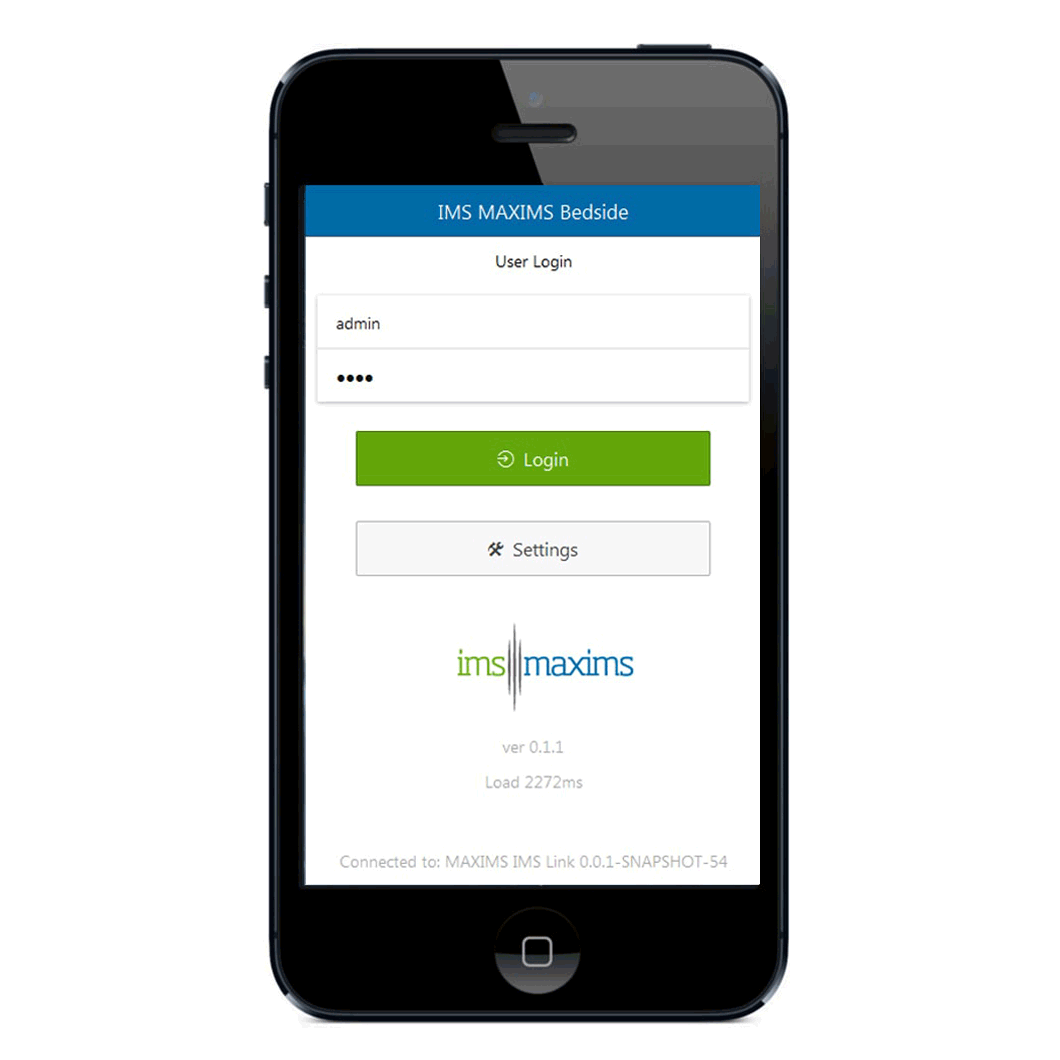
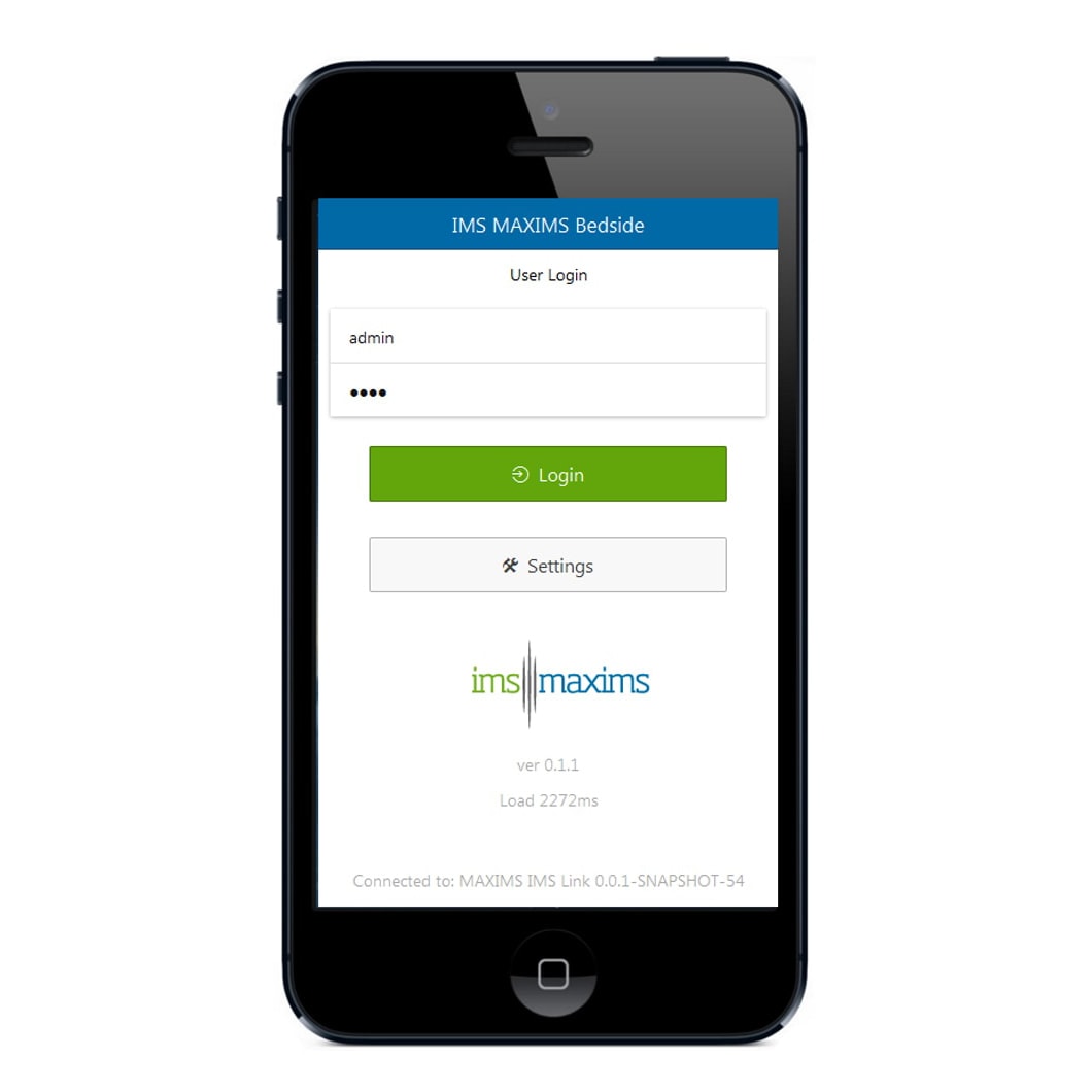
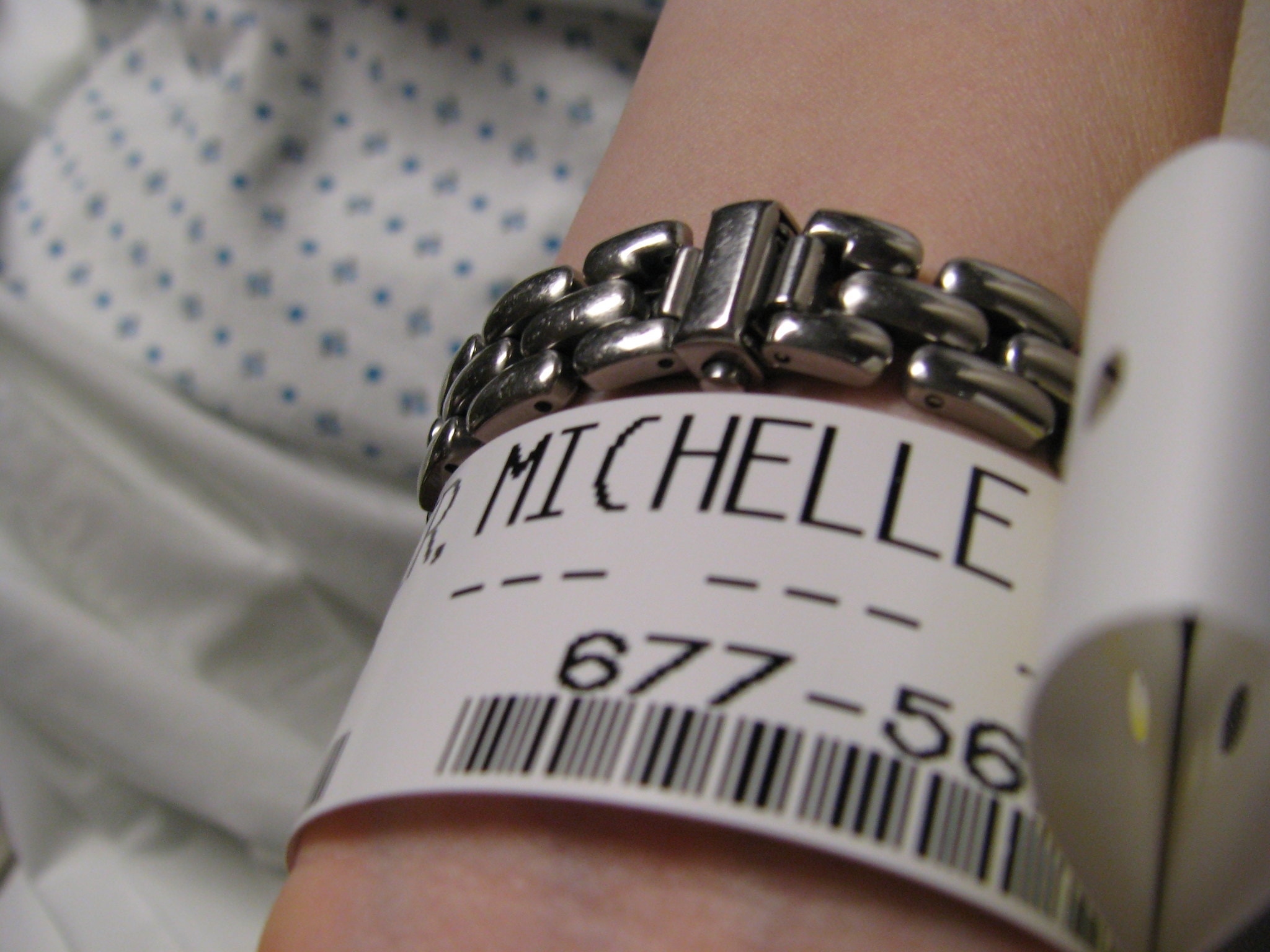
EObs is a medical mobile app that facilitates medic workflows in real-time, at the patient's bedside. Its aim is to reduce reliance on paper-based workflows by transitioning to digital solutions, thus allowing more time for patient care. In simple terms the medic records a patient's physiological observations and the app generates a warning score if the patient is in danger. The app integrates with the MAXIMS Enterprise desktop solution.
The app was already in production for a year however, there was no Design Thinking or User Experience work applied to it. End-users found it confusing to use and it had the potential to cause clinical risk and lead to serious and potentially deadly implications if information was misconstrued or recorded incorrectly.
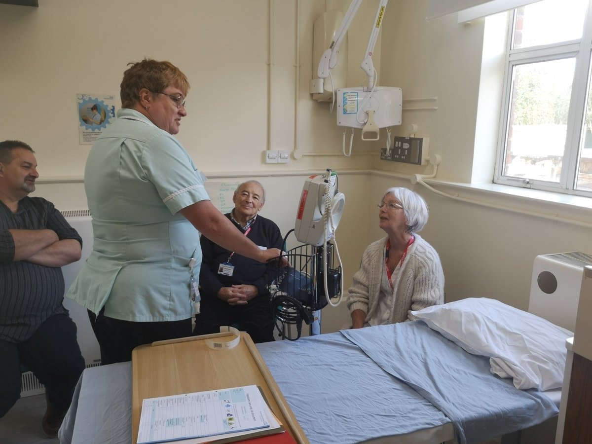
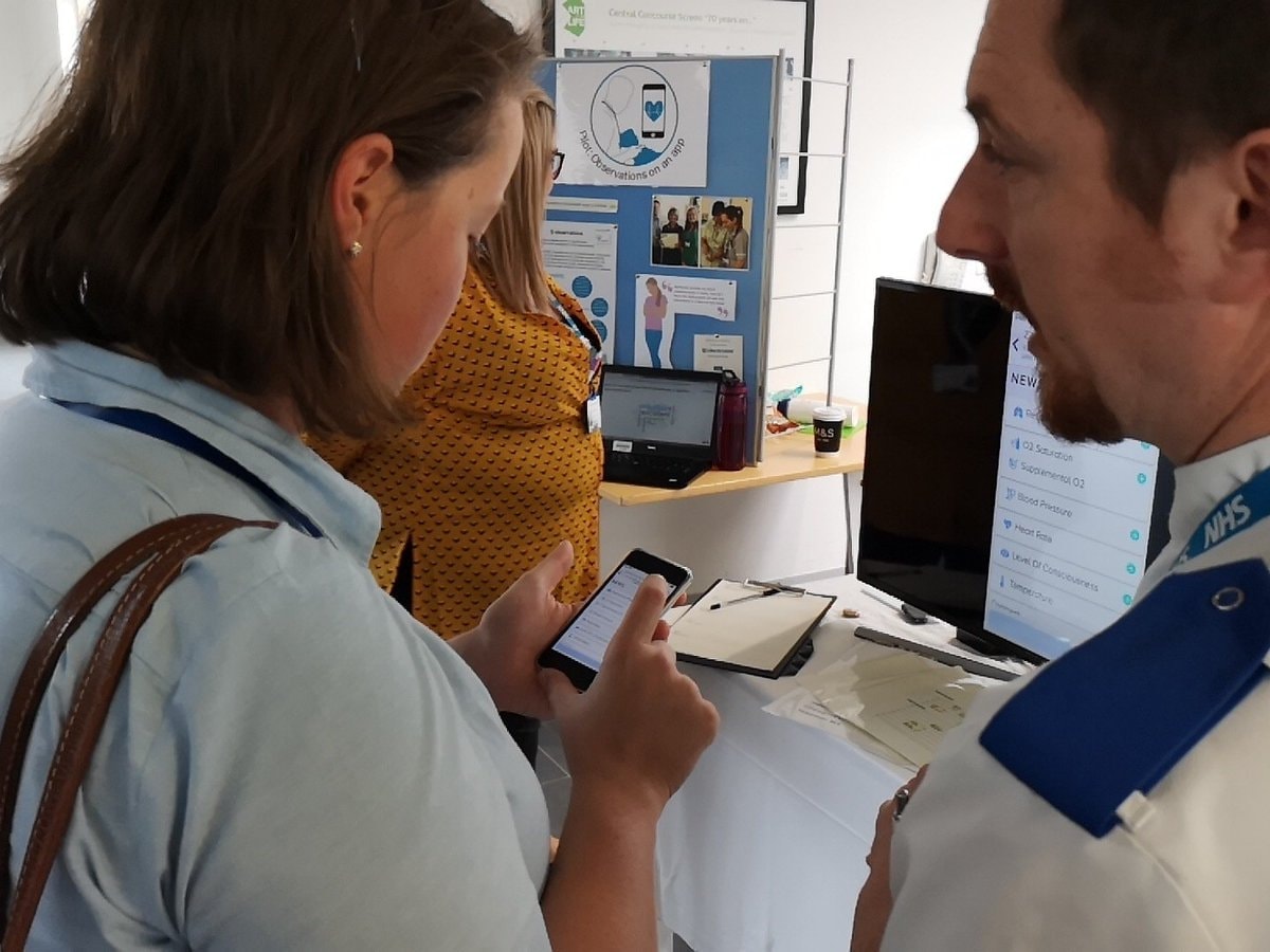
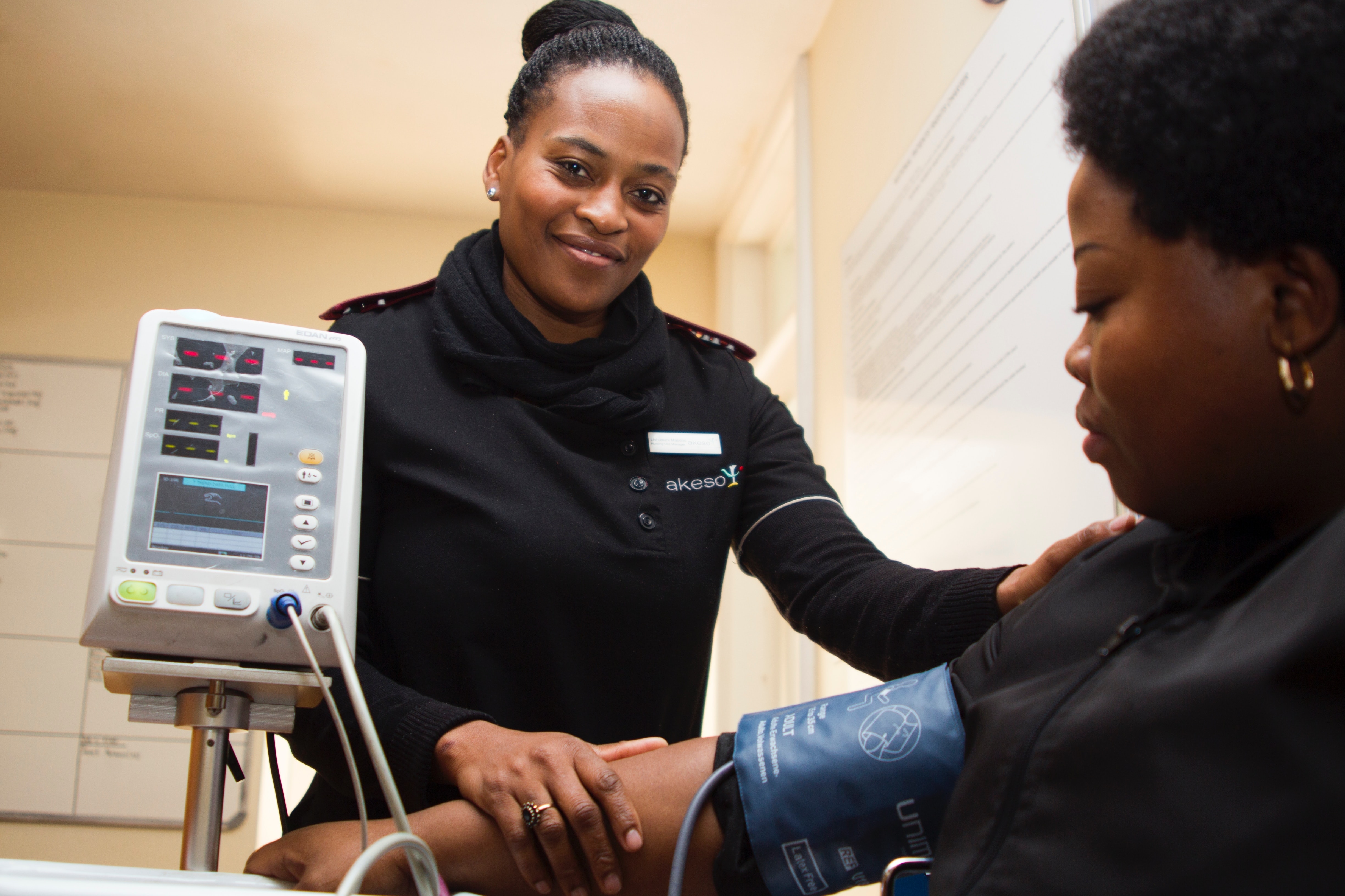
We worked hand in hand with the UK's National Health Service (NHS) Digital Team in Musgrove Park Hospital in Taunton which is one of only a handful of hospitals in the UK to be accredited as a Global Digital Exemplar (GDE). The hospital is one of the largest in the UK and has over 700 beds, 15 surgical theatres and about 4000 staff members. The majority of the Product Team work in the UK office and visit the Digital Team in Musgrove Park several days a week.
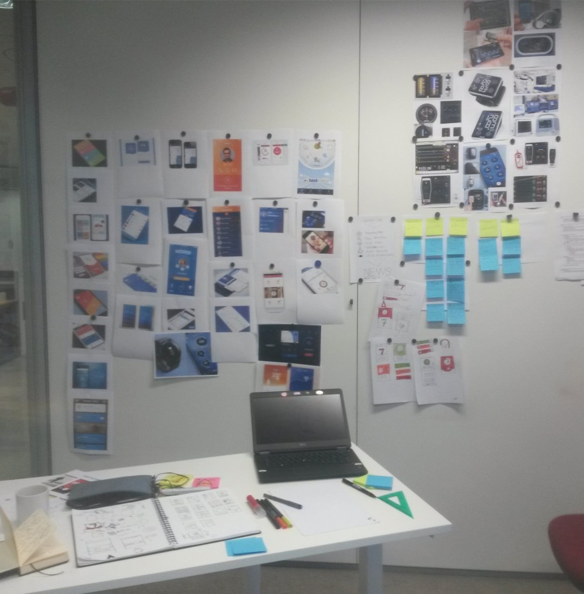
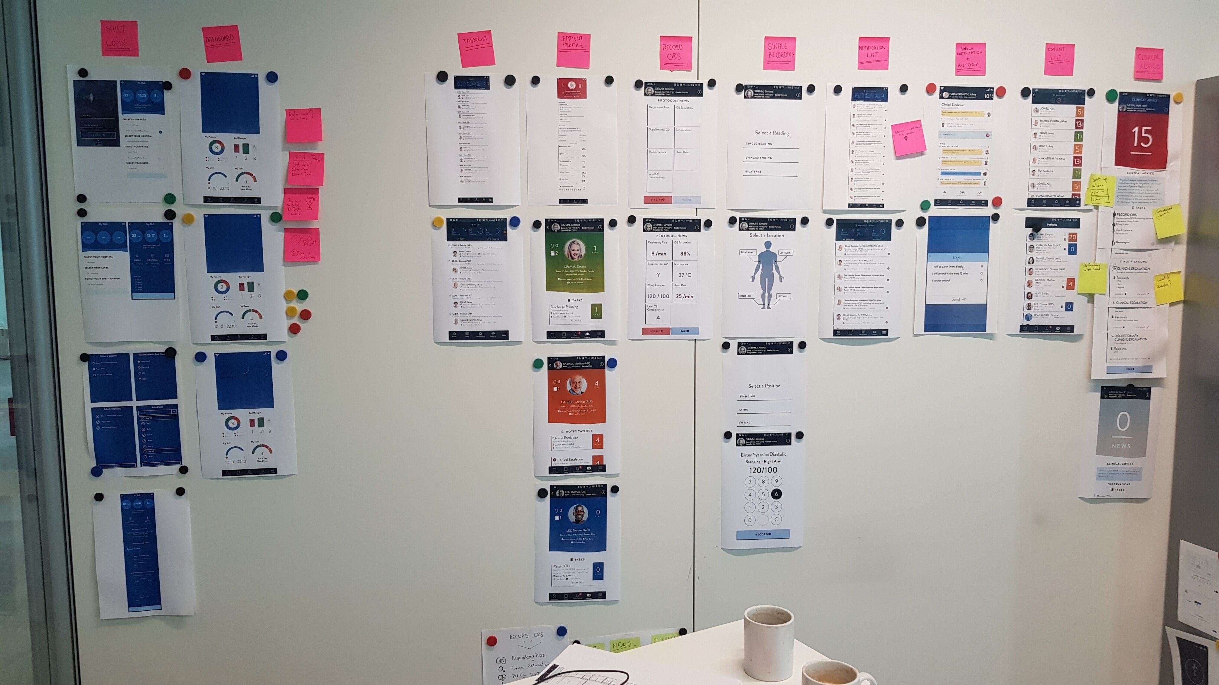
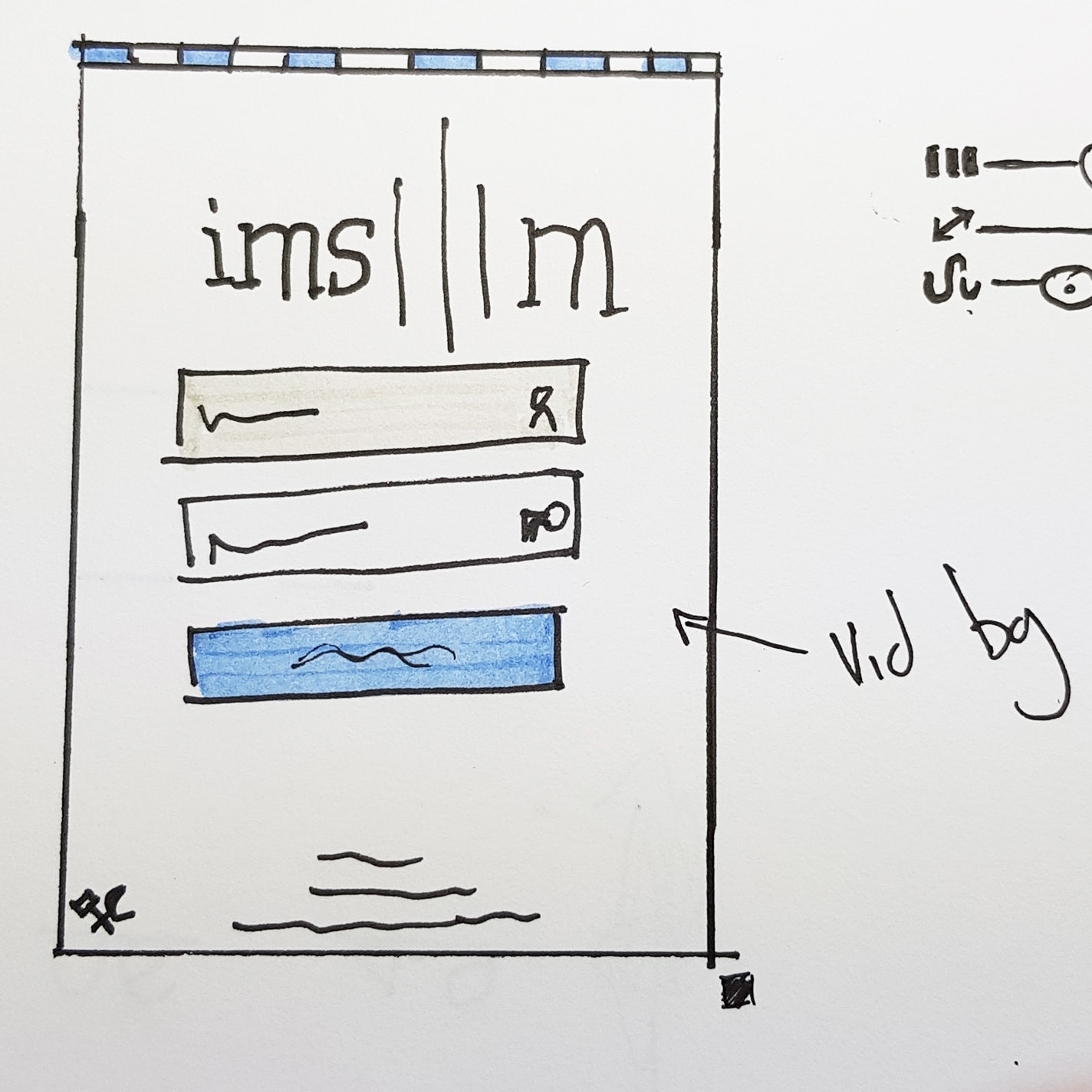
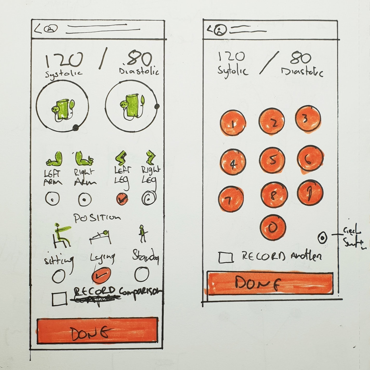
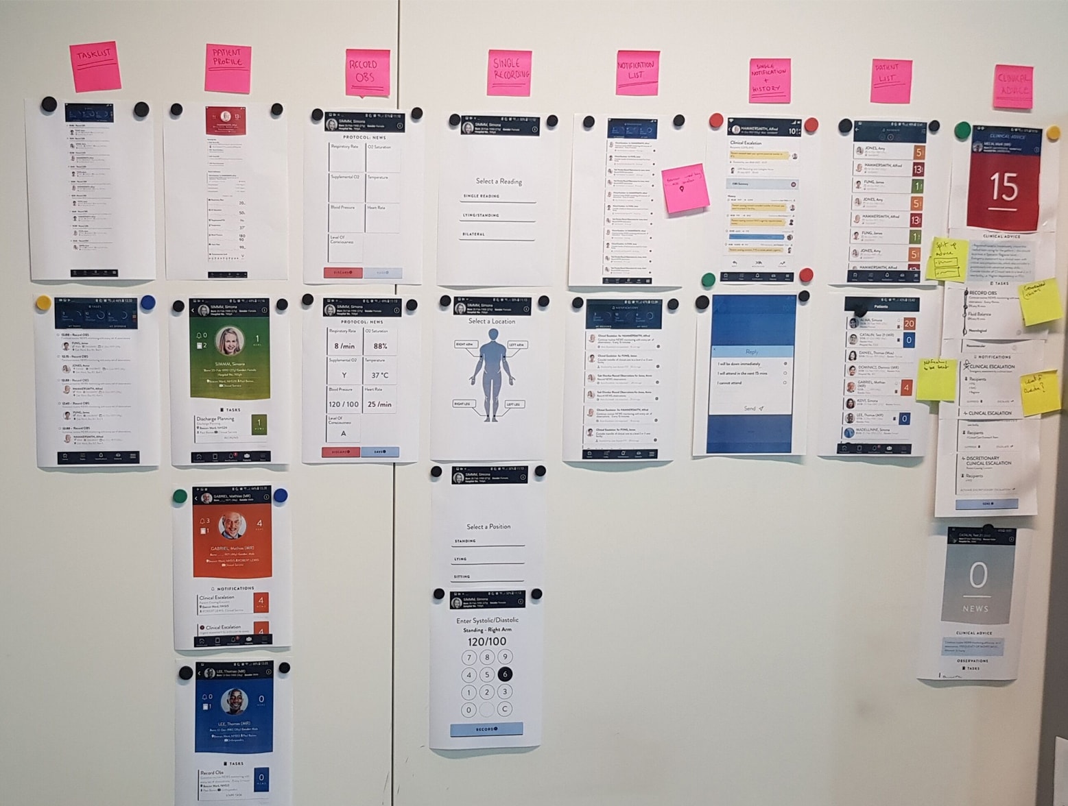
We adapted a design sprint approach to find solutions to speed up the data entry, simplify the flow and create a new visual language. My role was to lead the UX/UI Design. I was responsible for all designing, prototyping, ideation, testing and some minor development.
Business Goals
Increase revenue by launching a new mobile product line built on the backbone of the desktop PAS (Patient Administration Software) the company currently offers.
User Goals
Easily find patients and enter medical observations on a mobile device.
Project Goals
Redesign the current app by creating a more engaging, exciting and safer User Interface that solves all the pain points.
Scope and restraints:
- Limited access to the end users.
- ISB 1500-1508: Common User Interface (CUI) guidelines which set information standards for use in health ITsystems
- Had to rely on a lot of second-hand information.
- No resources for proper testing.
- Majority of the Product team work in another country.
- Users in another country.
- The clinical safety/testing process.
- Prohibited from conducting a UI review or UI sign-off of designs implemented by the developers.
User Demographics
The user demographics for the app is extremely broad as the users can vary from 20 to 65 years of age, they also have varying technical skill levels.
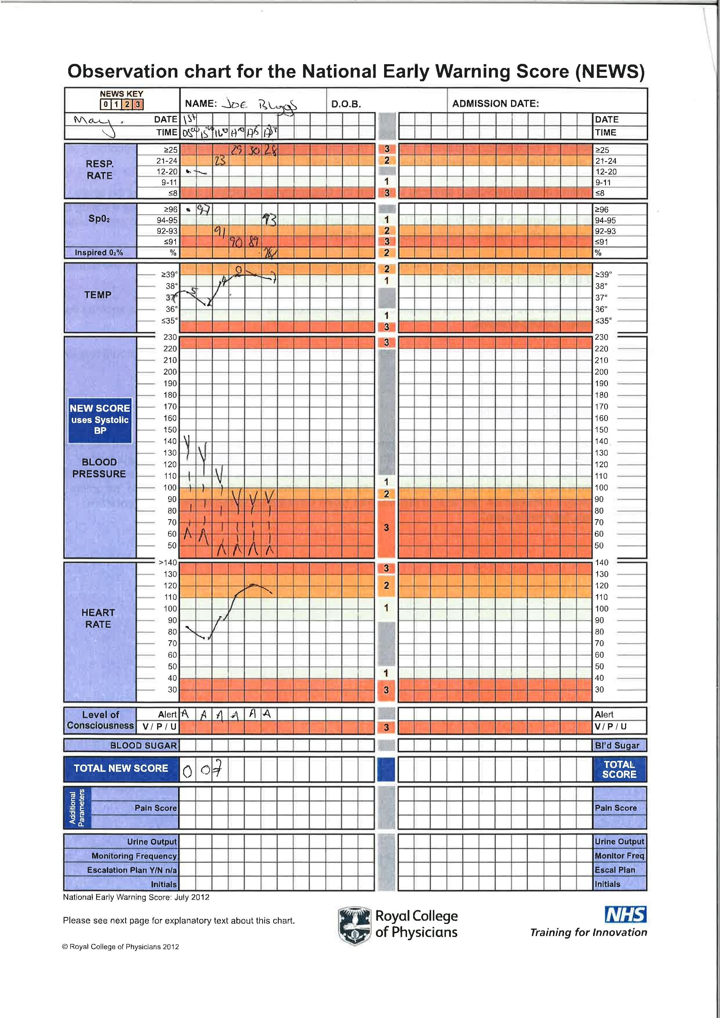
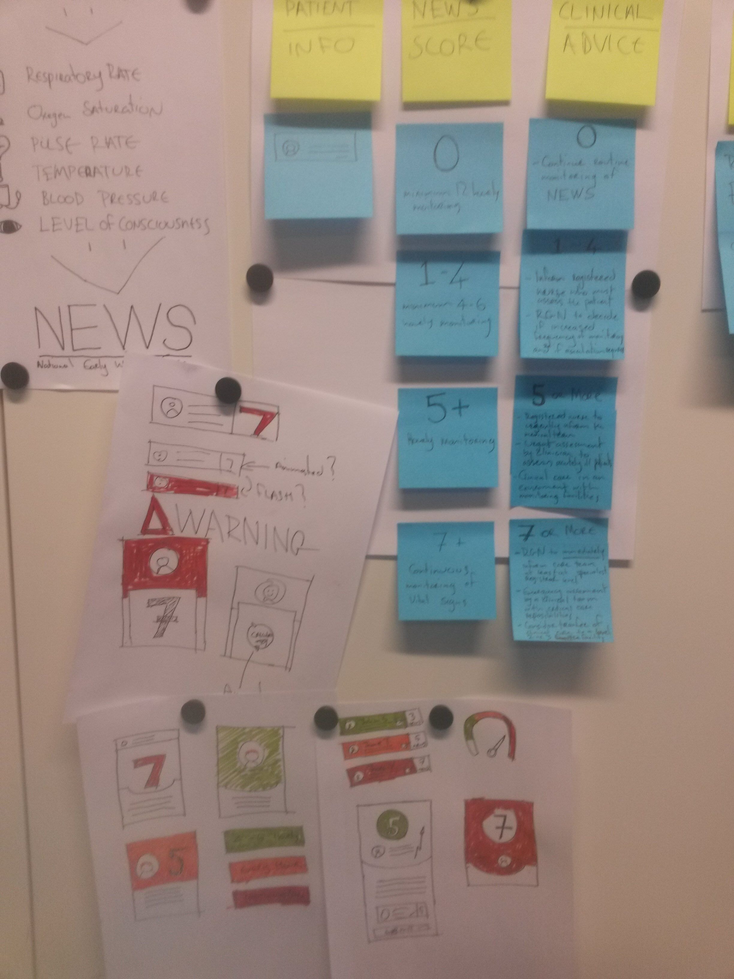
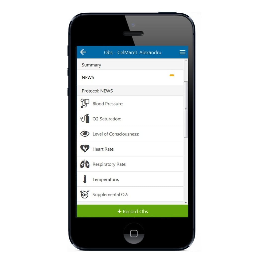
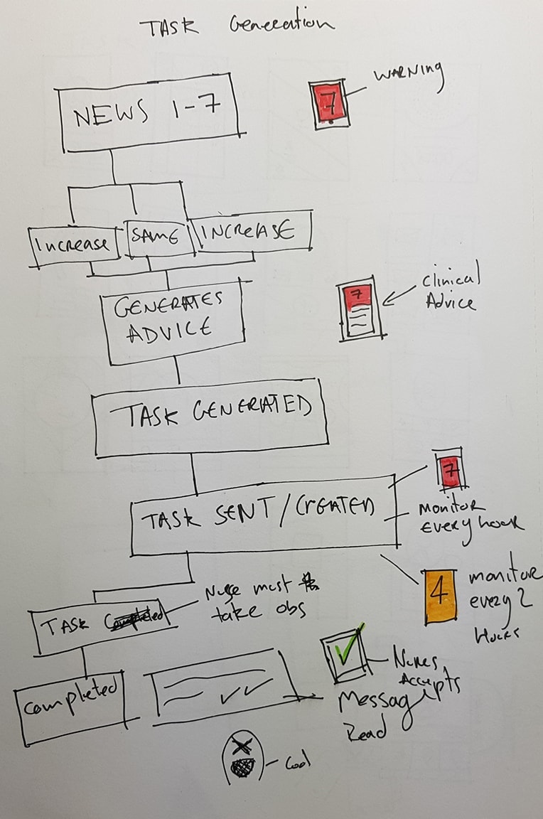
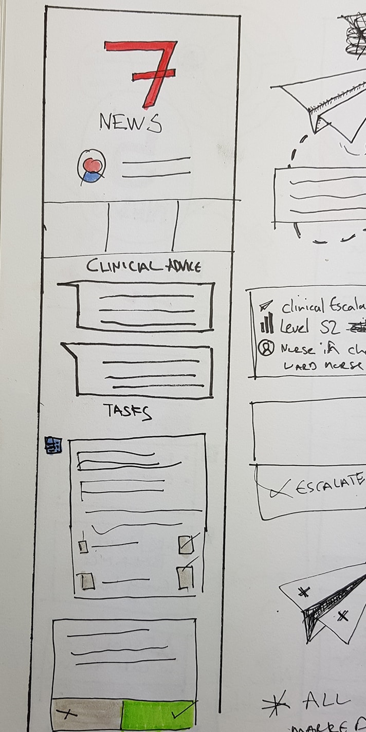
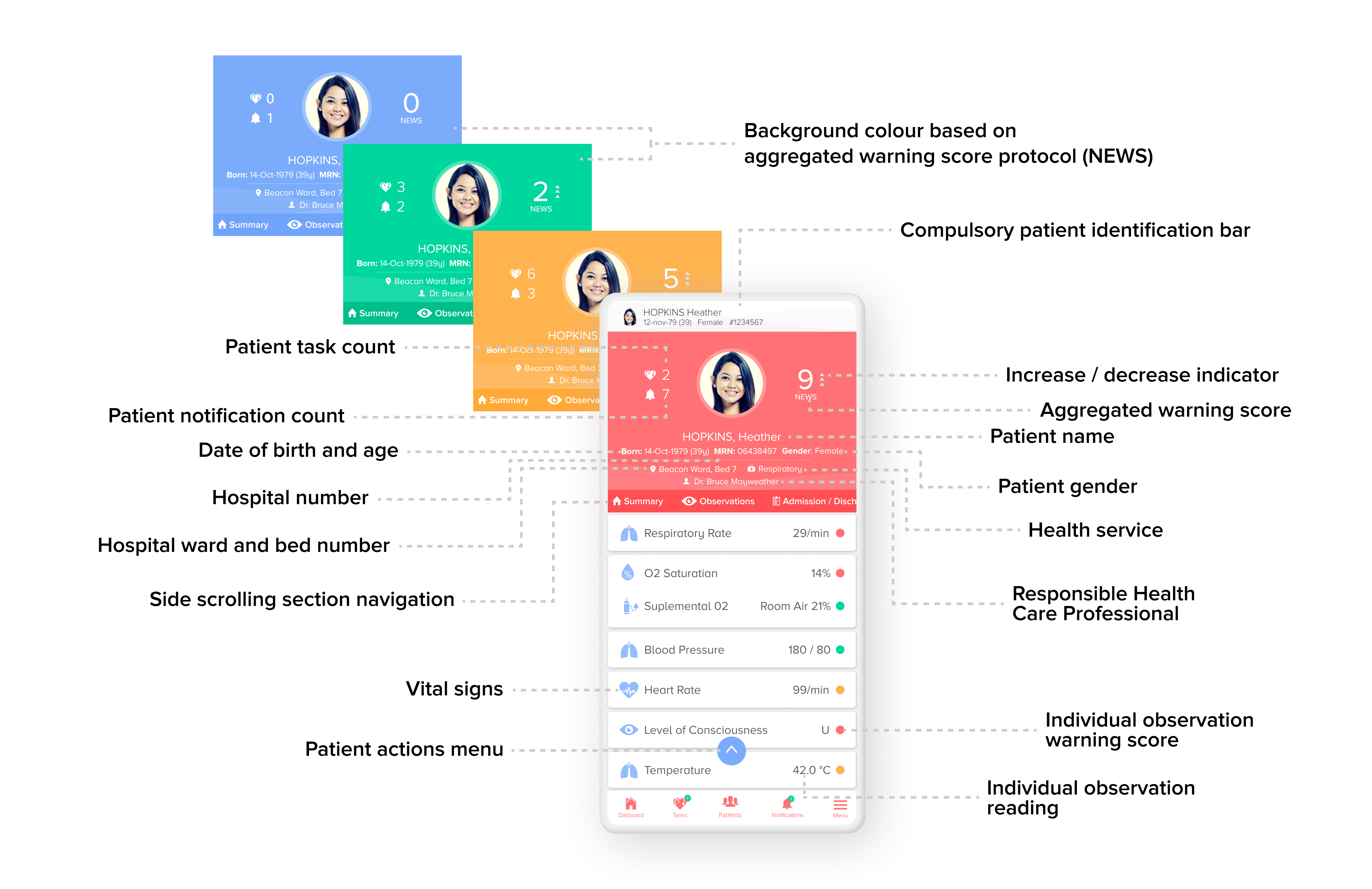
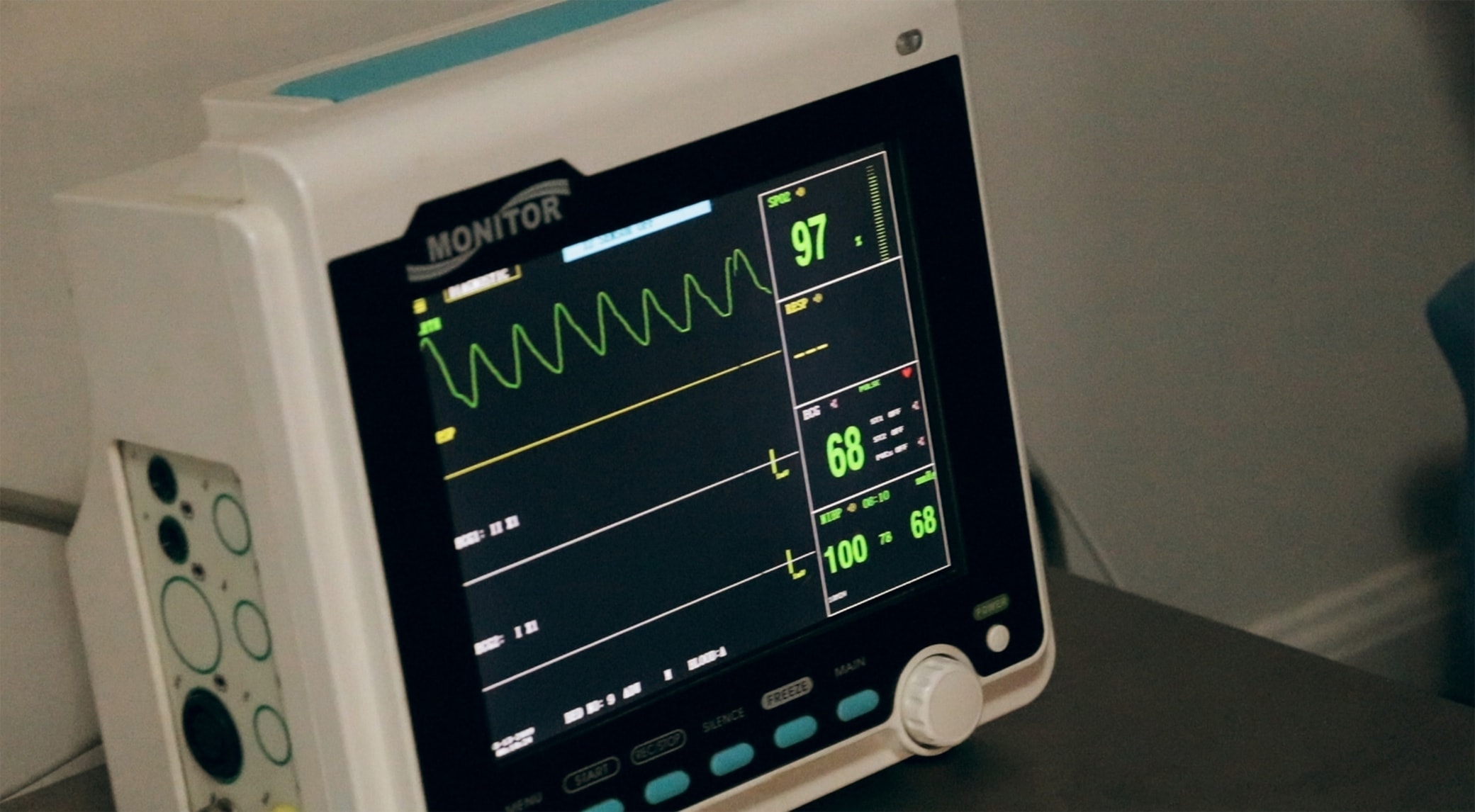
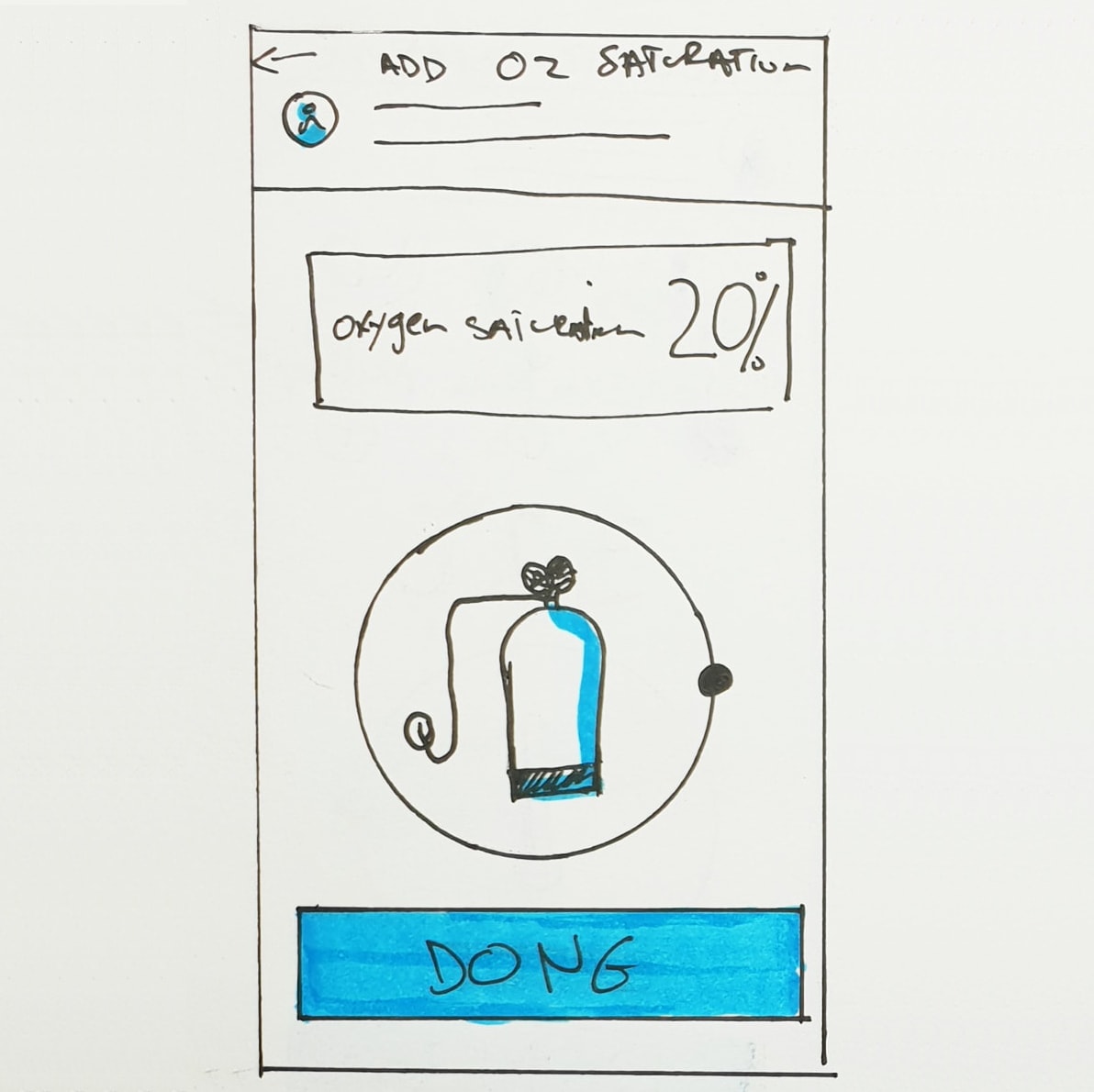
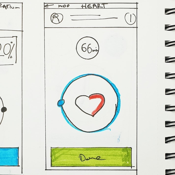
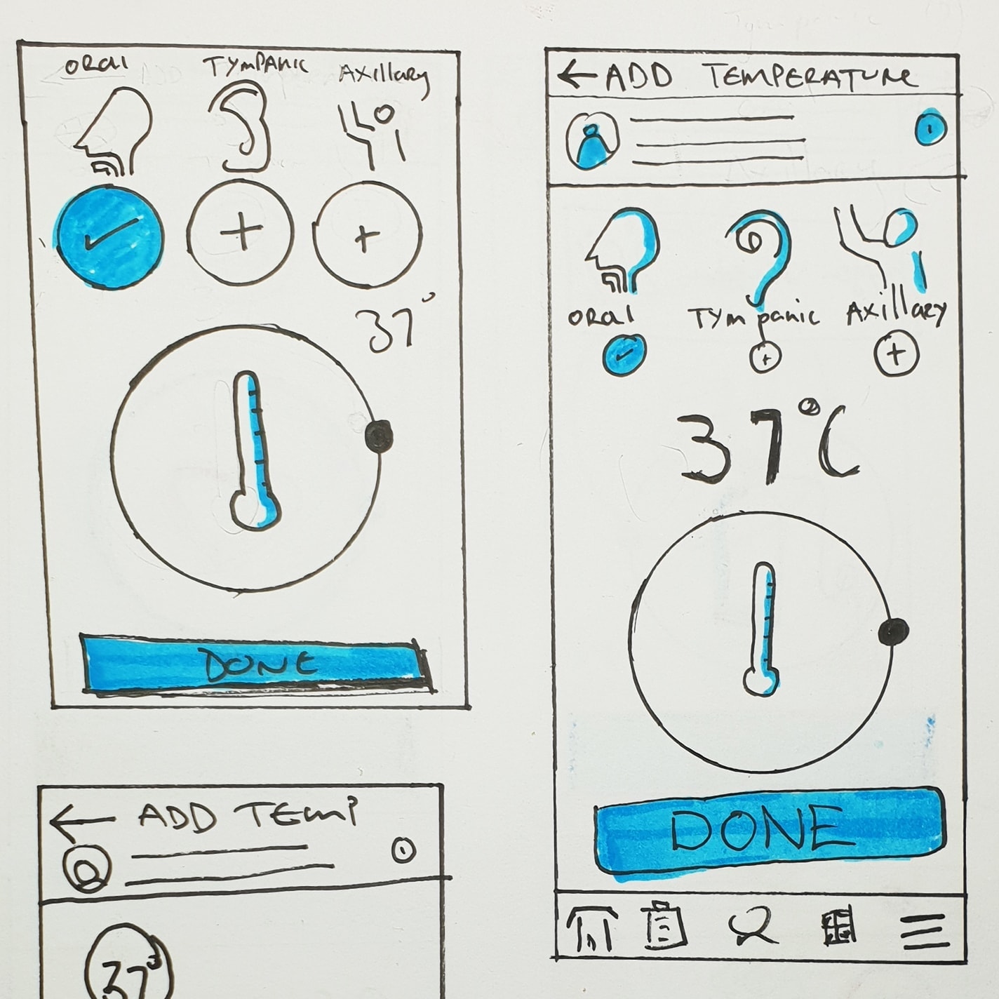
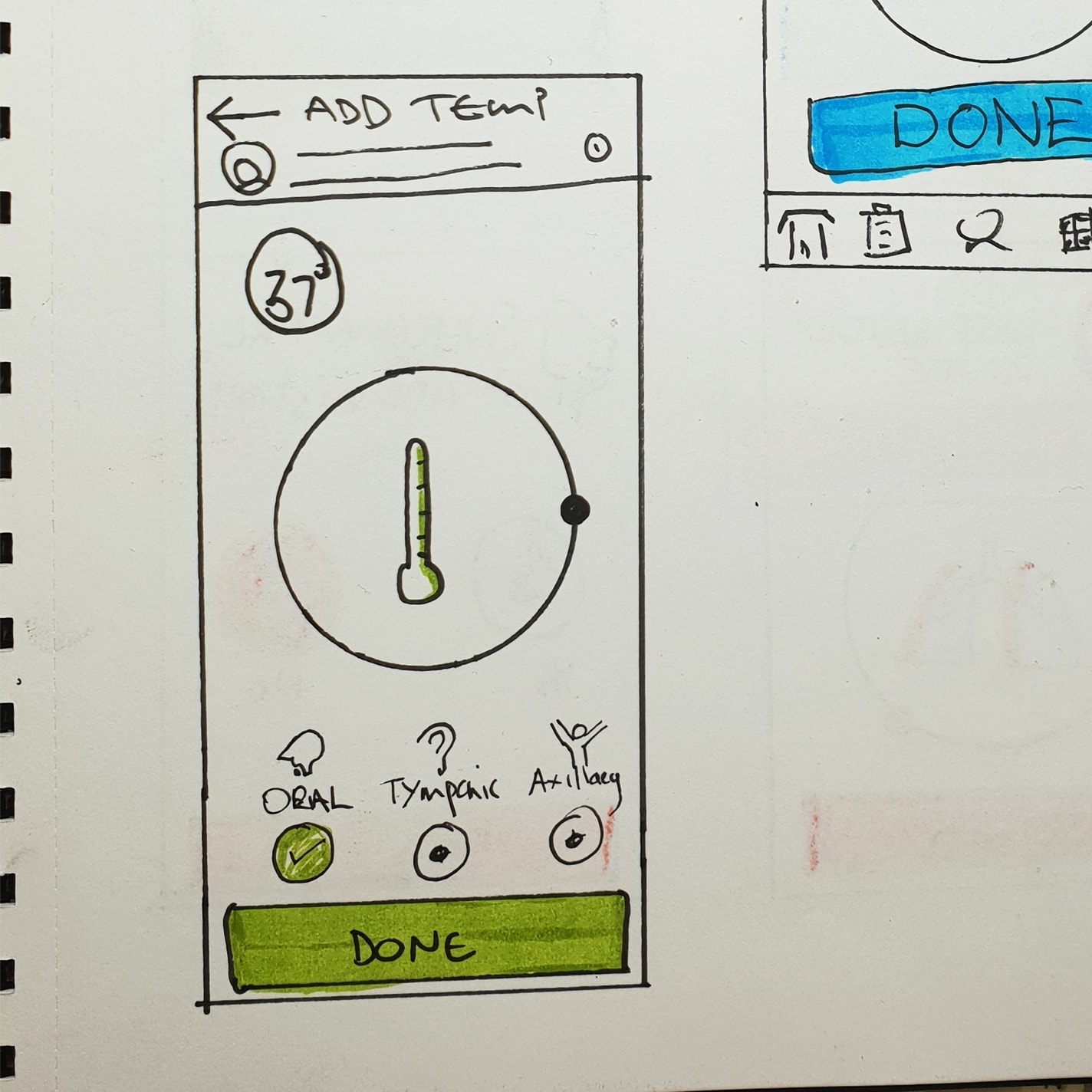
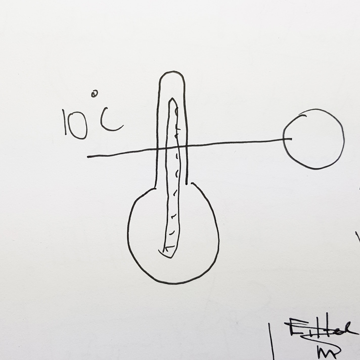
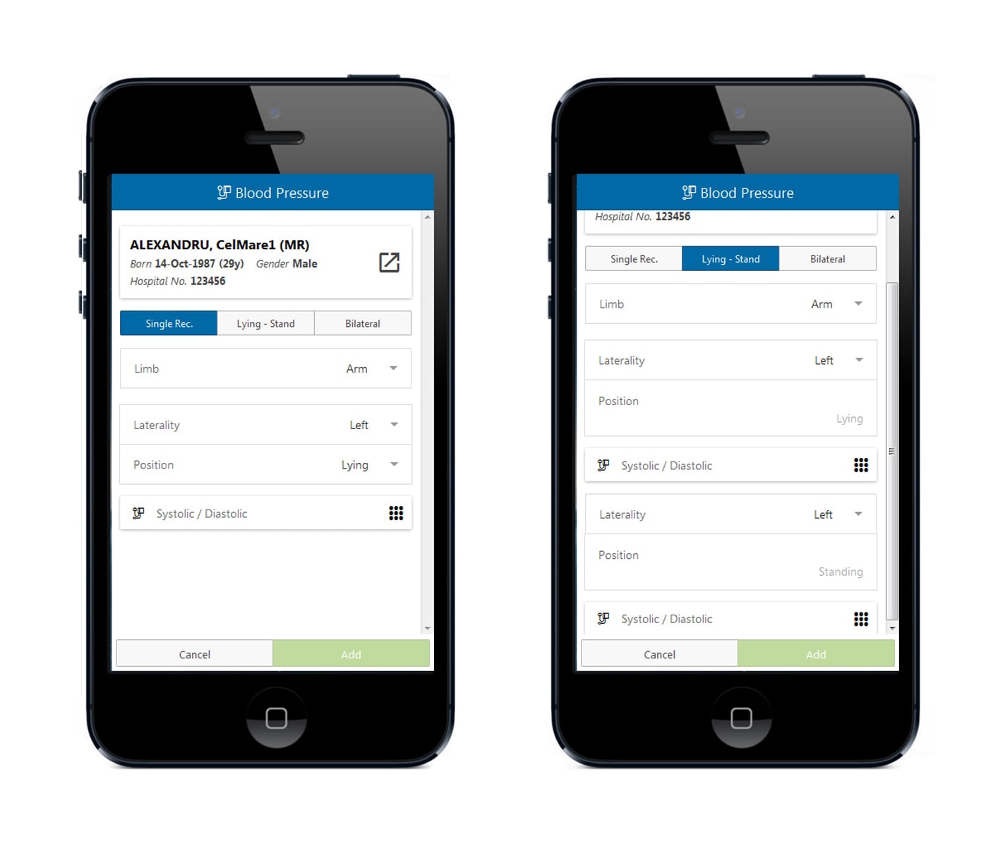
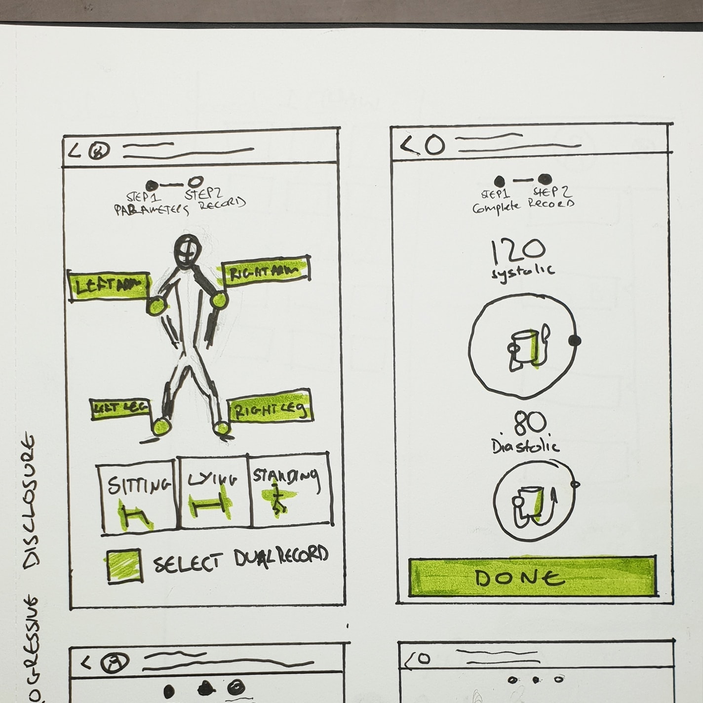
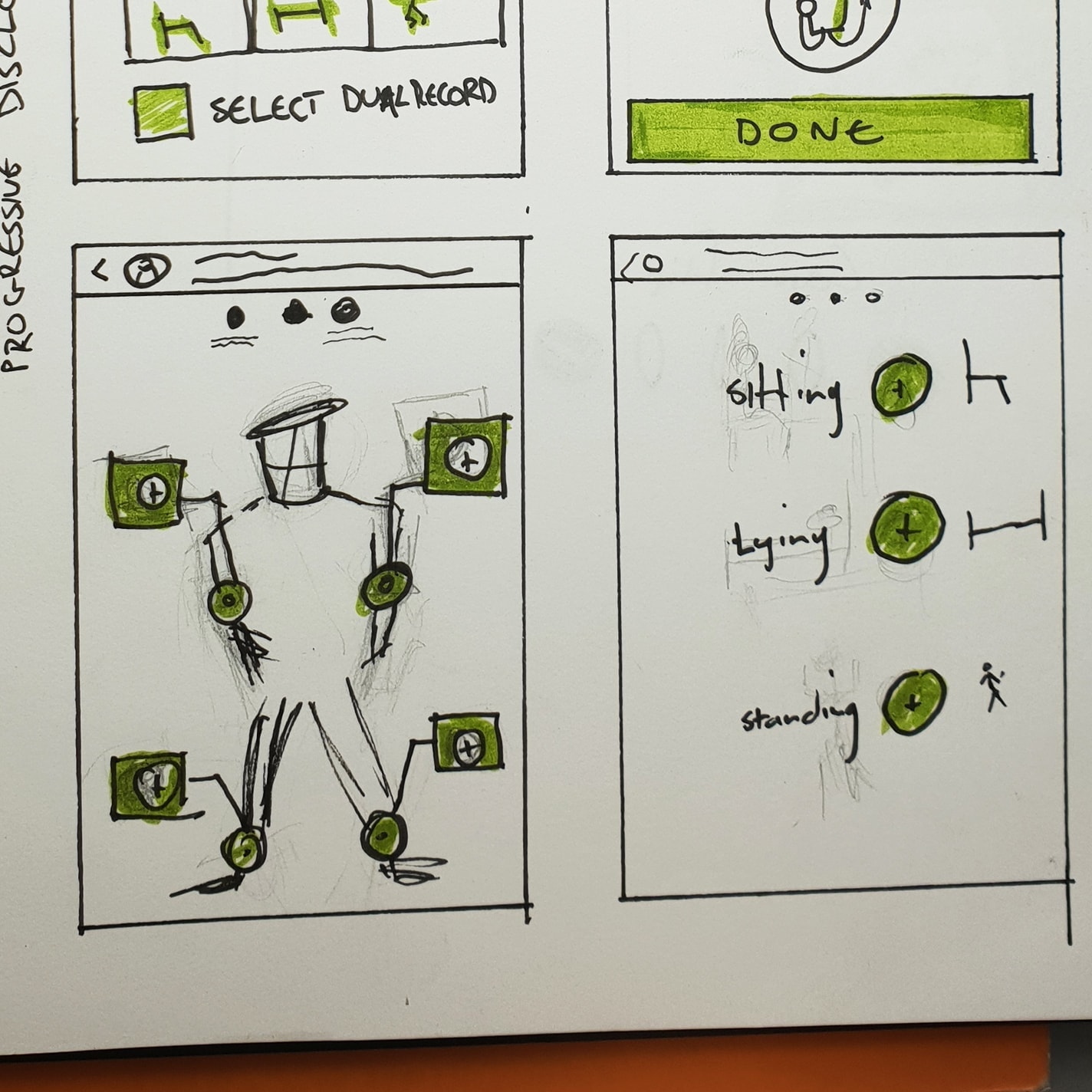
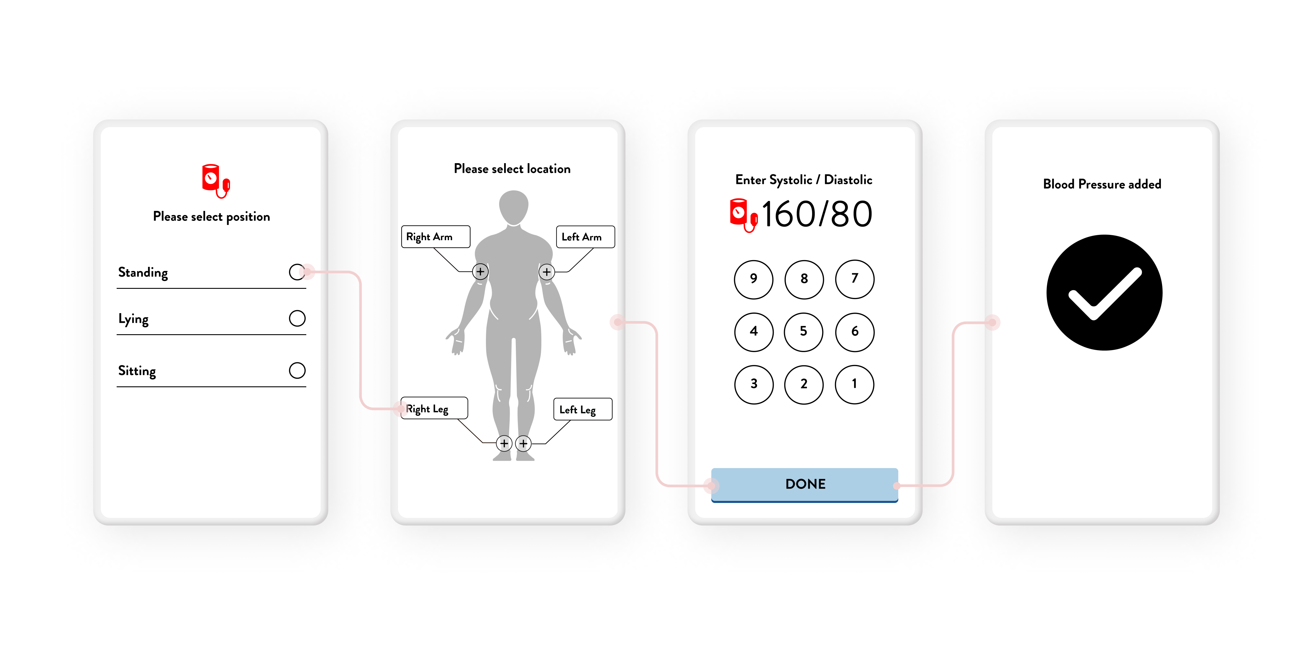
What is a Clinical Observation and NEWS anyway?
I did a content audit on the app and investigated the medical work flow it supports, in order to understand what are clinical observations and the purpose of early warning protocol (NEWS) score calculation.
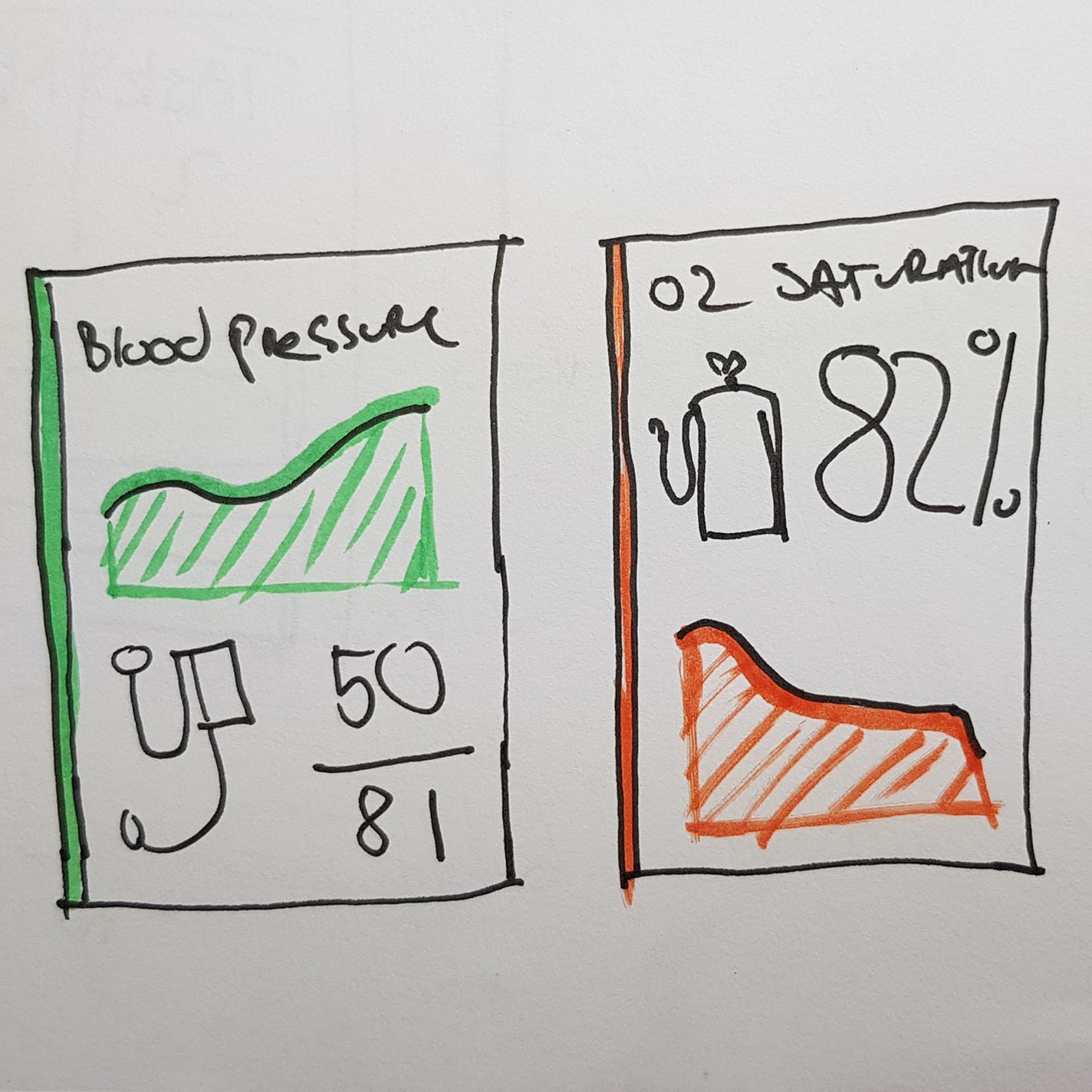
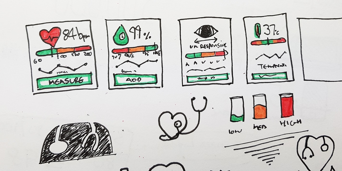
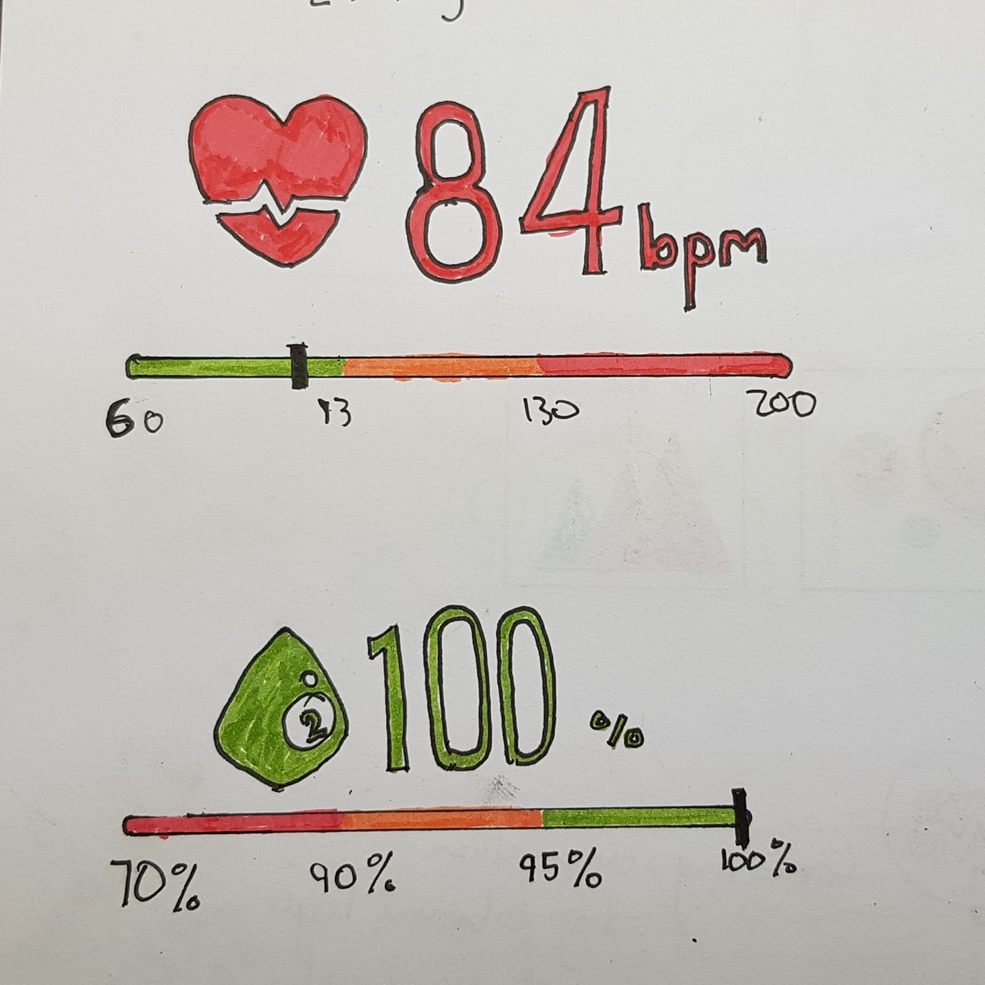
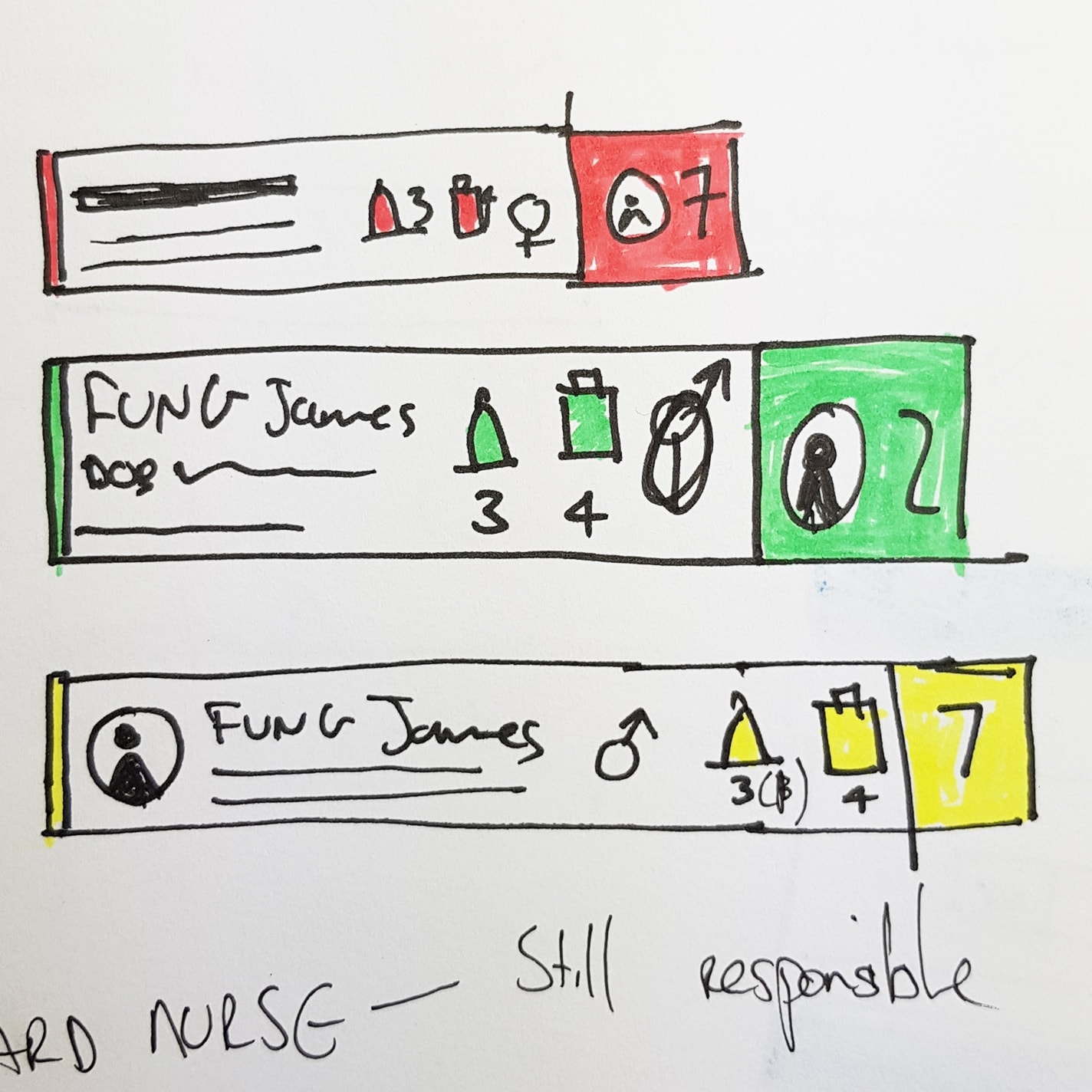
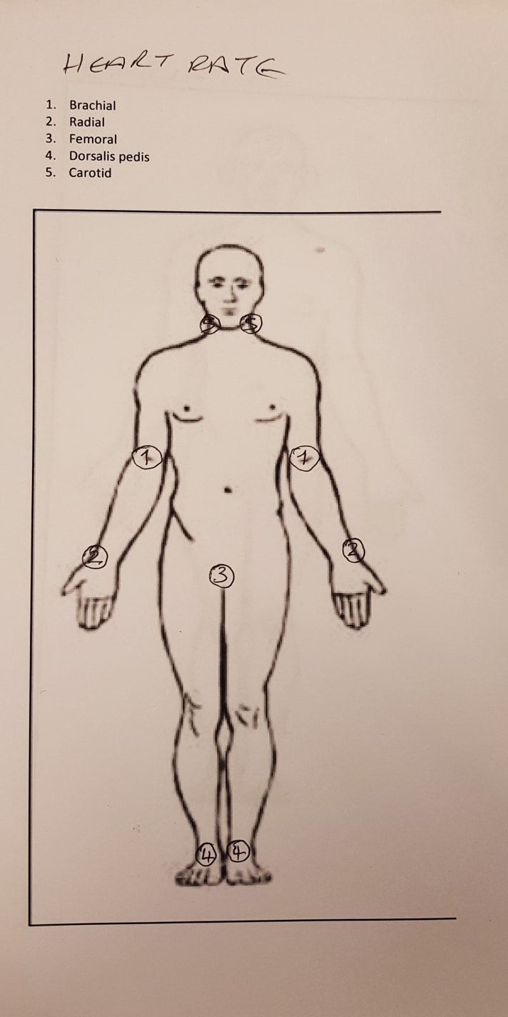
The National Early Warning Score (NEWS) is based on a simple aggregate scoring system, in which a score is allocated to physiological measurements, already recorded in routine practice, or are being monitored in hospital.
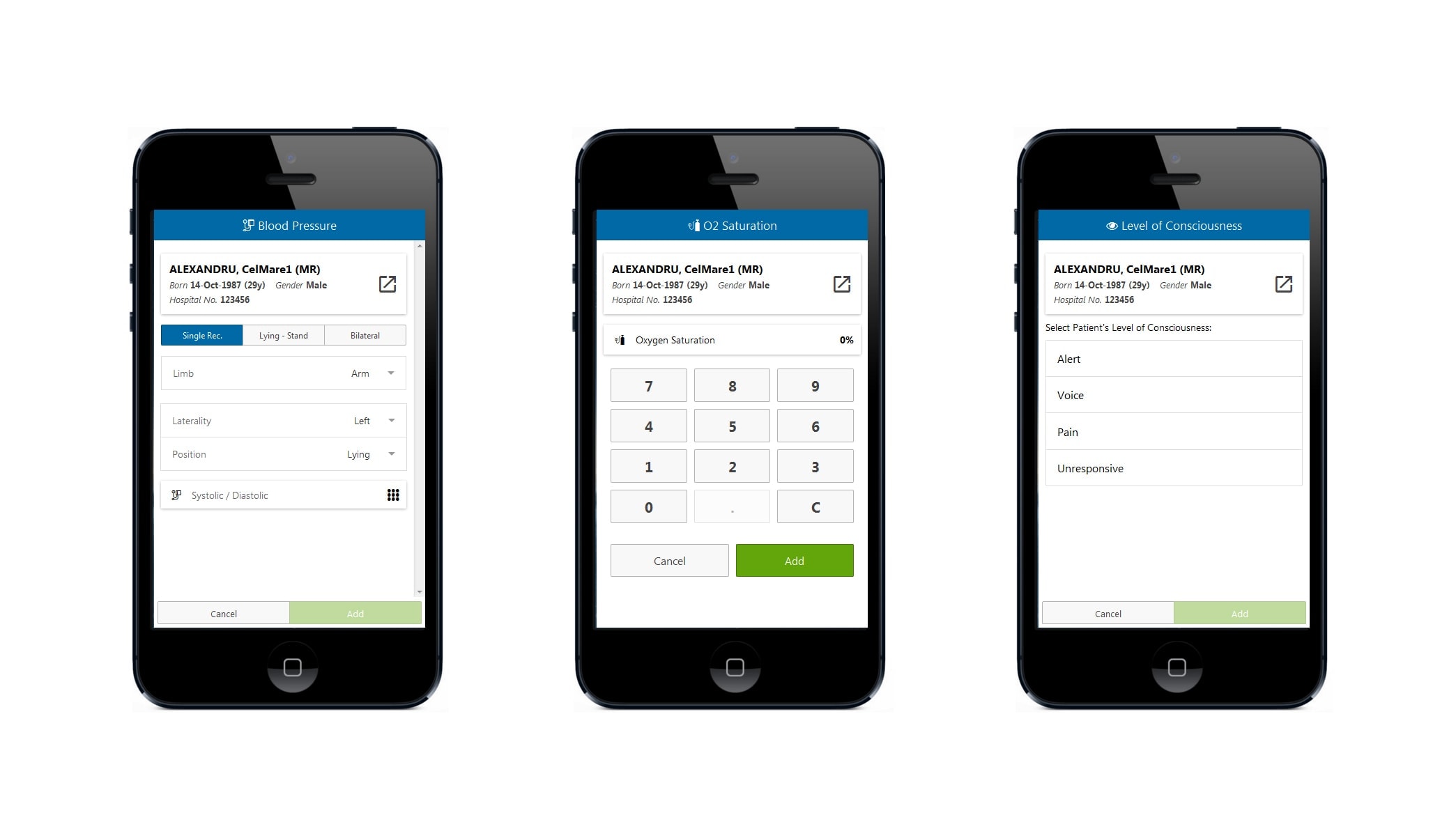
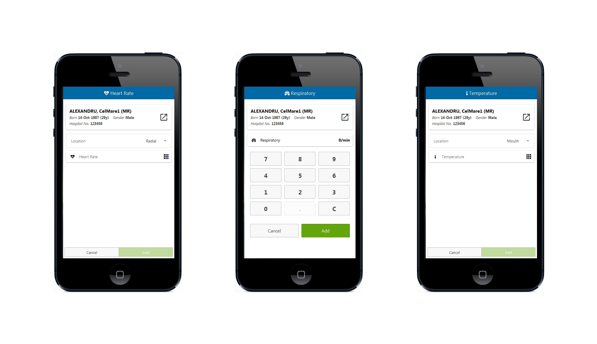
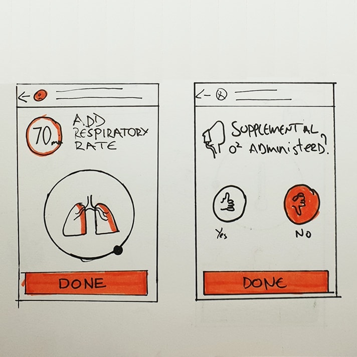
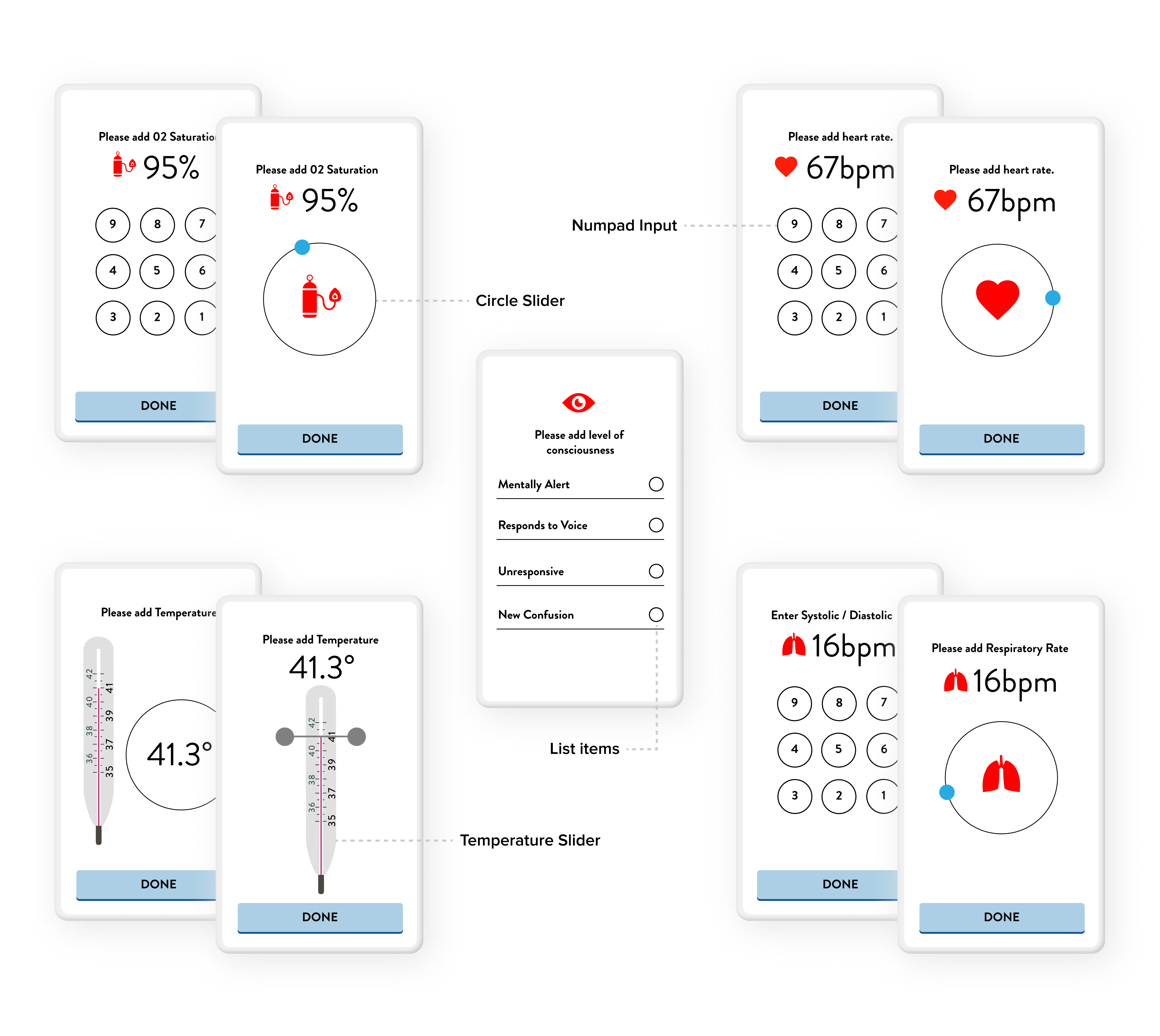
Six simple physiological observations of vital signs parameters form the basis of the scoring system:
- Respiration rate
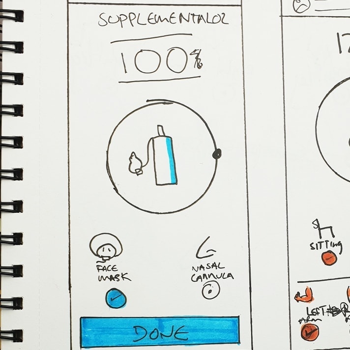
- Oxygen saturation
- Systolic blood pressure
- Heart rate
- Level of consciousness or wnew confusion
- Temperature
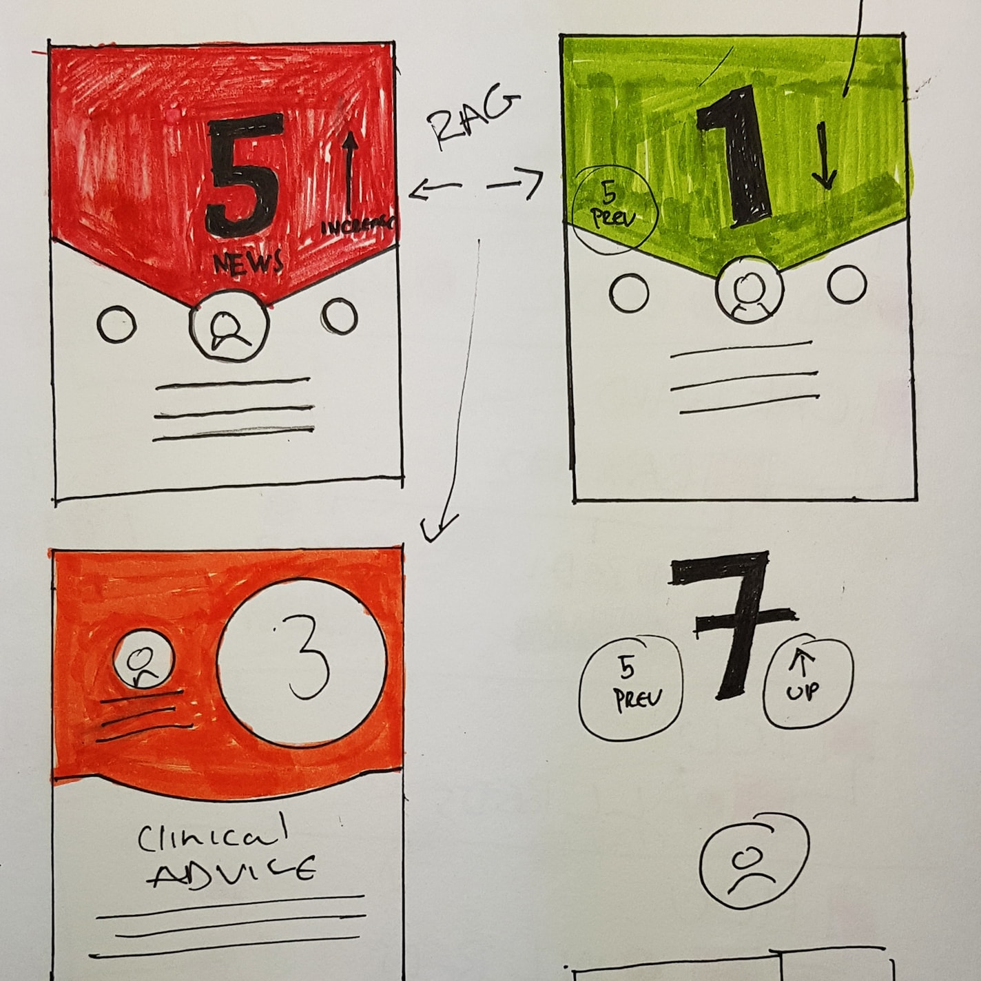
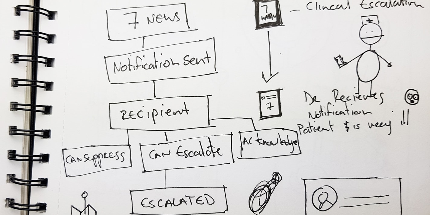
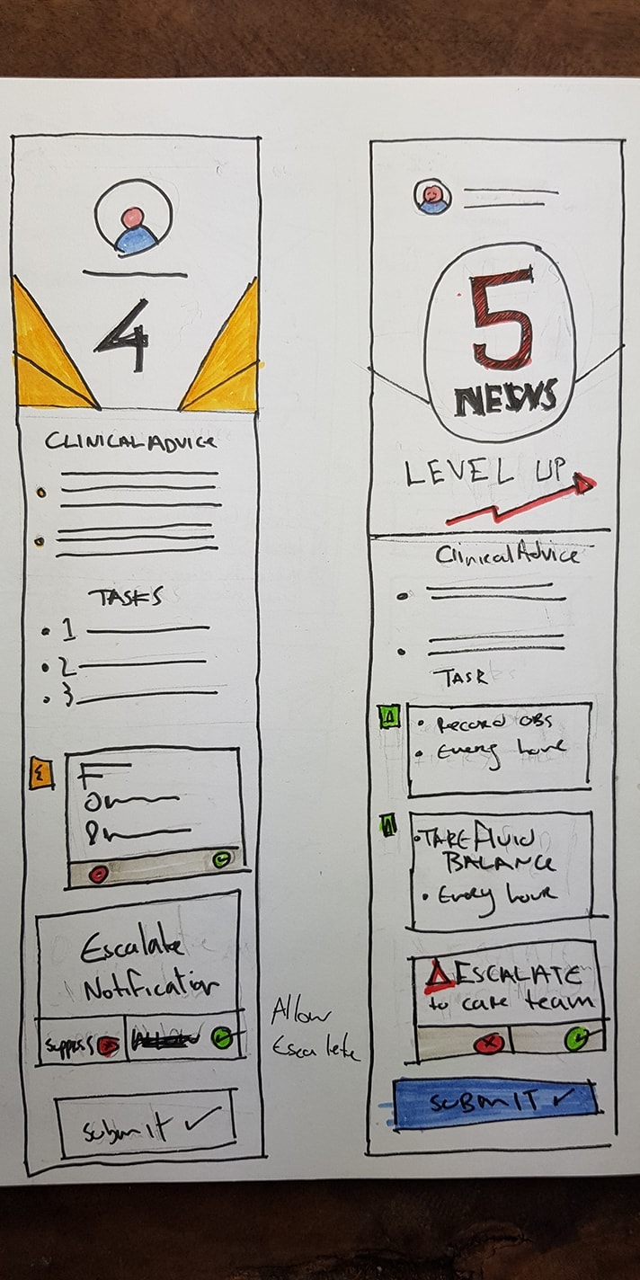
This generates a clinical risk score or National Early Warning Score (NEWS) which informs the medical staff the amount of monitoring the patient requires.
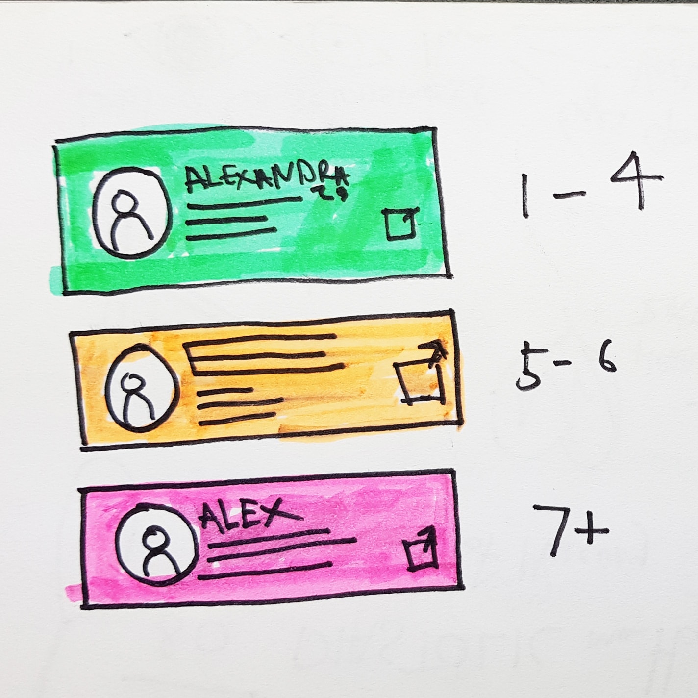
- 0; minimum monitoring, colour code blue
- Low 1-4; minimum 4-6 hourly monitoring, colour code green
- Medium 5-6;hourly monitoring, colour code amber
- High 7+; continuous monitoring colour, code red